100xEngineers
A futuristic visual identity for India's premier AI engineering community
The Challenge
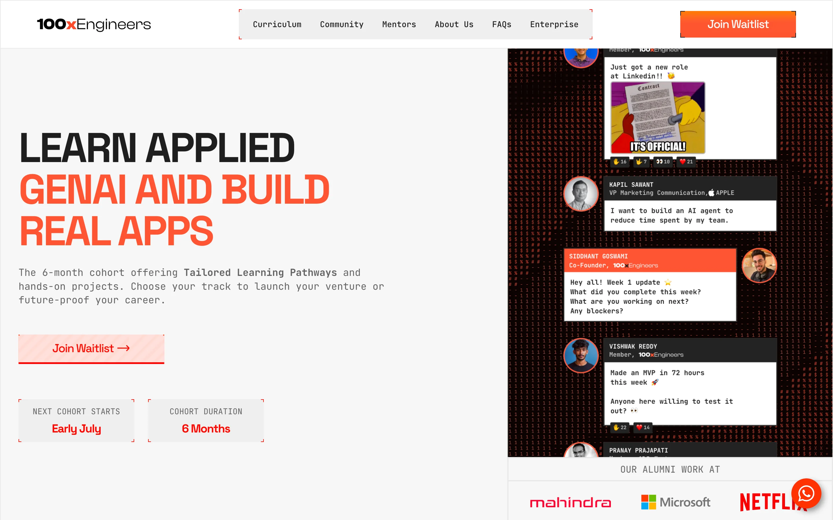
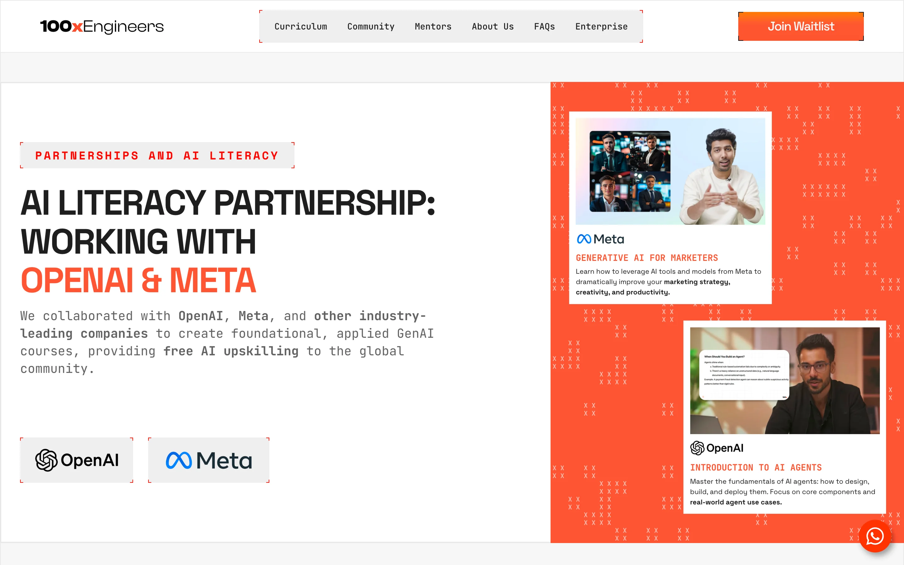
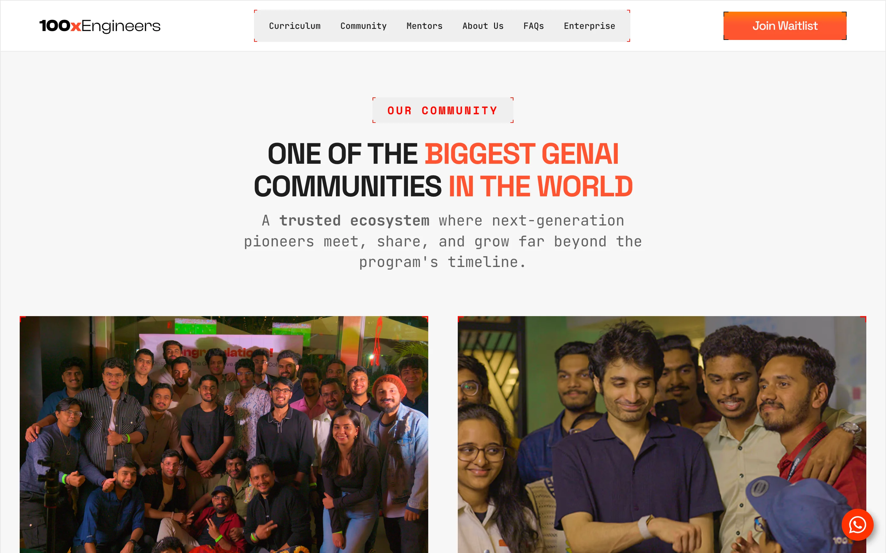
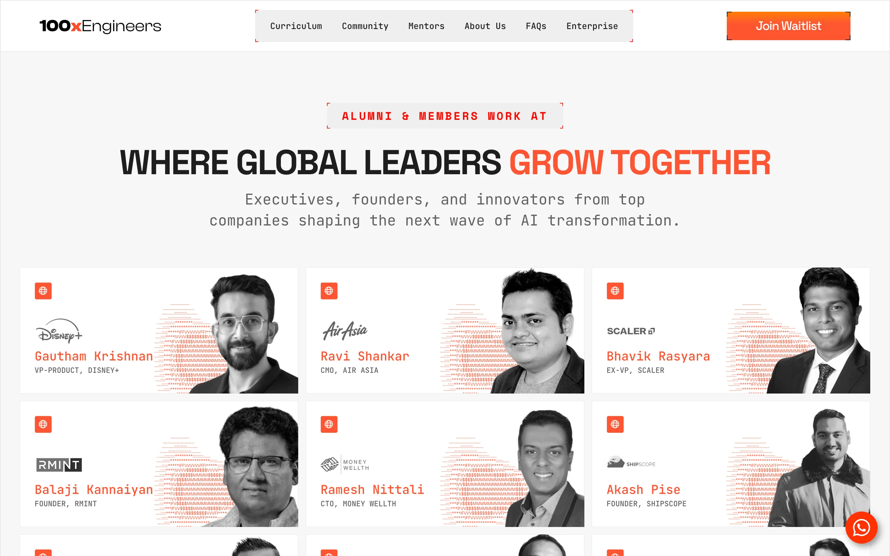
100xEngineers is one of India's most recognized AI engineering communities but their visual identity hadn't kept pace with their ambition. The site read "hardcore bootcamp" to an audience of senior professionals looking for transformation. They needed a design system that felt futuristic and interactive across web, presentations and merch.
The Solution
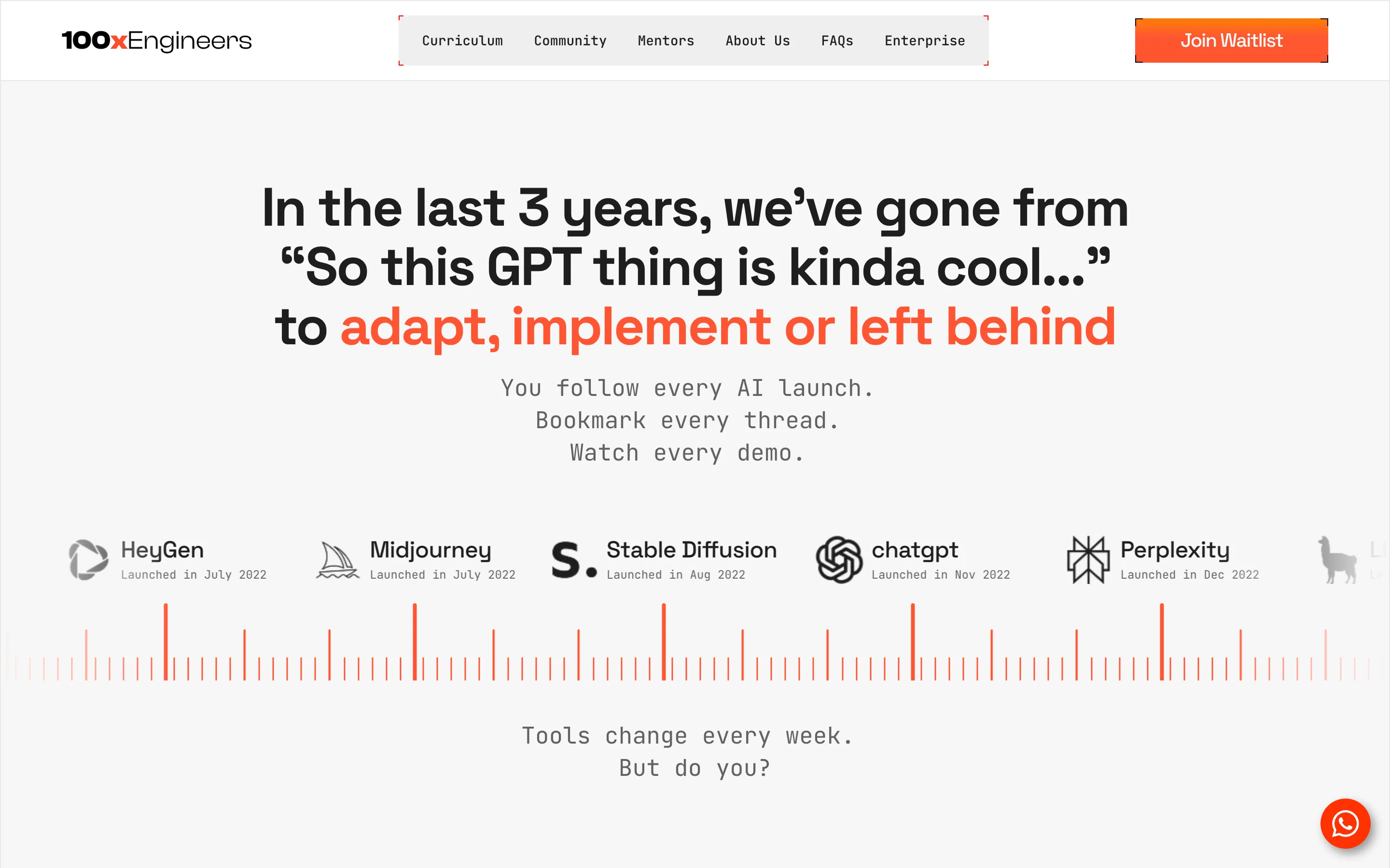
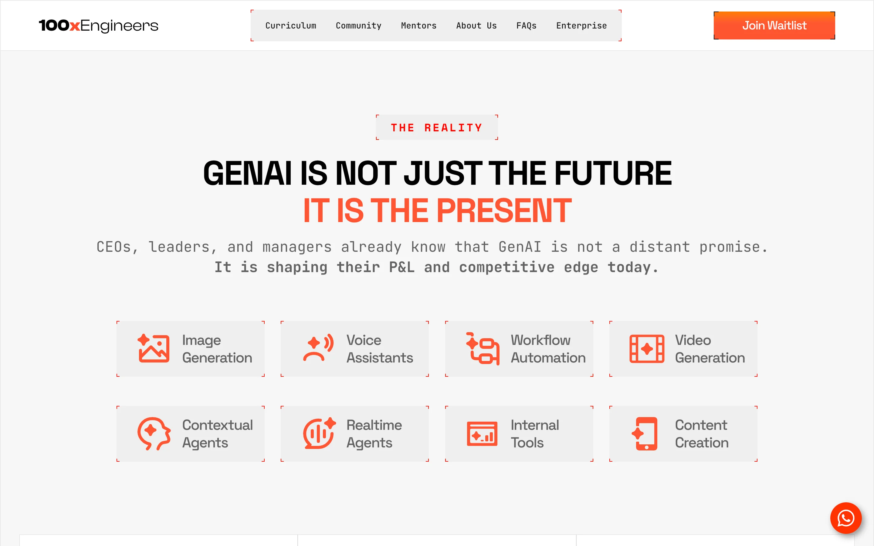
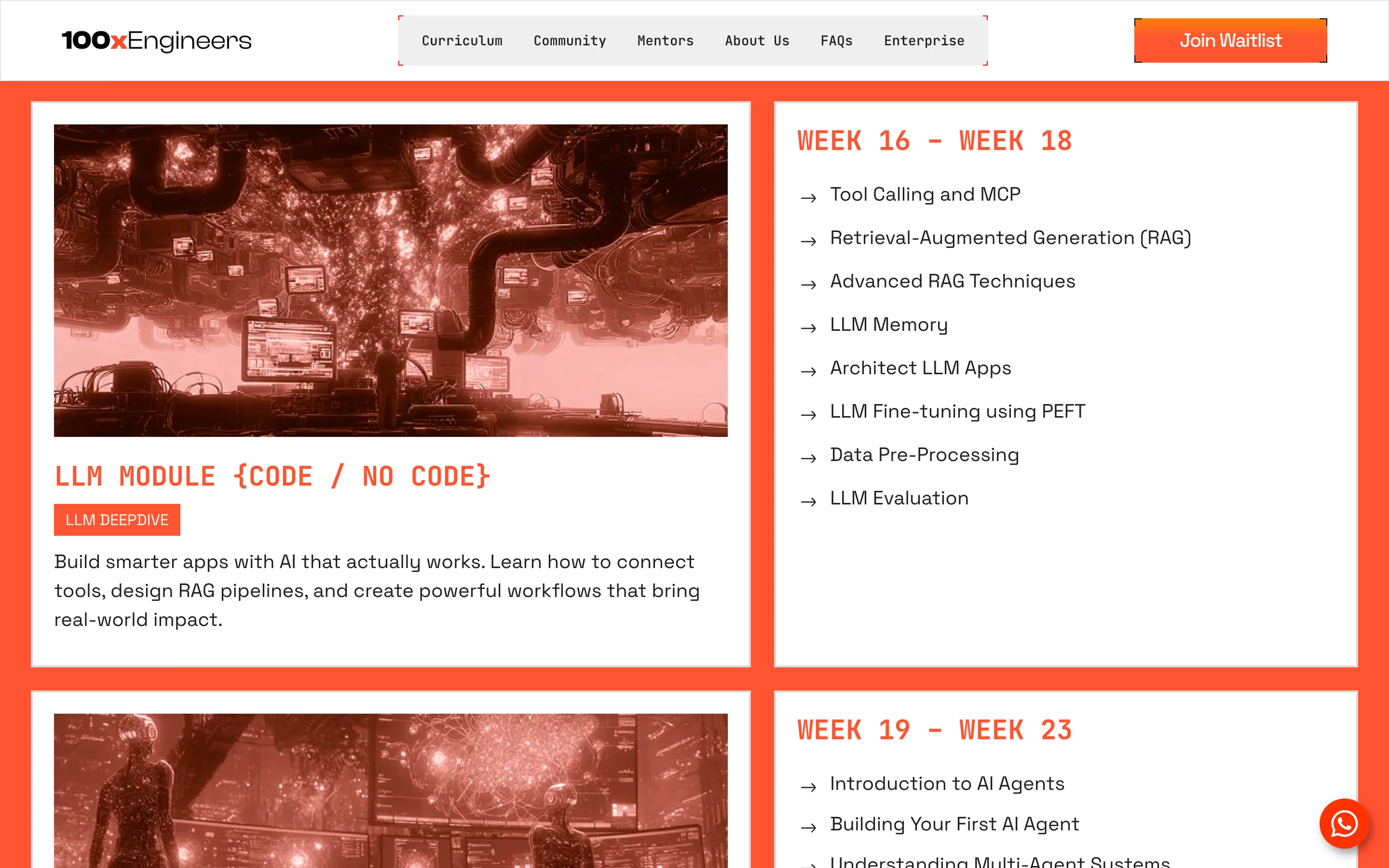
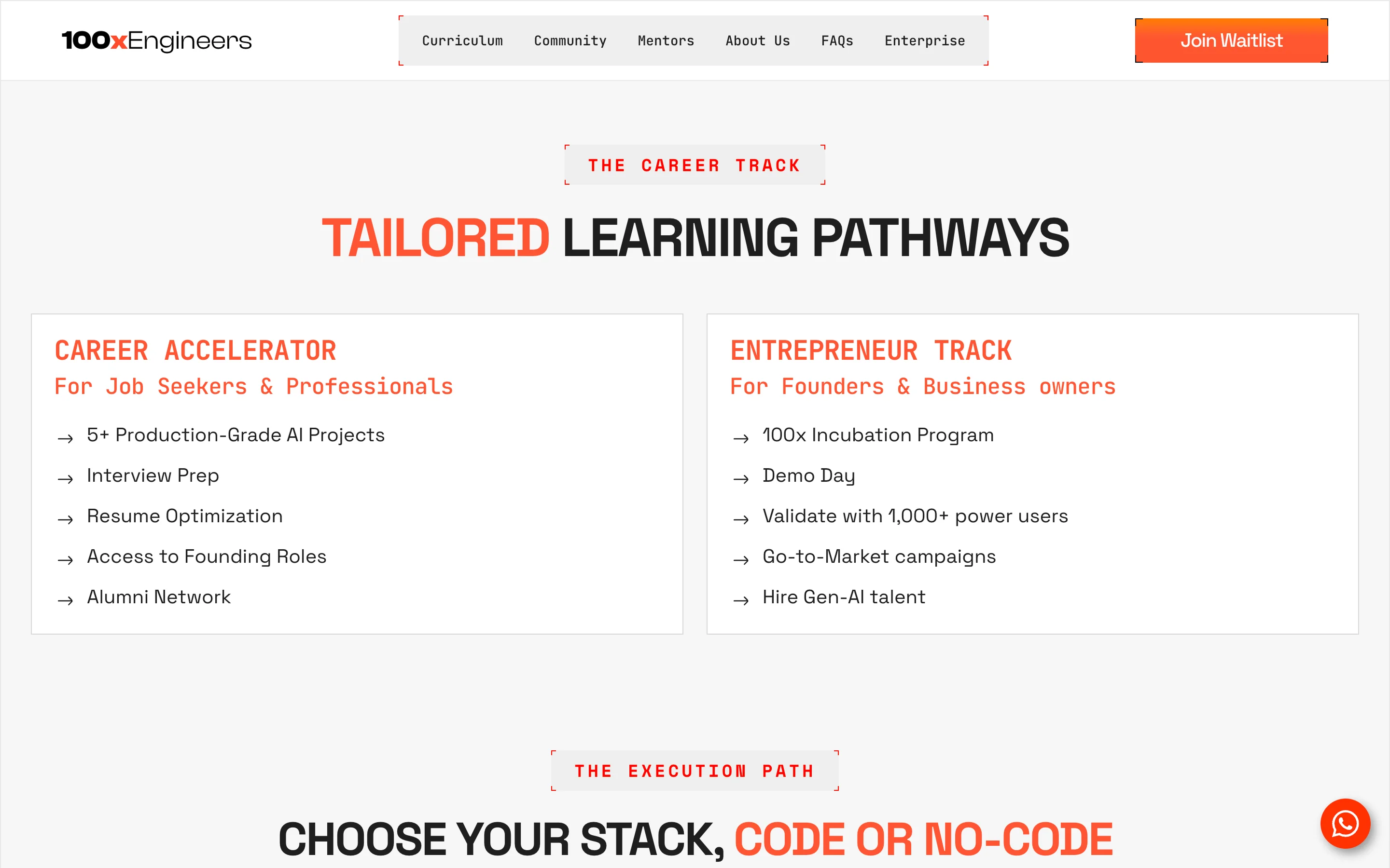
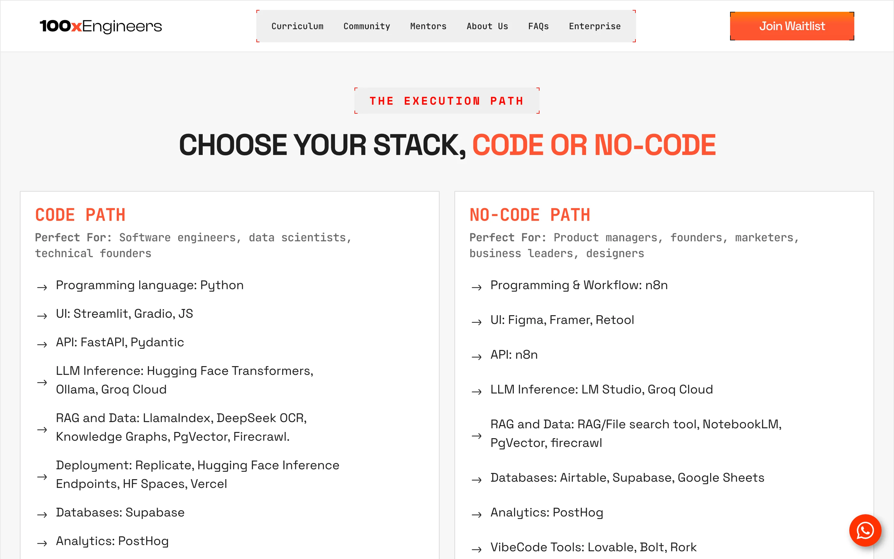
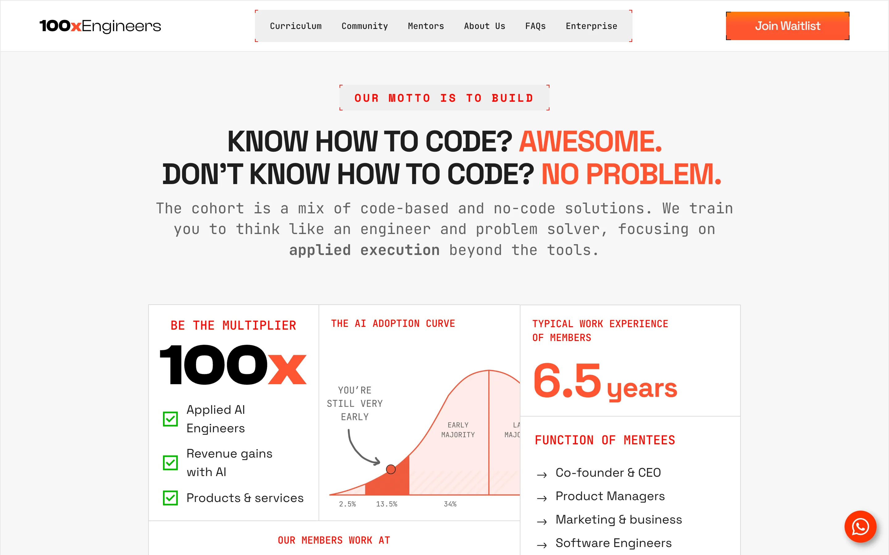
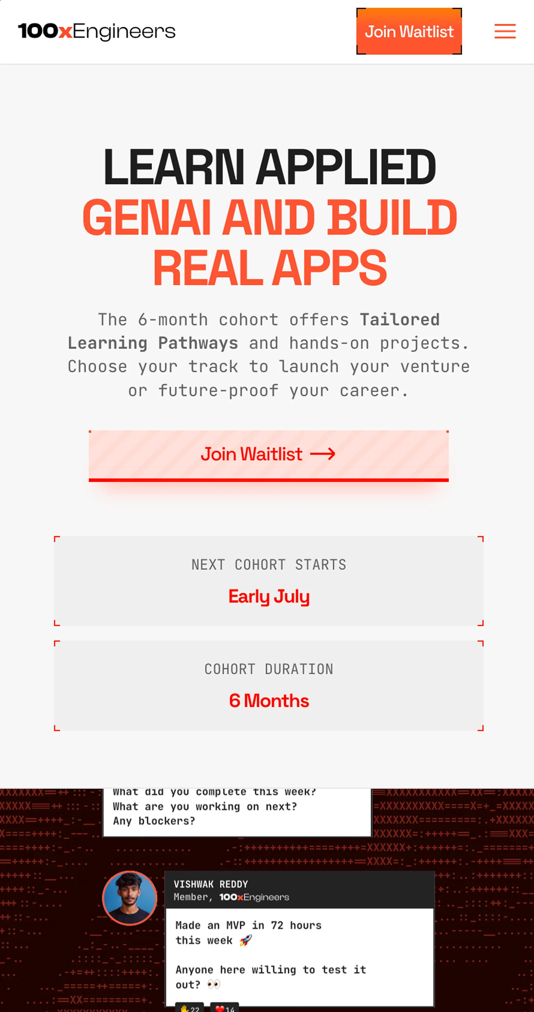
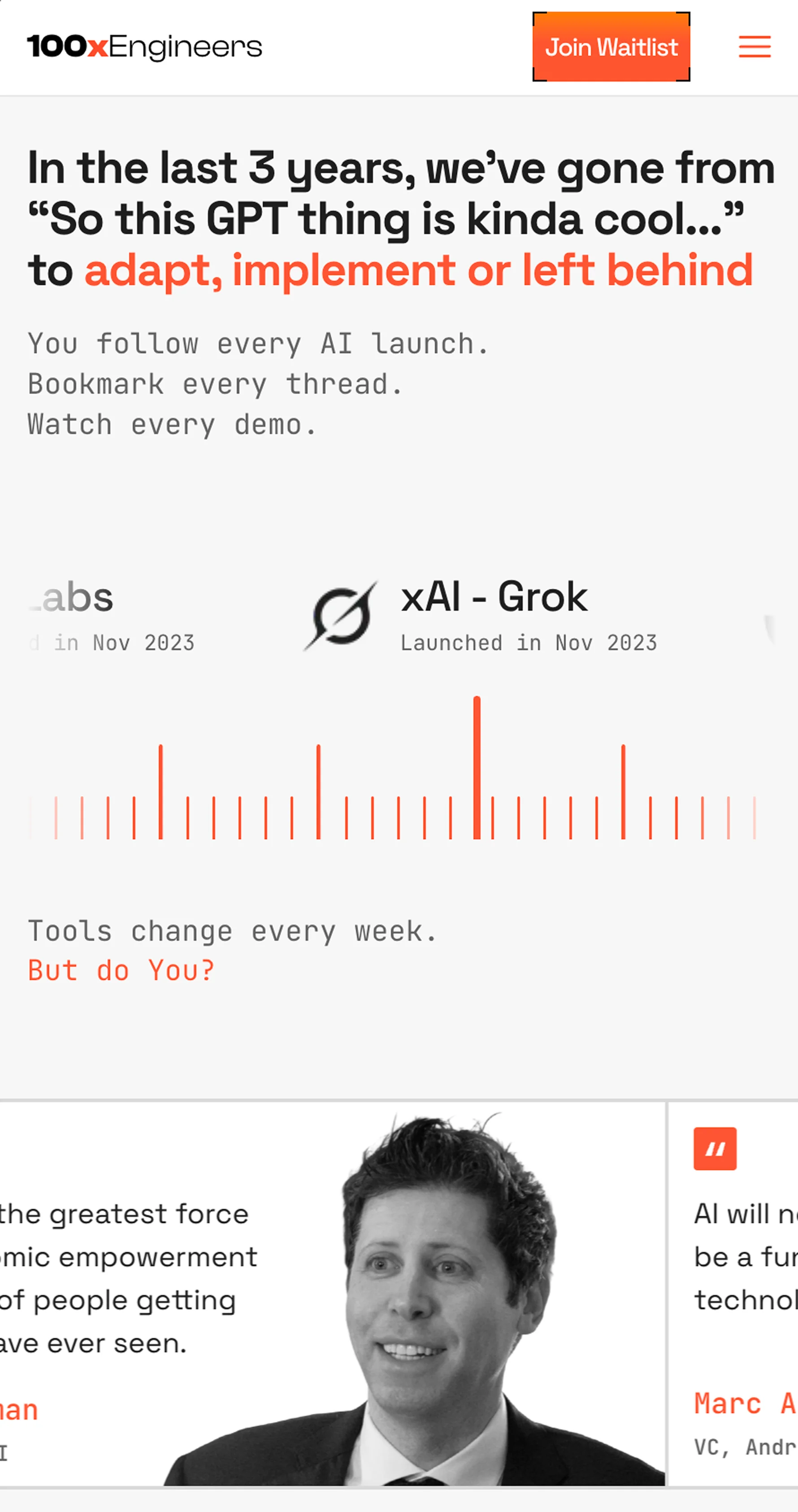
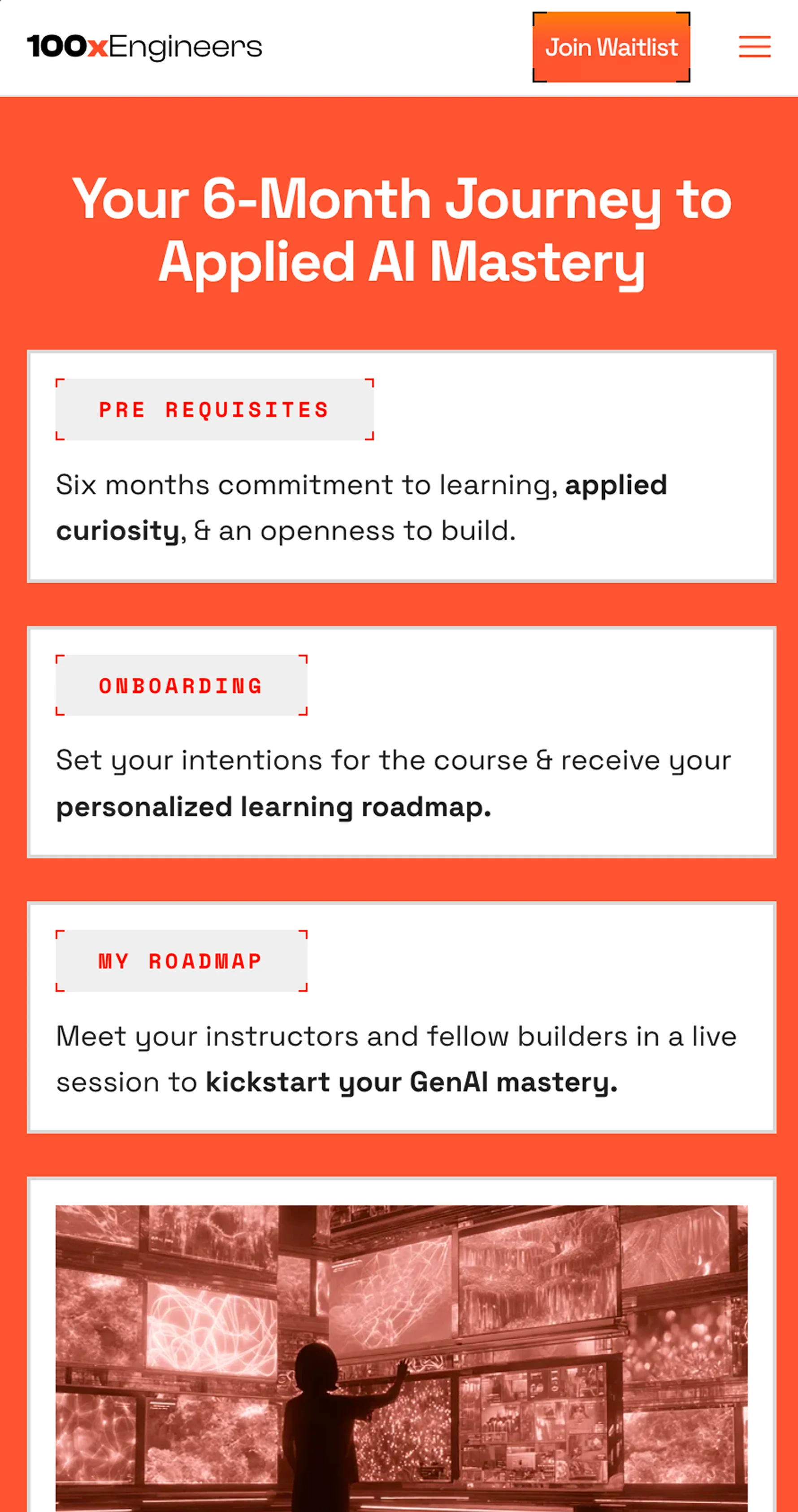
ASCII and source-code aesthetics as the unifying visual thread. Minimal and technical on merch, animated and dynamic on web, bold and expressive in graphics. The website was built in Framer with scroll-driven elements and a custom horizontal timeline section.
Moodboarding + Direction
Deep dive into existing brand and competitor landscape. Explored ASCII art, source code aesthetics and generative visuals. Validated that ASCII-driven design could scale across web, graphics and merch while staying developer-native.
Workshop + Explorations
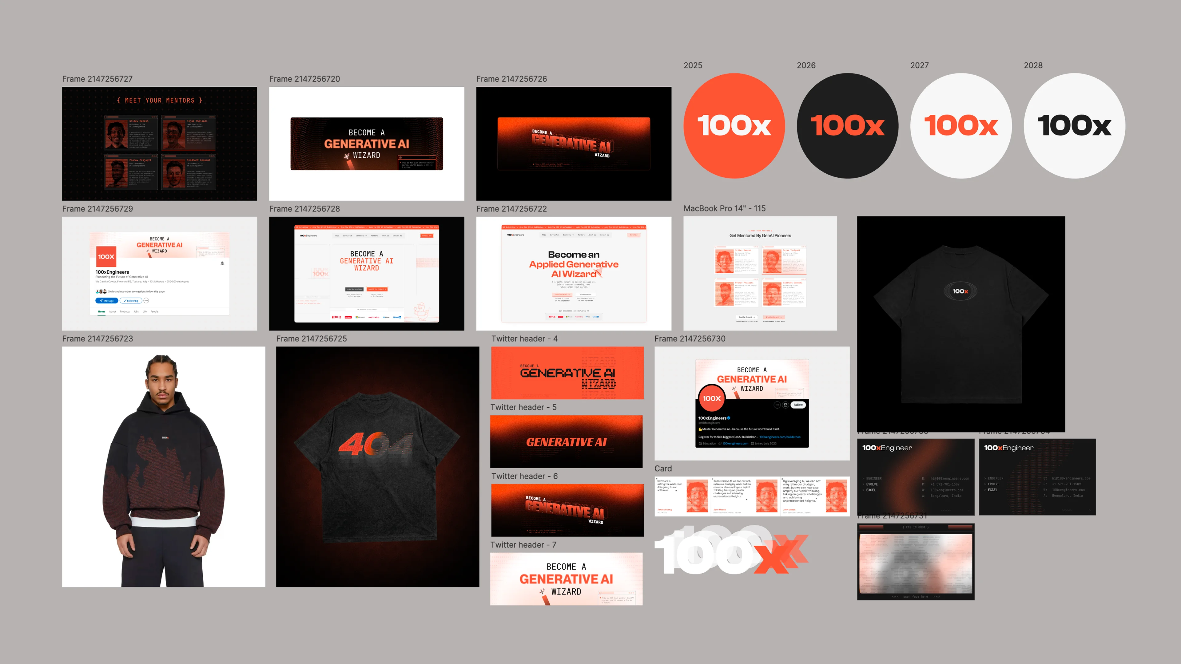
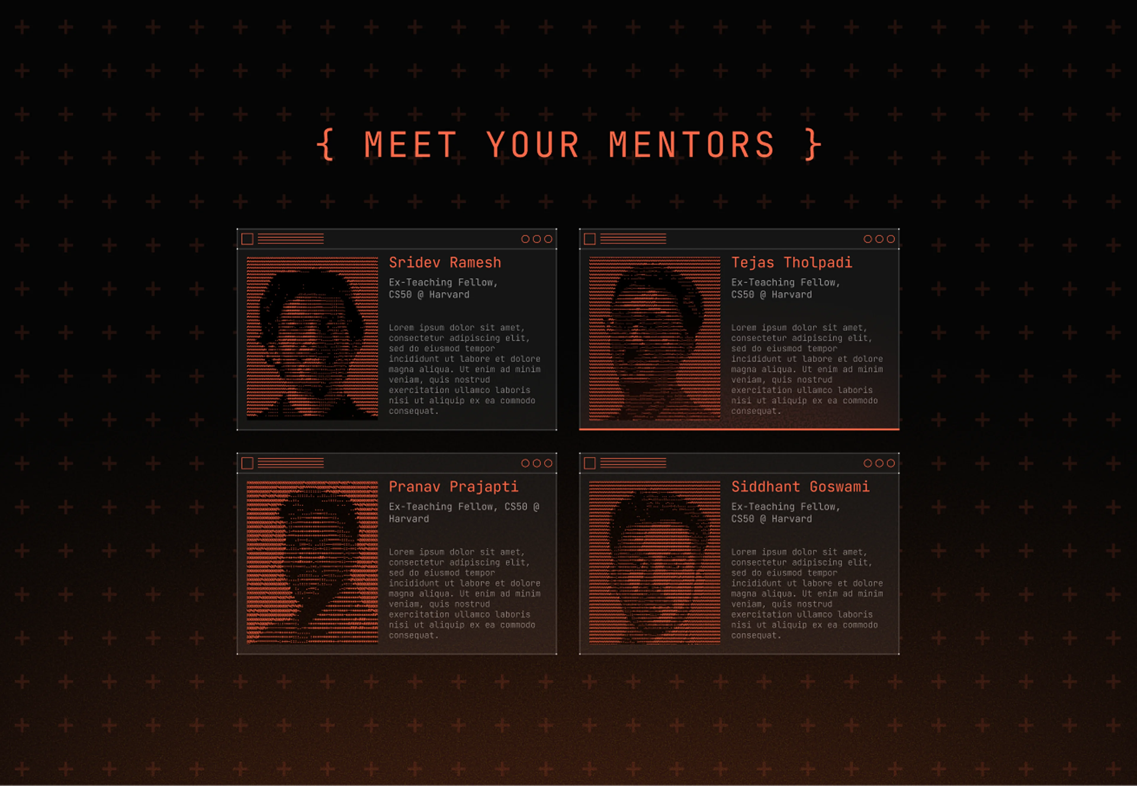
Brand workshop to align on personality, voice and visual ambition. Explored dark and light mode treatments, bold typography with unconventional typefaces and playful duck mascot applications. Created streetwear-coded merch concepts.
Website Design + Build
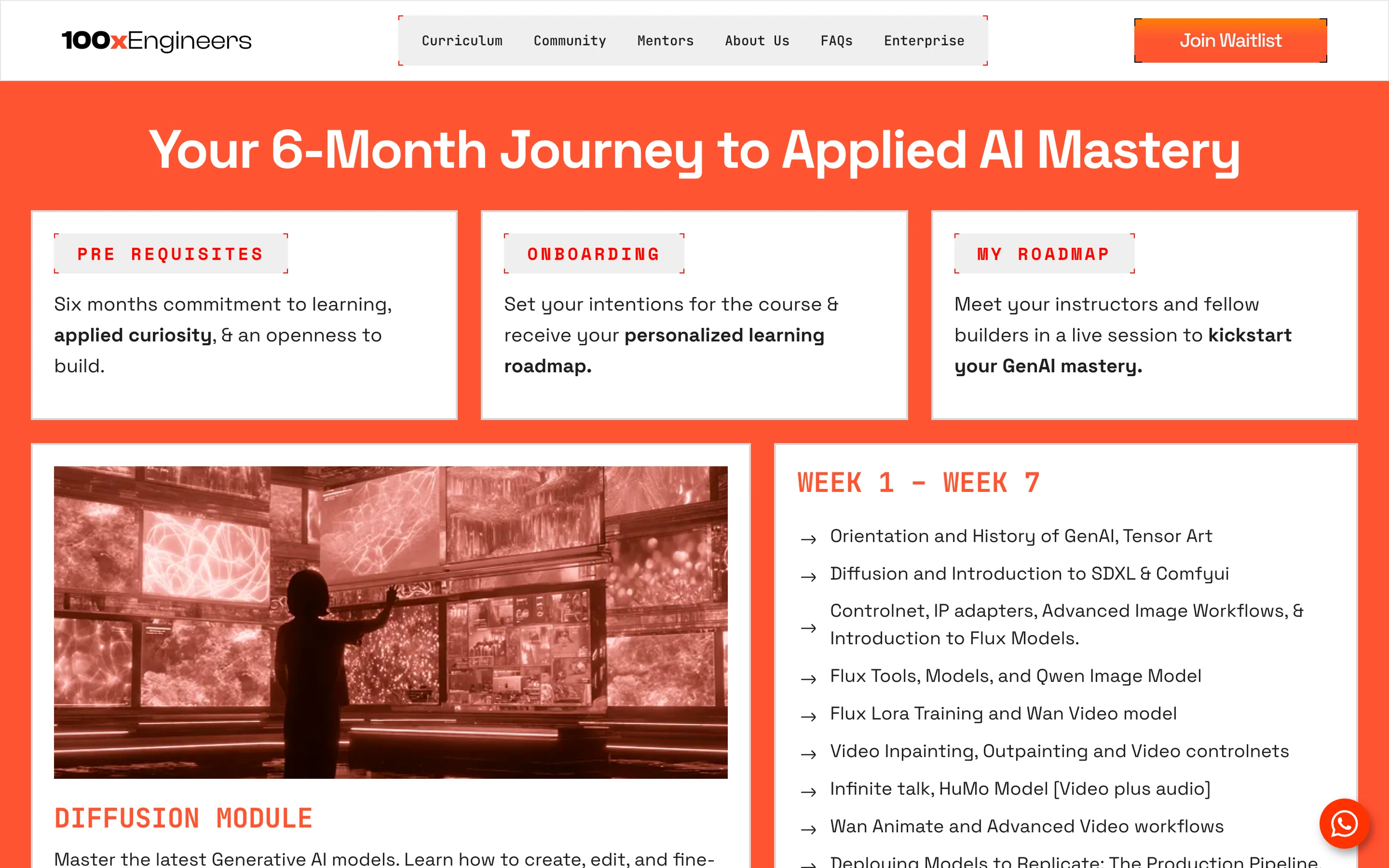
Designed and built the full site in Framer. Scroll-driven horizontal timeline that moves with the page rather than hijacking scroll. Optimized for performance while maintaining the rich animated feel.
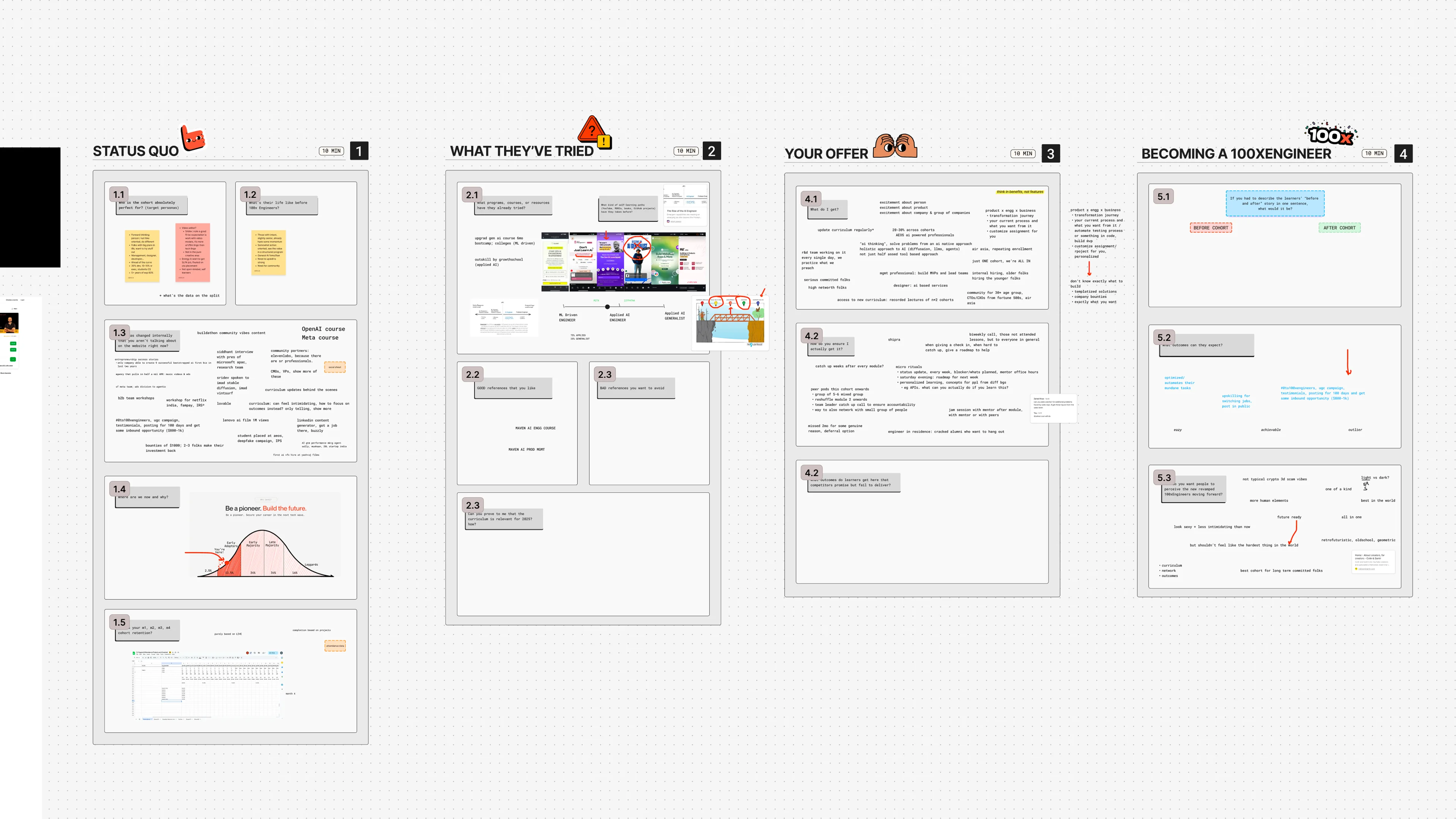
Brand Workshop
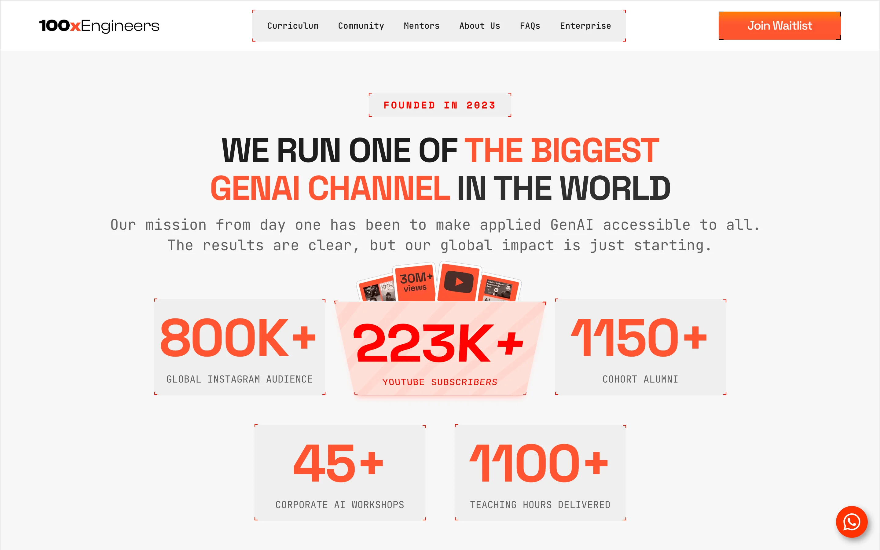
The core tension surfaced immediately: extraordinary traction internally (enterprise workshops, alumni-founded agencies, industry-first hires) but the brand was underselling all of it. The marketing head put it plainly: "We have incredible proof but look intimidating. Make us feel premium, human and outcome-driven."
Early Visual Direction
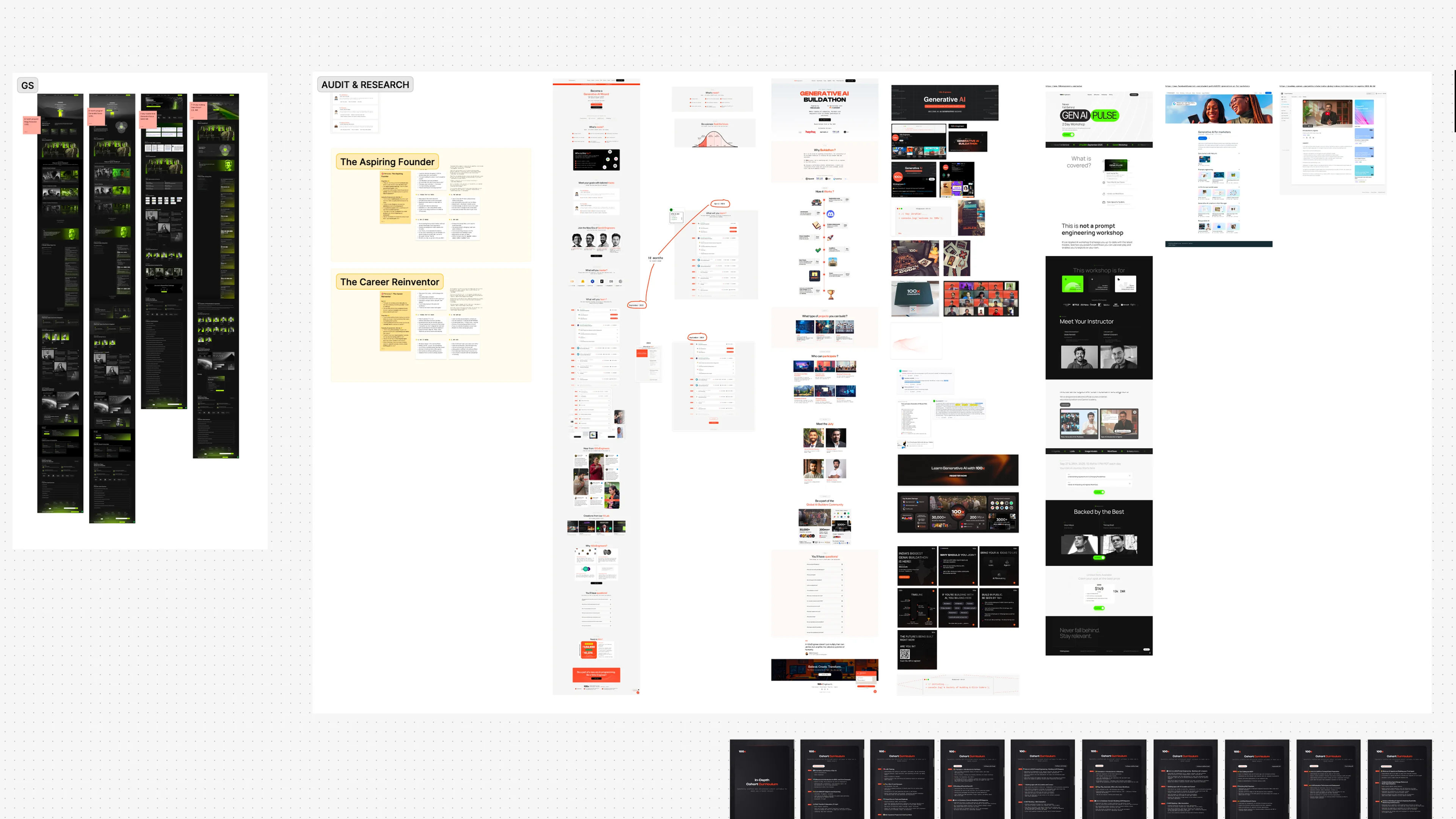
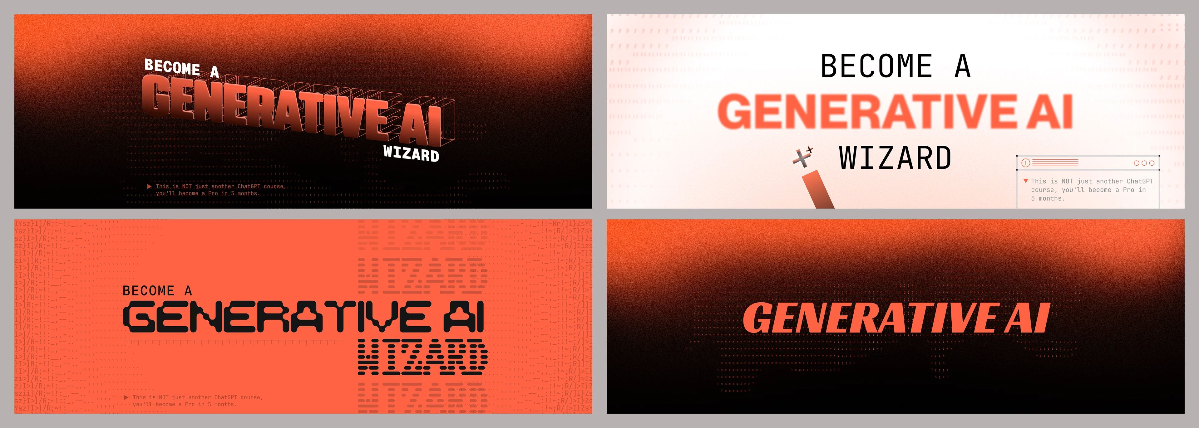
We audited 100x's brand alongside competitors across AI education. The existing dark-mode tech-heavy identity was blending into everything else on the market. We explored ASCII art, source code aesthetics and generative visuals as potential directions. Moodboards spanned web, graphics and merch to validate that an ASCII-driven system could scale across all three.
Figma Iterations
Early hero explorations tested the "Generative AI Wizard" positioning across dark and light treatments. ASCII art became the anchor, rendered in source code characters as both subtle background texture and bold hero art. Typography shifted between refined serifs and raw monospaced type, testing how far the technical aesthetic could push before losing warmth.
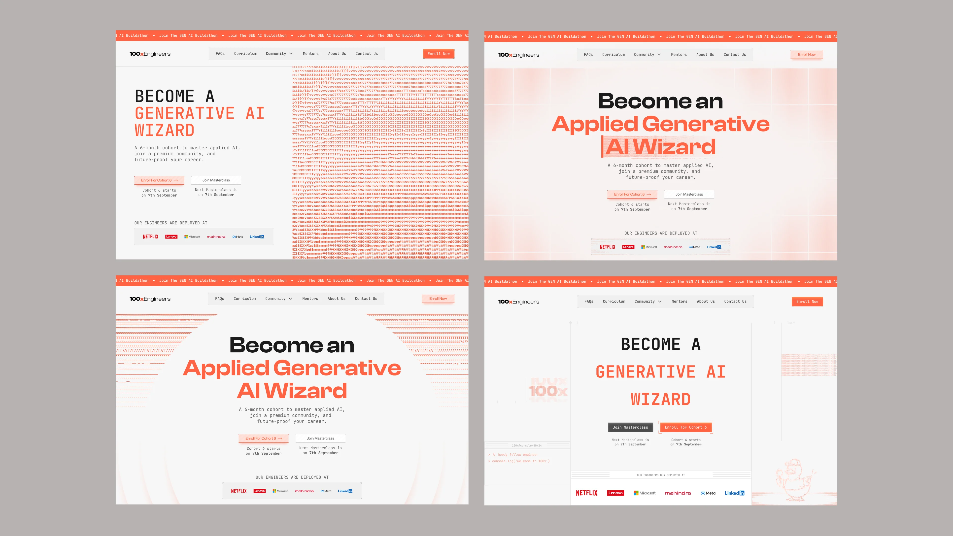
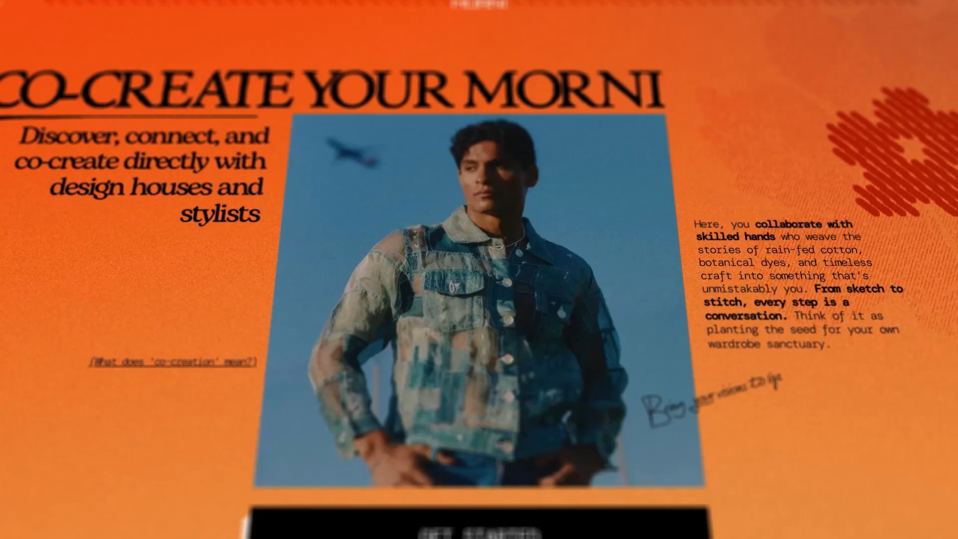
The Website
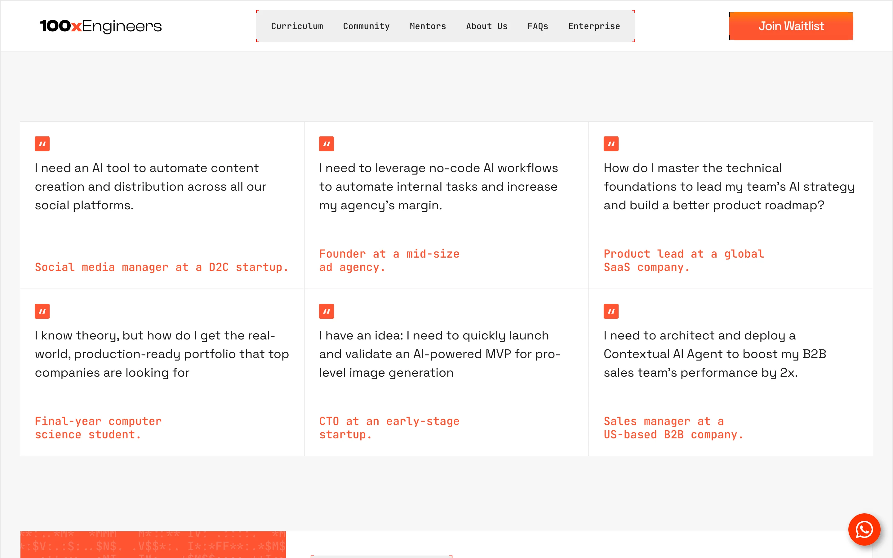
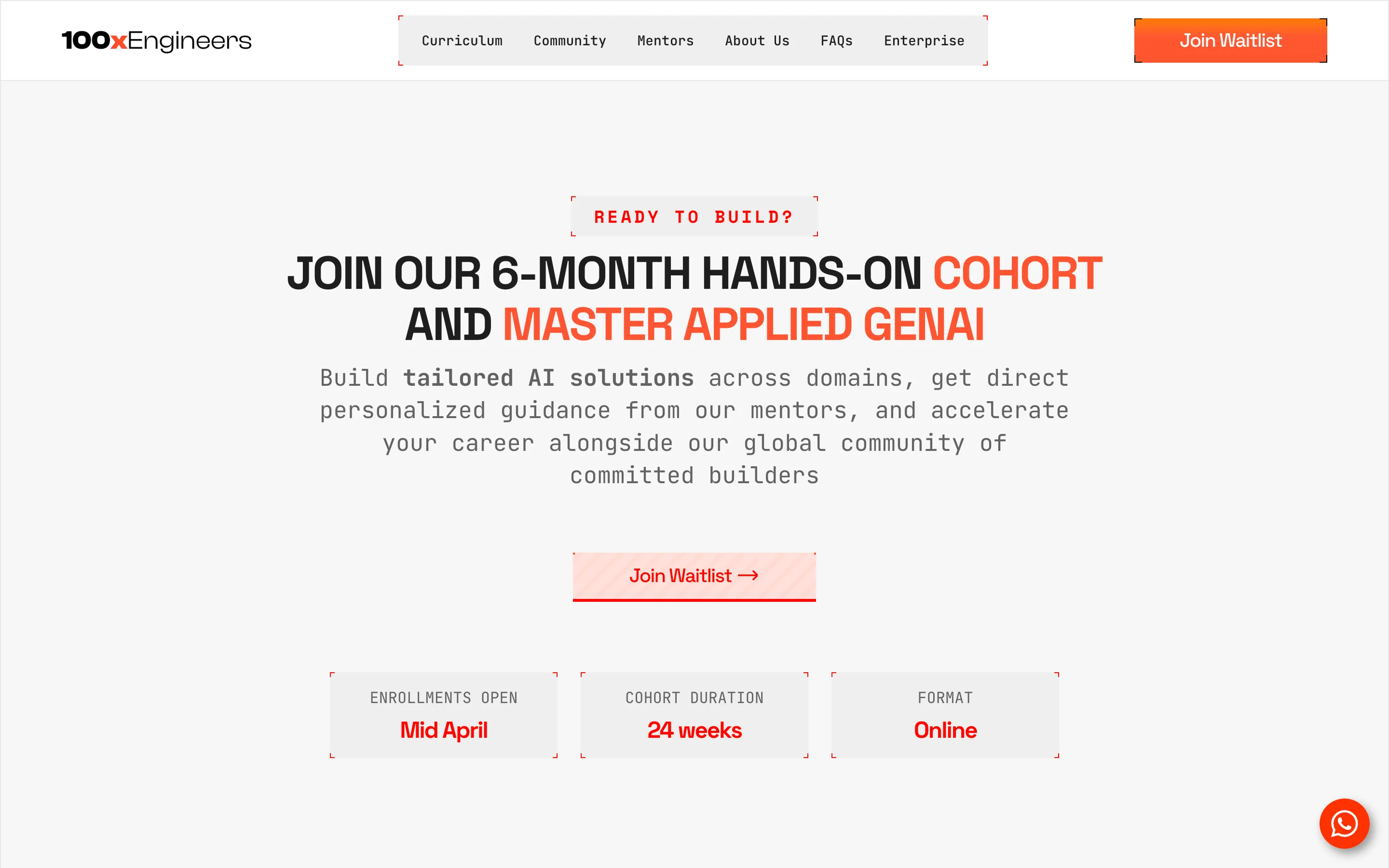
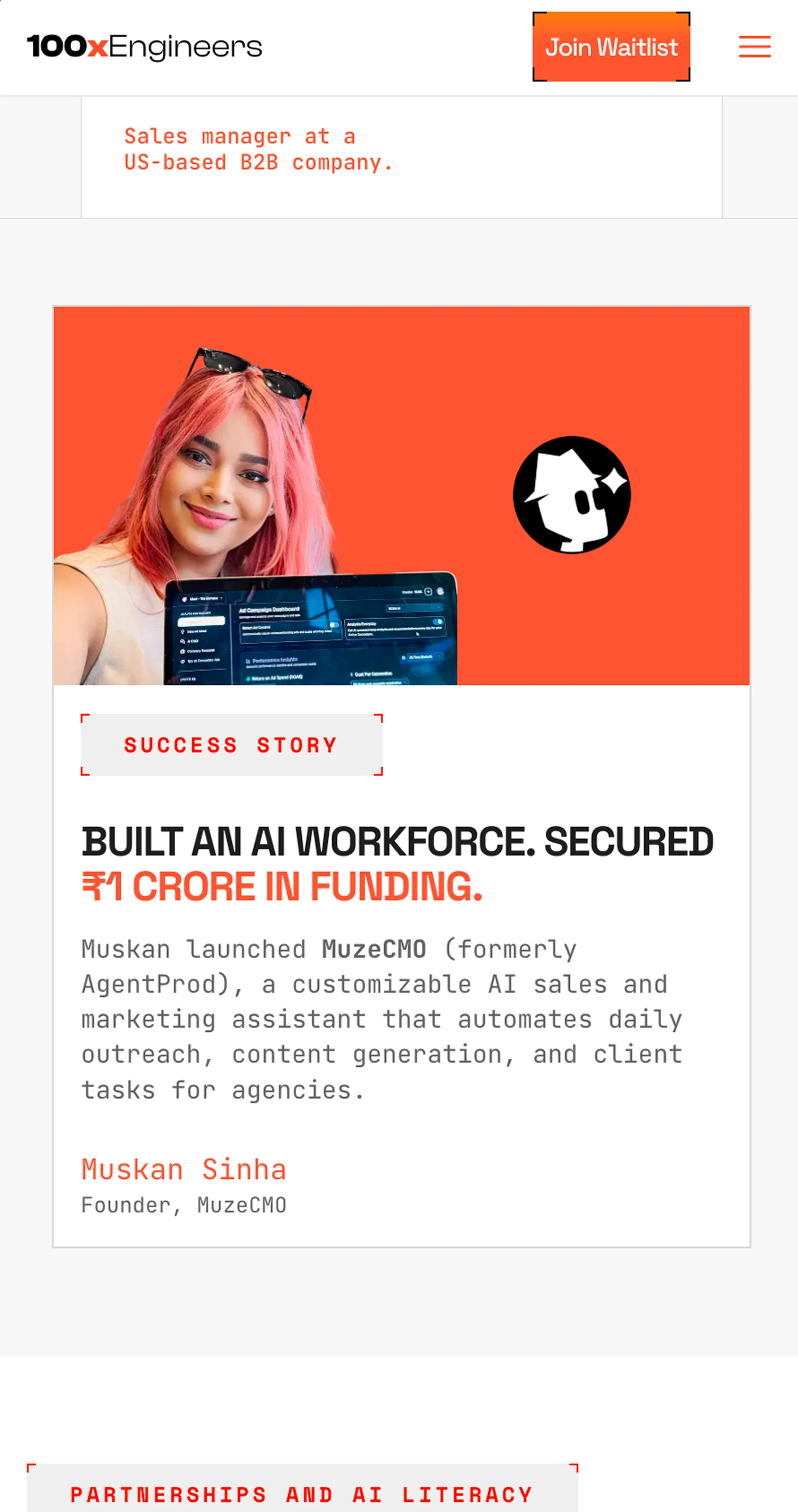
A fully redesigned site with new visual language across the system. Restructured around messaging and tone to lead with outcomes over curriculum. Shaped around how the brand should feel, not just how it should look.