Potpie
A developer-first AI brand built from the ground up
The Challenge
Potpie had a powerful AI engineering platform but no brand. The website undersold the product. They needed an identity that could stand in front of enterprise procurement teams and individual developers at the same time.
The Solution
Starting with a brand workshop, we uncovered the core metaphor: like the dish, Potpie offers comforting reliability with layers of depth beneath a simple surface. We translated this into a complete identity, design system and website built in Framer.
Brand Workshop + Identity
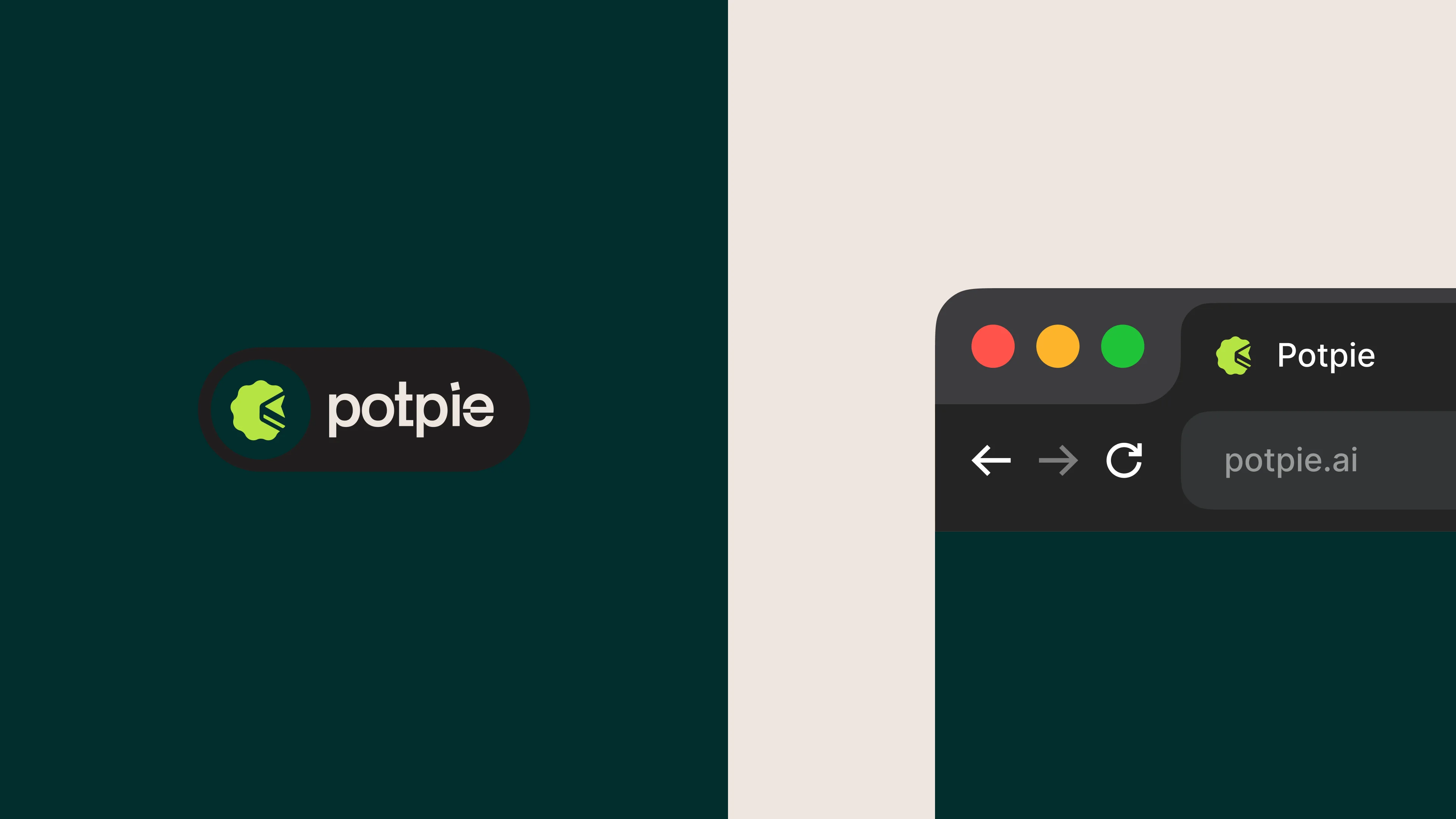
Ran a structured brand alignment workshop with the founders. Developed the logo, a cursor within a pie slice that doubles as a greater-than-or-equal-to symbol. Established the mathematical visual language inspired by generative art.
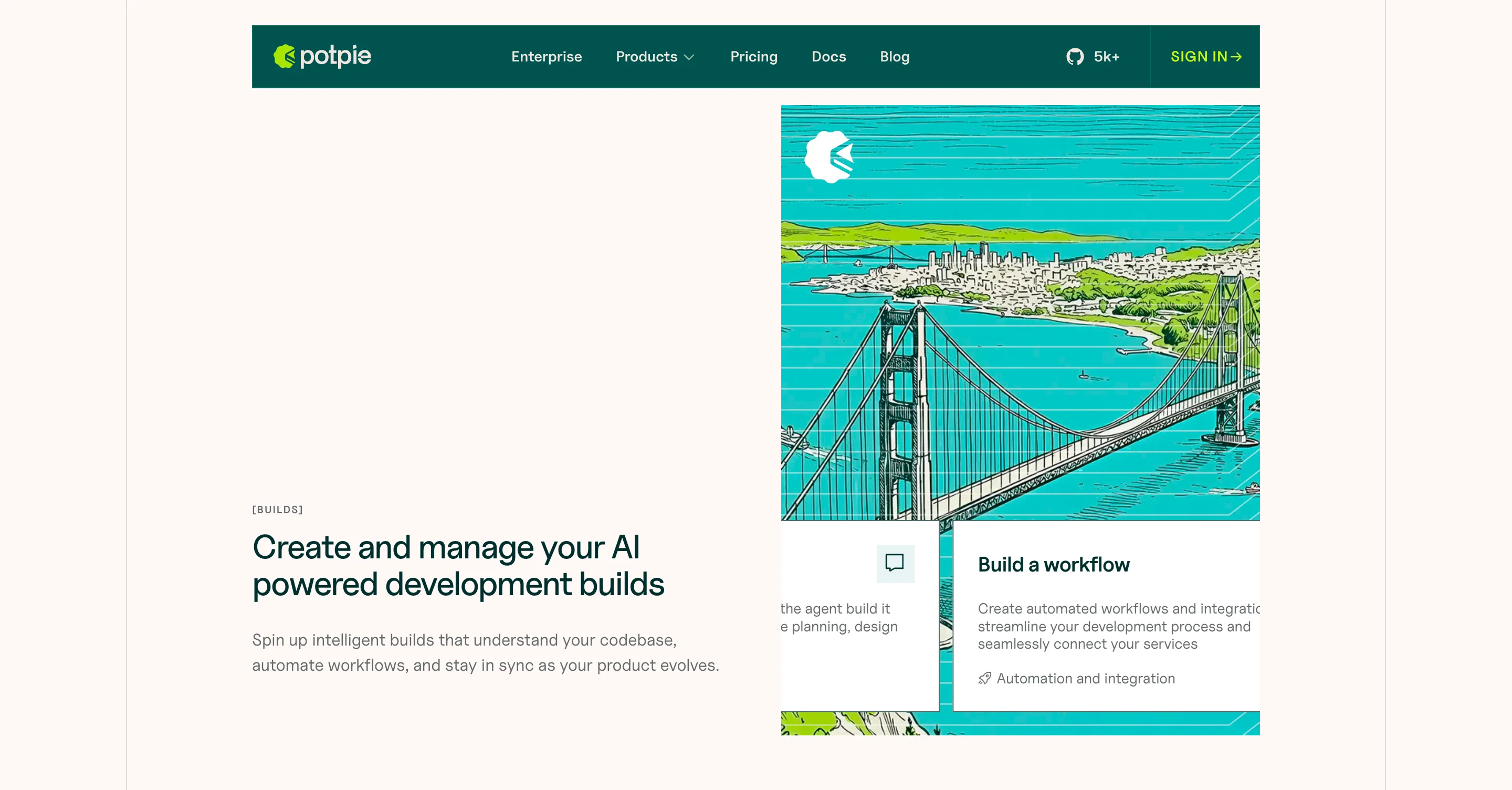
Website Design + Build
Designed the full website in Figma with the dark-teal and coral accent system. Built and launched natively in Framer with scroll interactions, CMS blog and reusable section kit. The full-team reveal earned spontaneous applause.
Launch
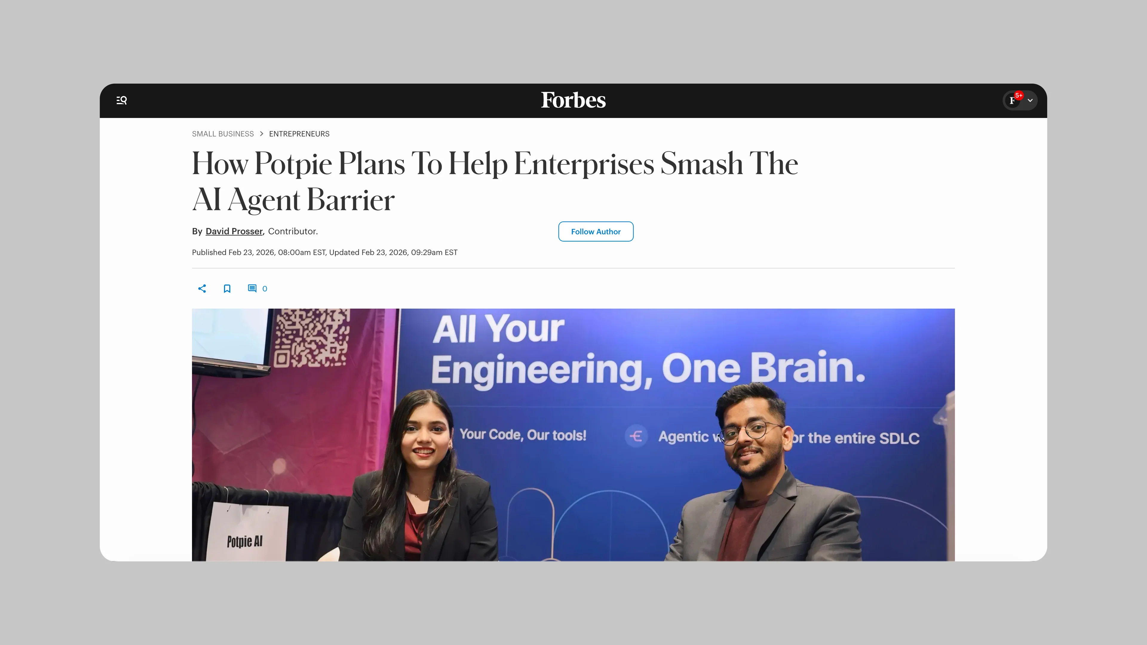
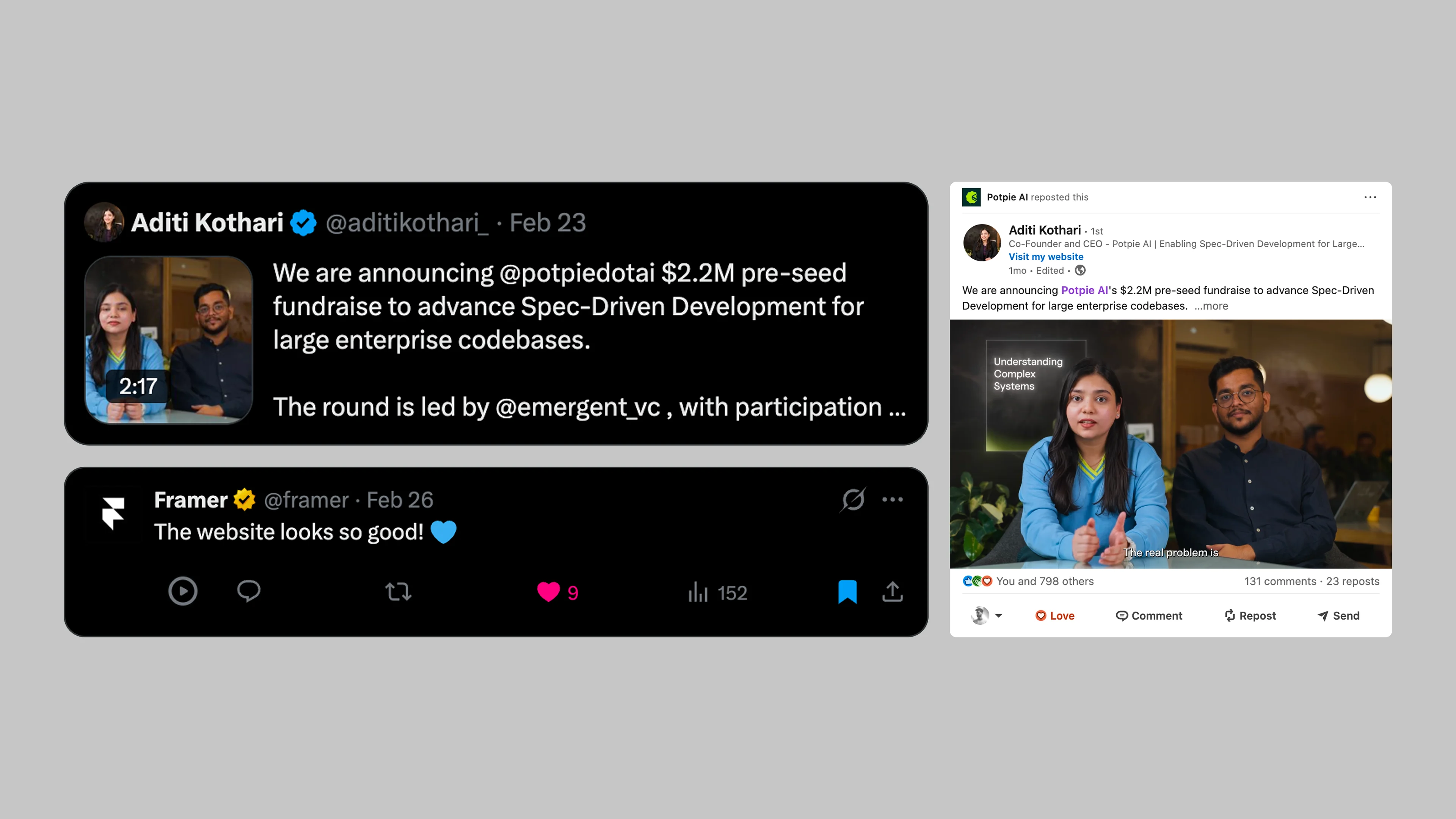
Timed the brand and website launch with Potpie's fundraise announcement. Forbes covered the fundraise. Framer featured the site. The design system scaled immediately into feature pages, use case templates and enterprise pages.
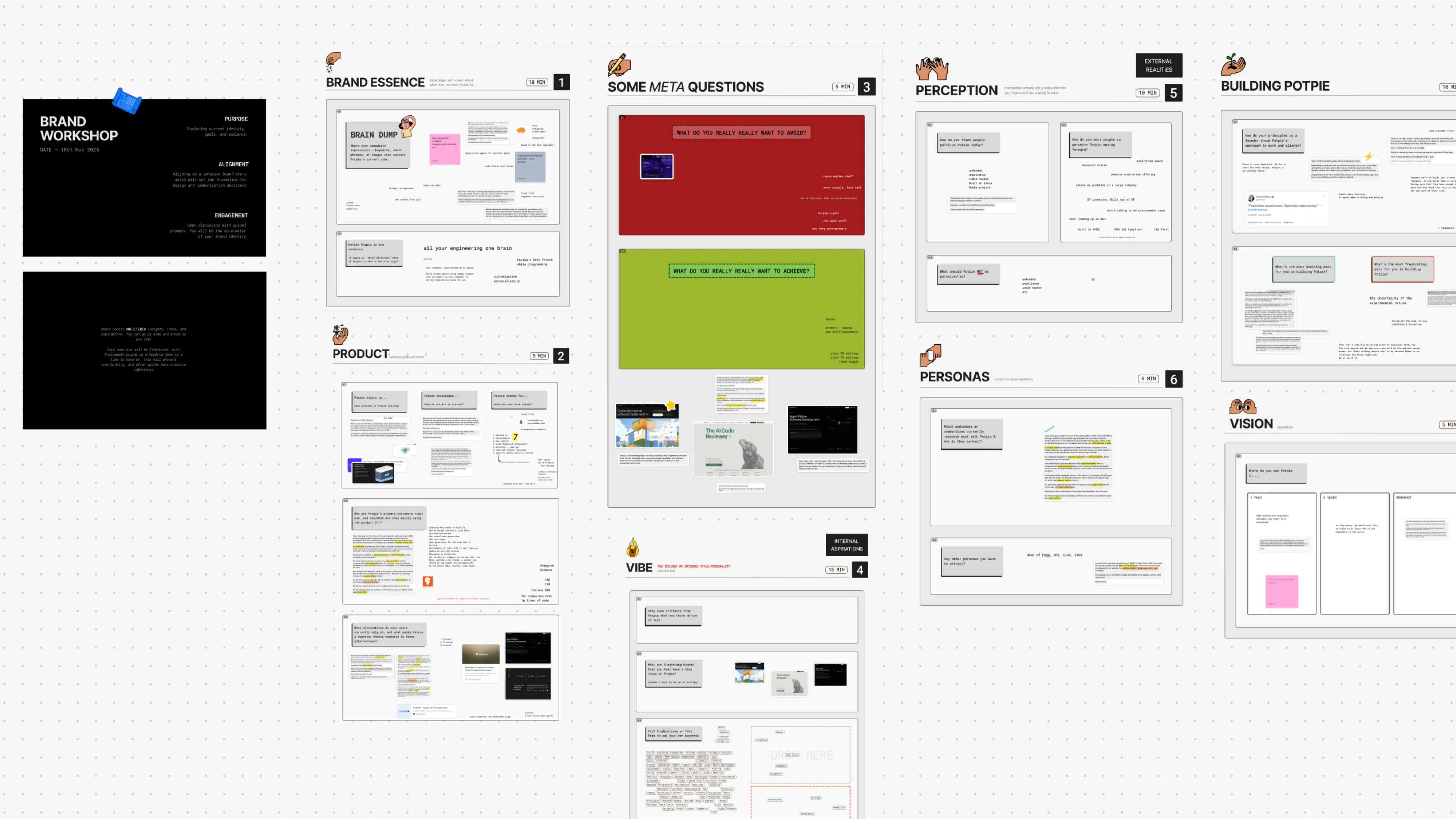
Brand Workshop
We run a brand alignment workshop before any design work starts. It's a framework we built in-house: tailored questions that dig into brand essence, positioning, audience and perception gaps.
With Potpie, the founders were honest about where they stood: "Unfunded small company, indie hacker project, unpolished. But good work." They wanted to be seen as a premium enterprise offering worth putting in front of a procurement team. By the end of the session we had a clear picture of not just how the brand should look, but how it should feel.
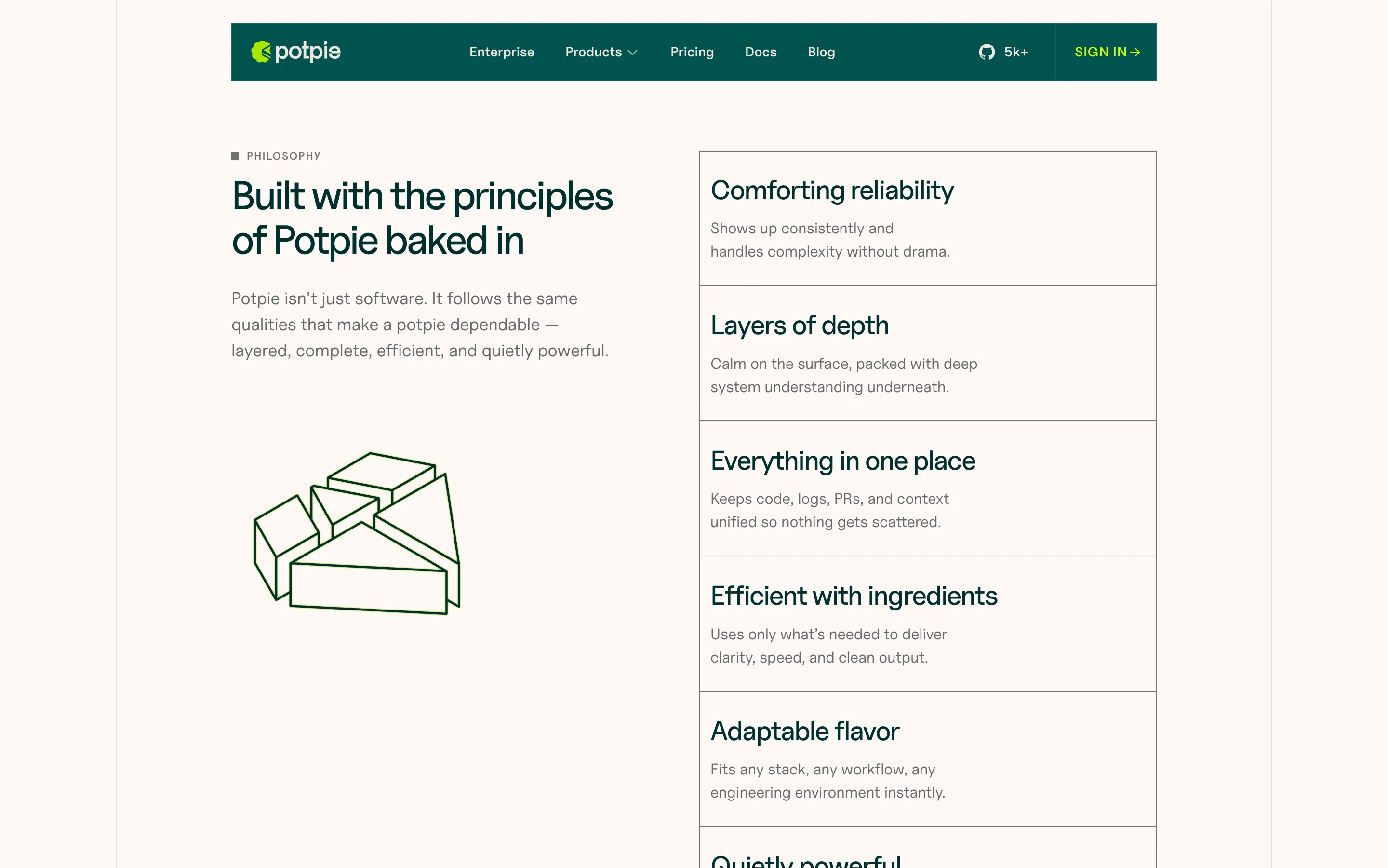
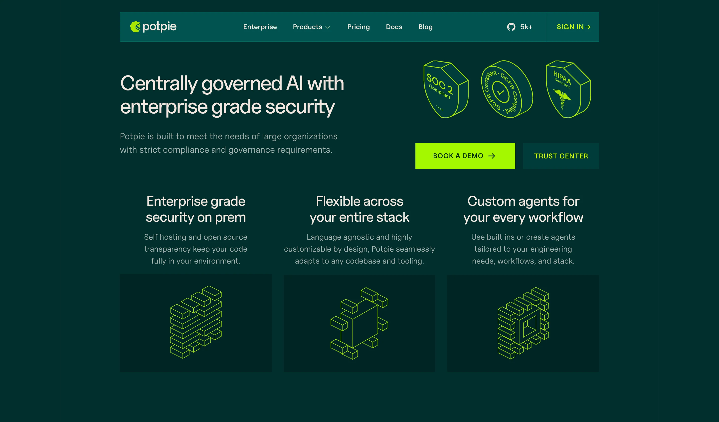
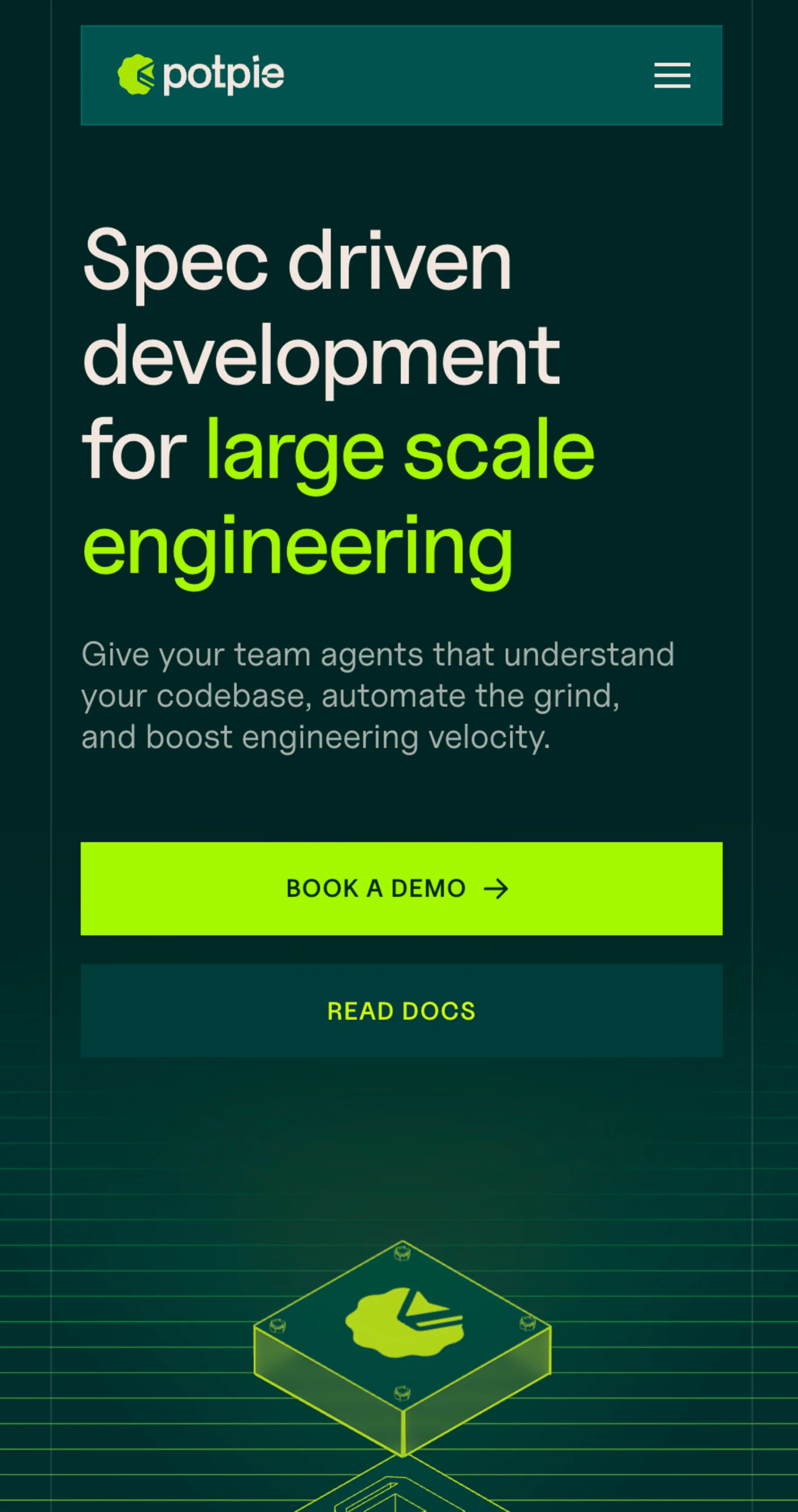
Potpie's Identity
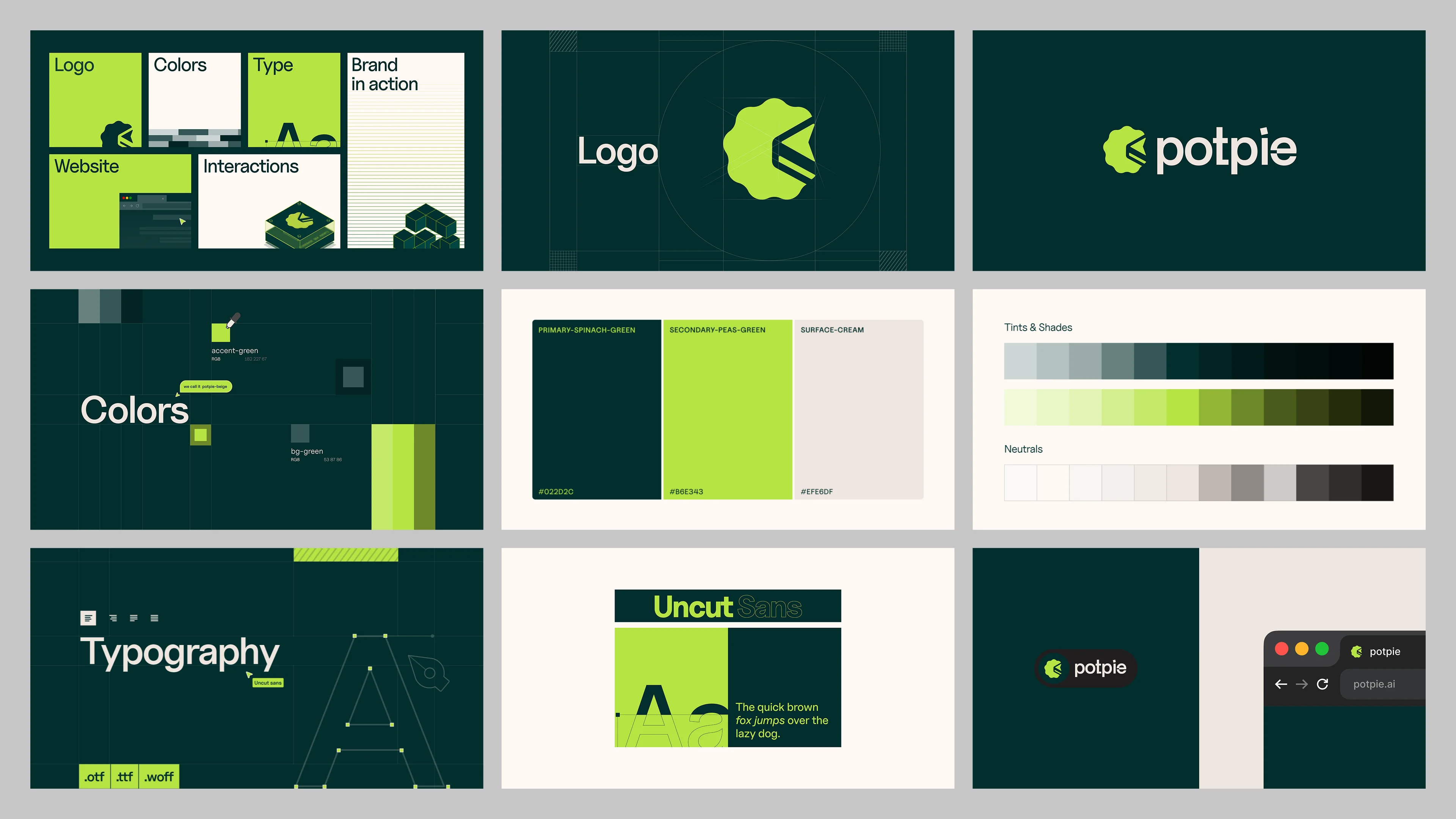
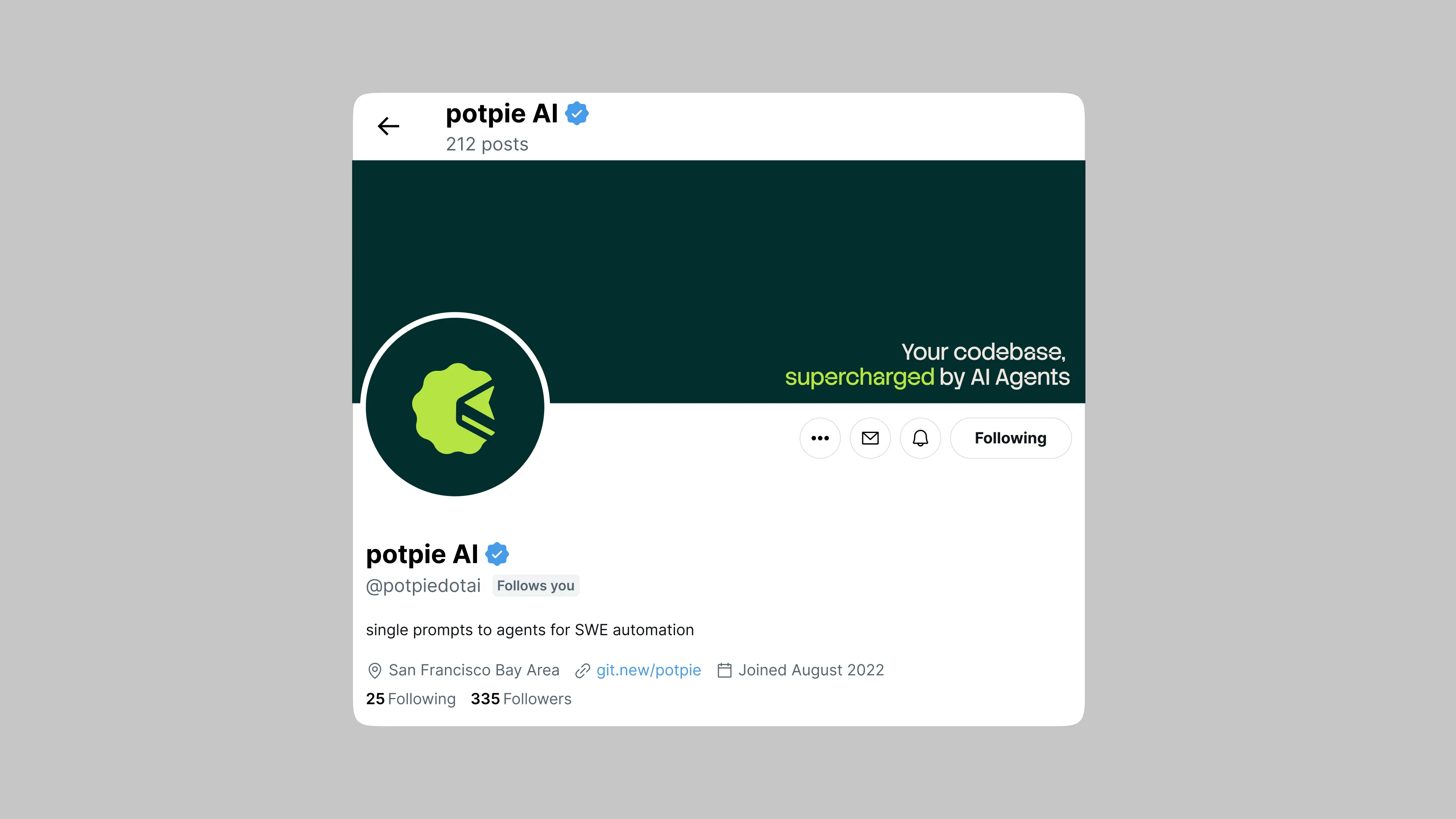
We explored three directions over two weeks and narrowed to one. The logo is the top view of a potpie that also reads as a greater-than-or-equal-to symbol, with a cursor formed in the negative space. Three meanings in one mark. The color palette came from the dish itself: spinach green, peas green, cream. Warm and grounded while still reading as technical.

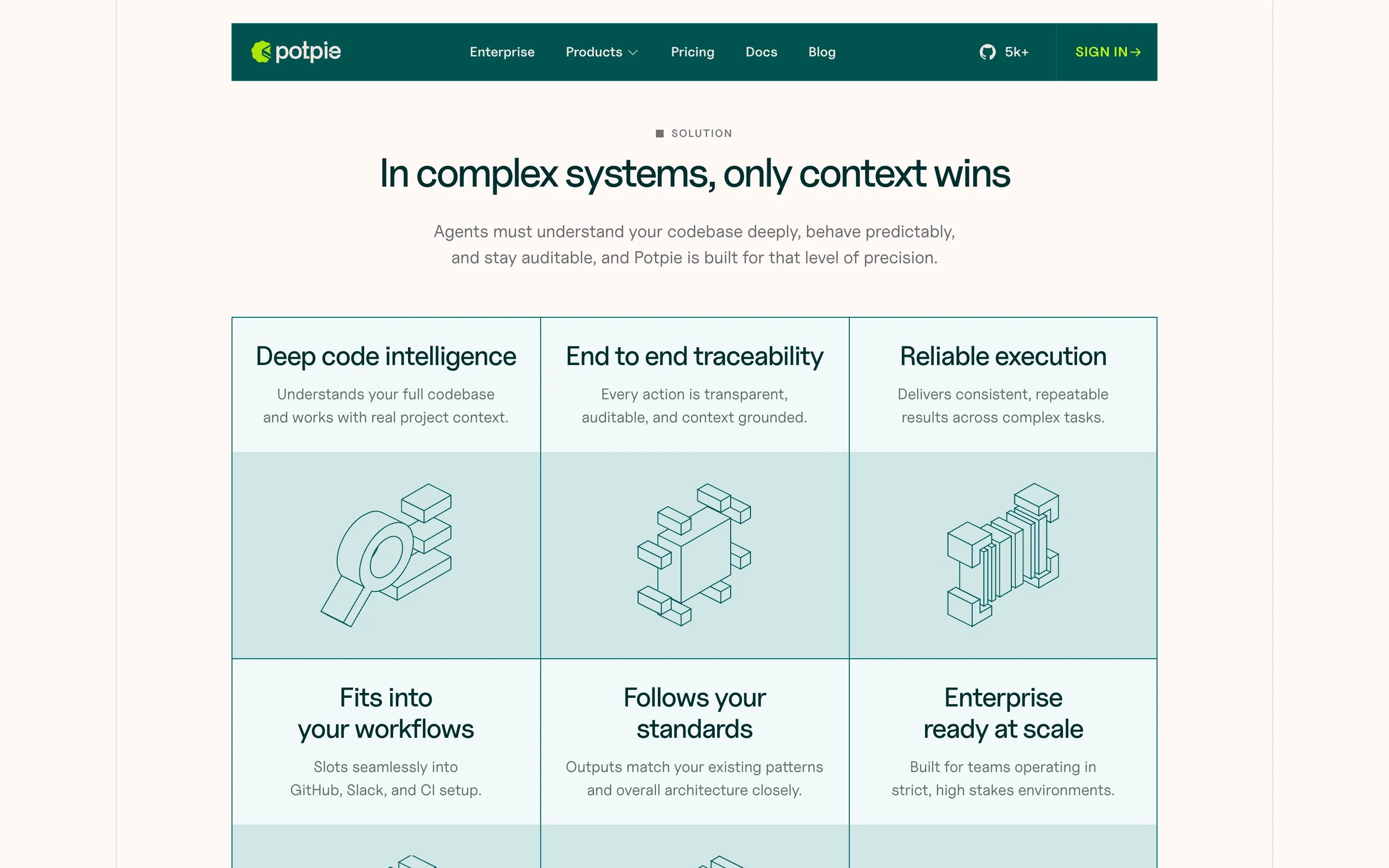
Design System
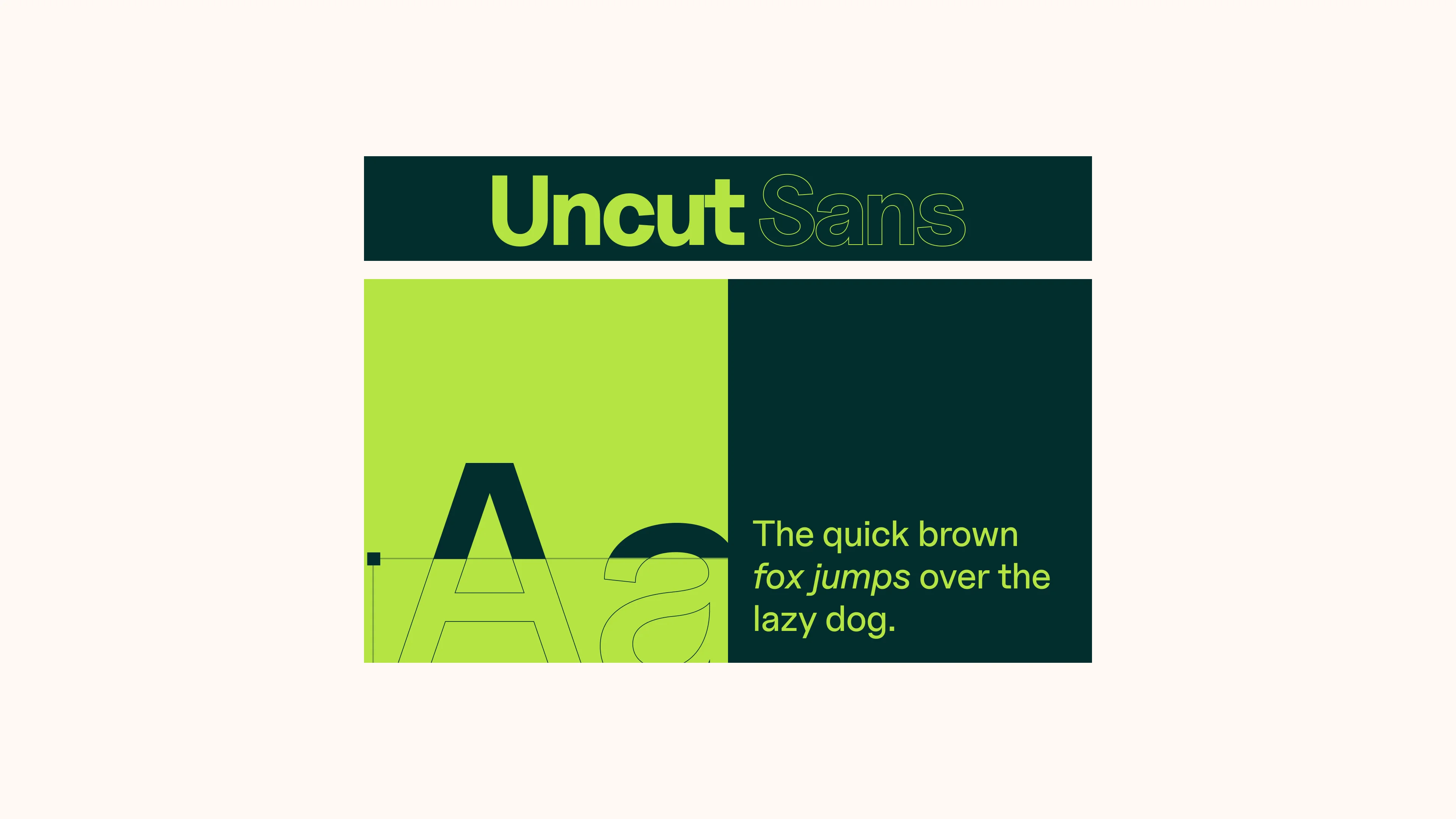
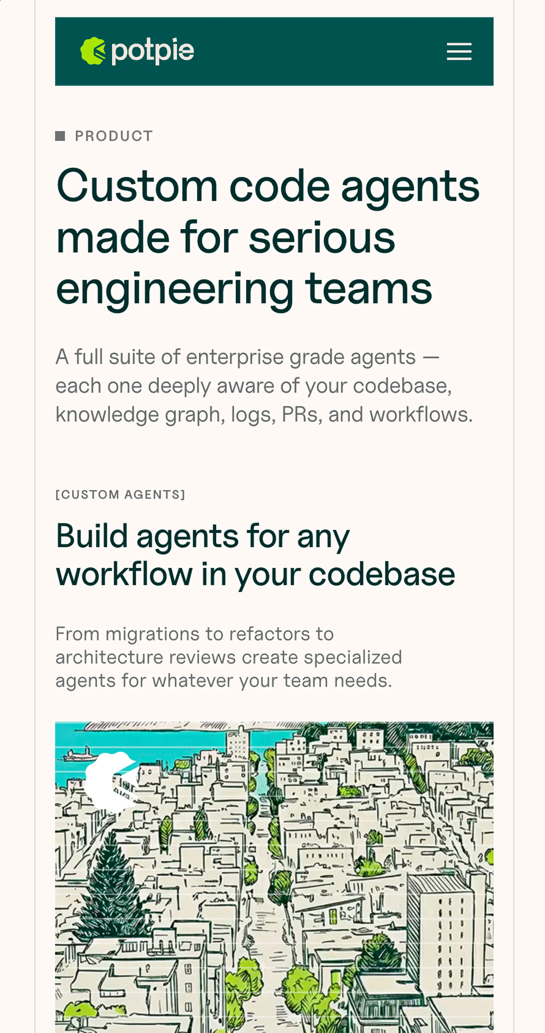
Spinach green as the primary, peas green as the secondary, cream as the surface. Warm enough to feel approachable, sharp enough to feel technical. Uncut Sans as the typeface. Clean enough for UI, sharp enough for headlines.
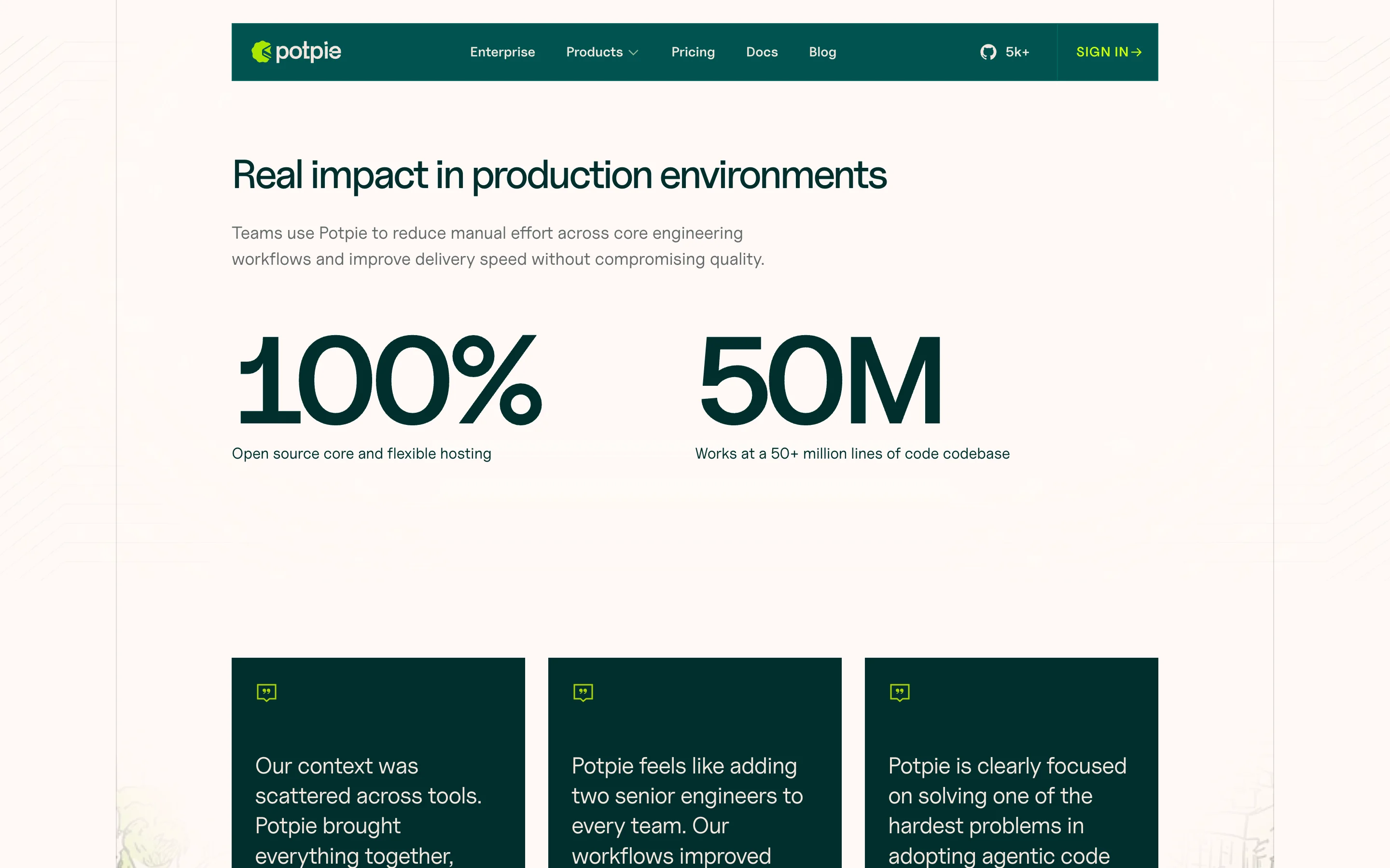
Every element was built as a reusable component. Cards, sections, CTAs, illustration frames. Things that could snap together into new pages without losing the thread. The system had to work for a homepage, product pages, enterprise pricing, a blog and whatever came next.
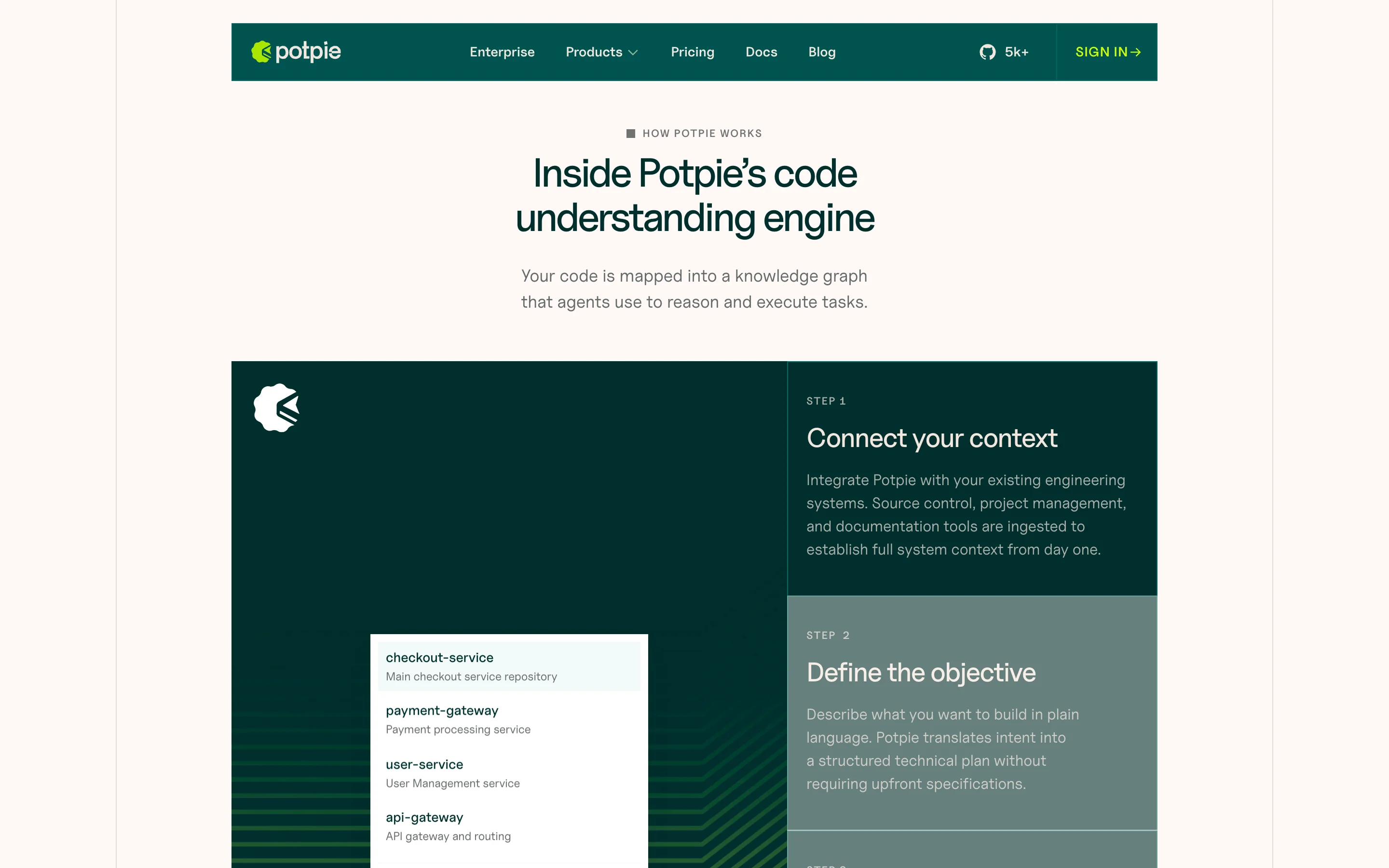
Figma Iterations
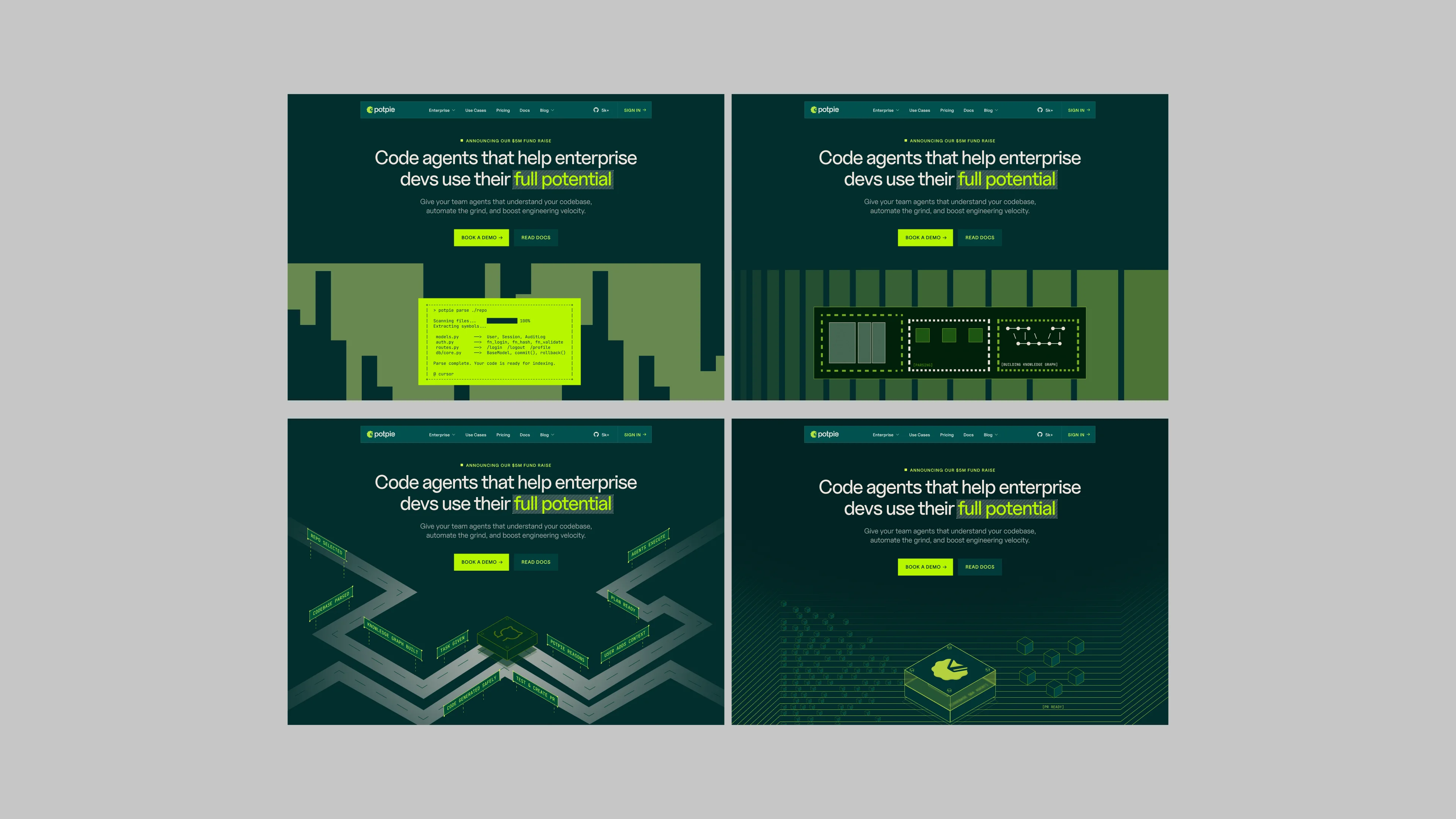
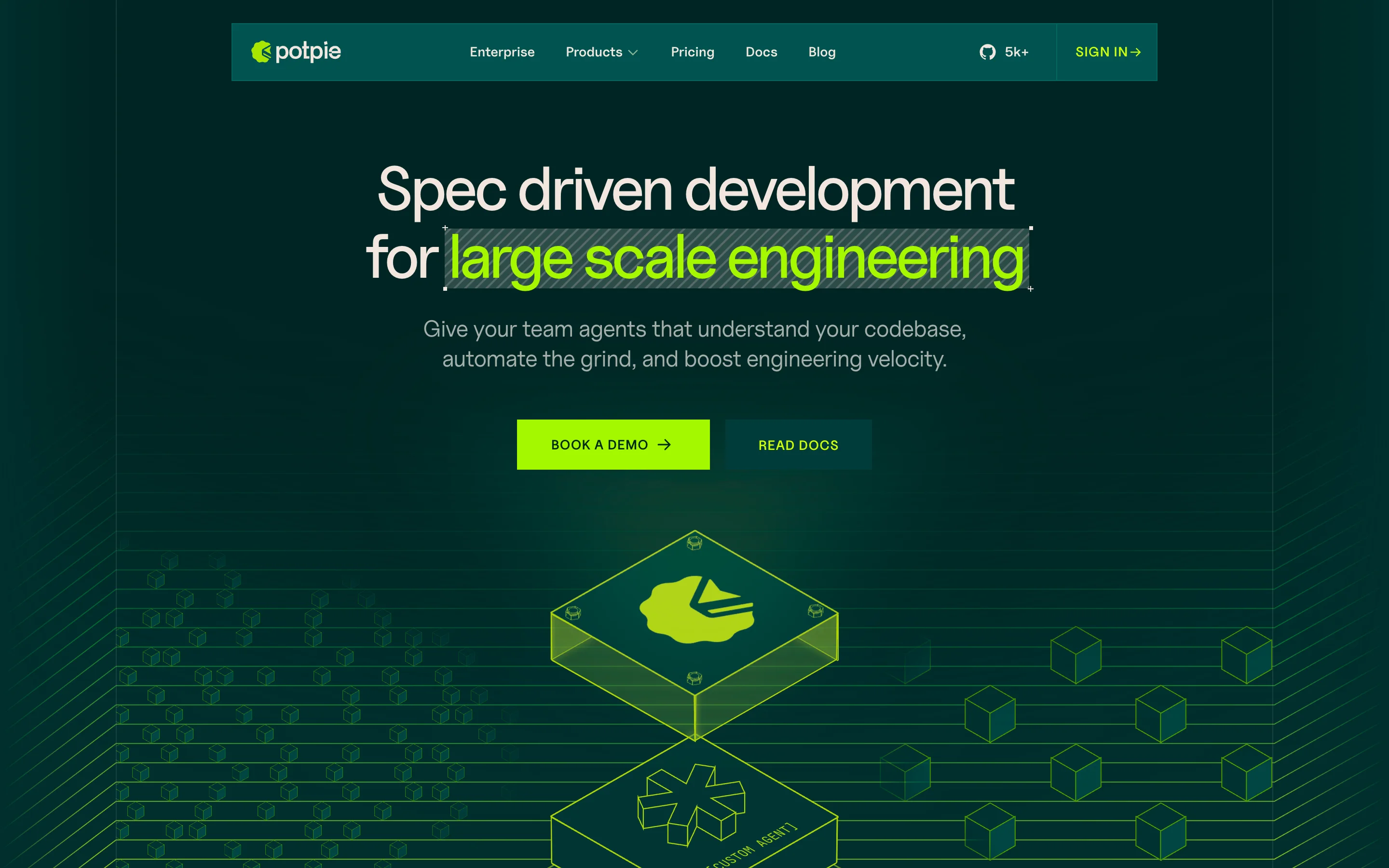
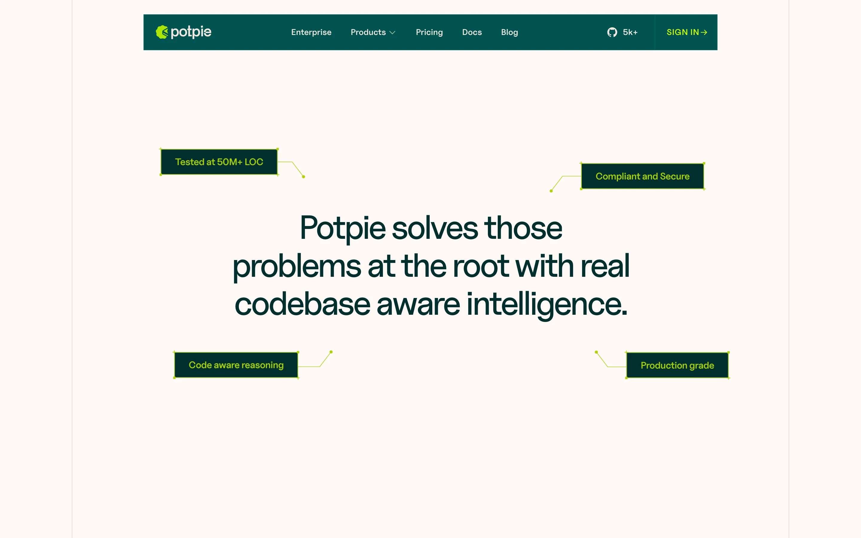
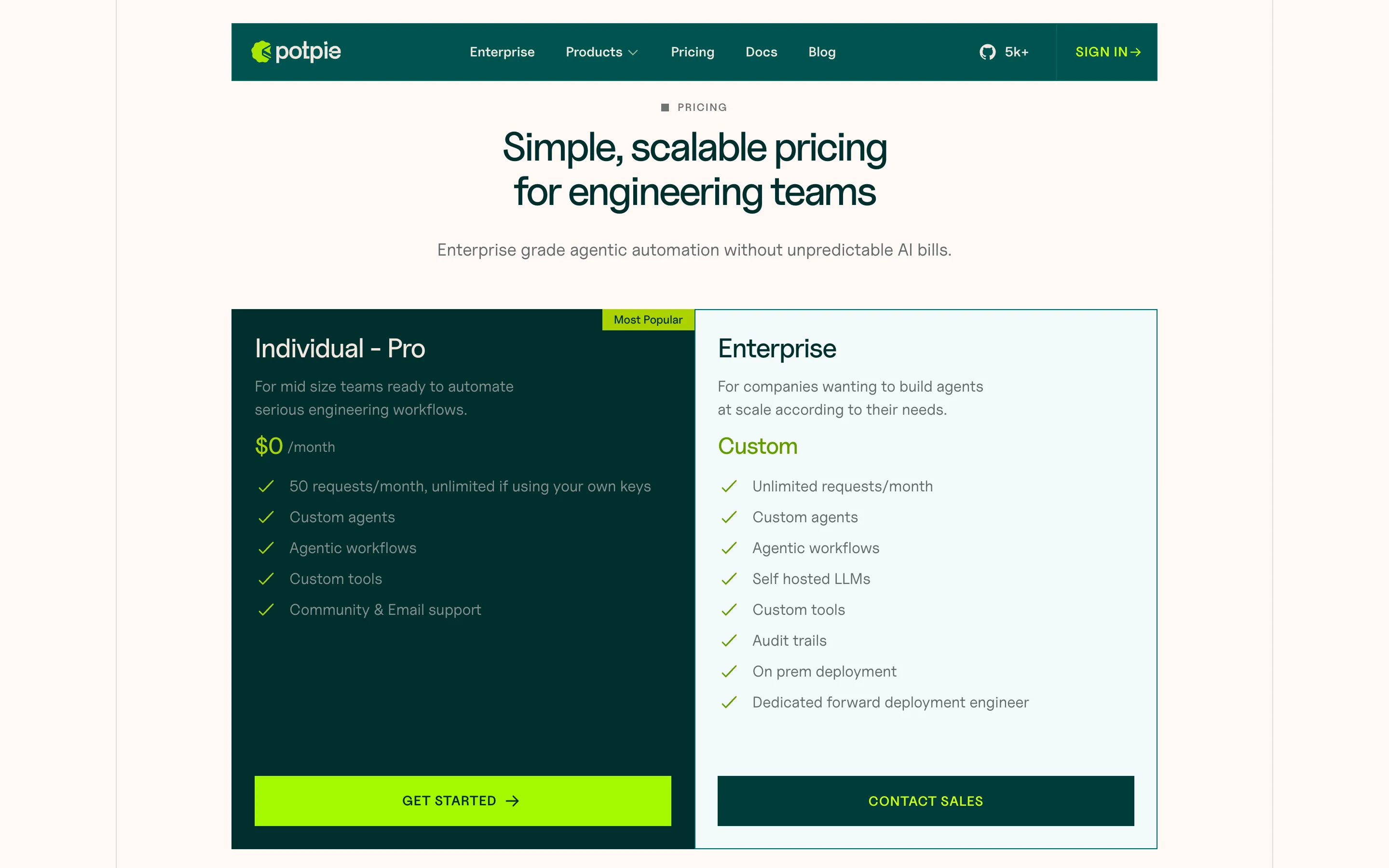
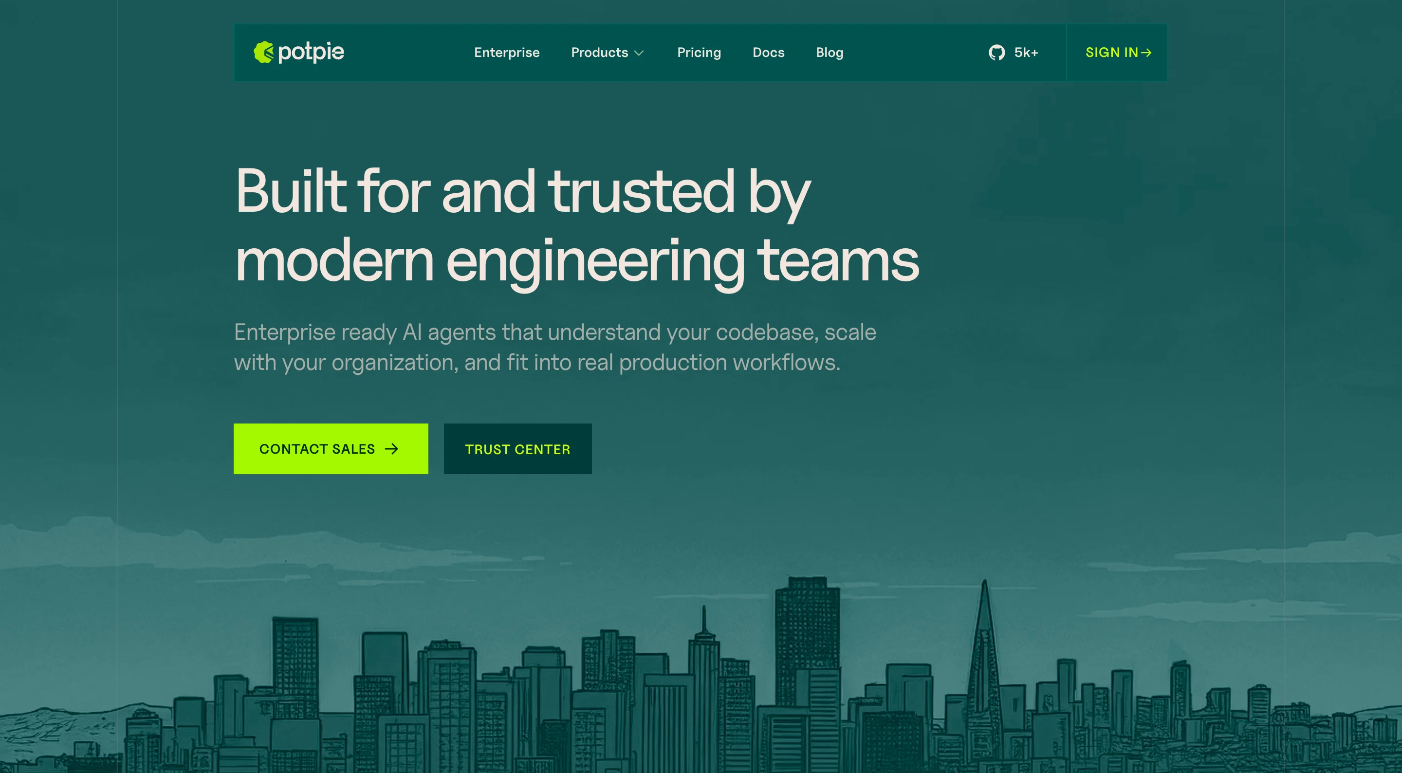
We started with wireframes in Figma and moved into high-fidelity designs across homepage, product pages, enterprise pricing, blog and sign-up. Each page had its own layout and interaction pattern tailored to what that section of the site needed to do.
The site had to work for enterprise buyers and individual developers at the same time. Clear enough to explain a technical product, polished enough to close a deal. The hero section alone went through several rounds before anything moved into development.
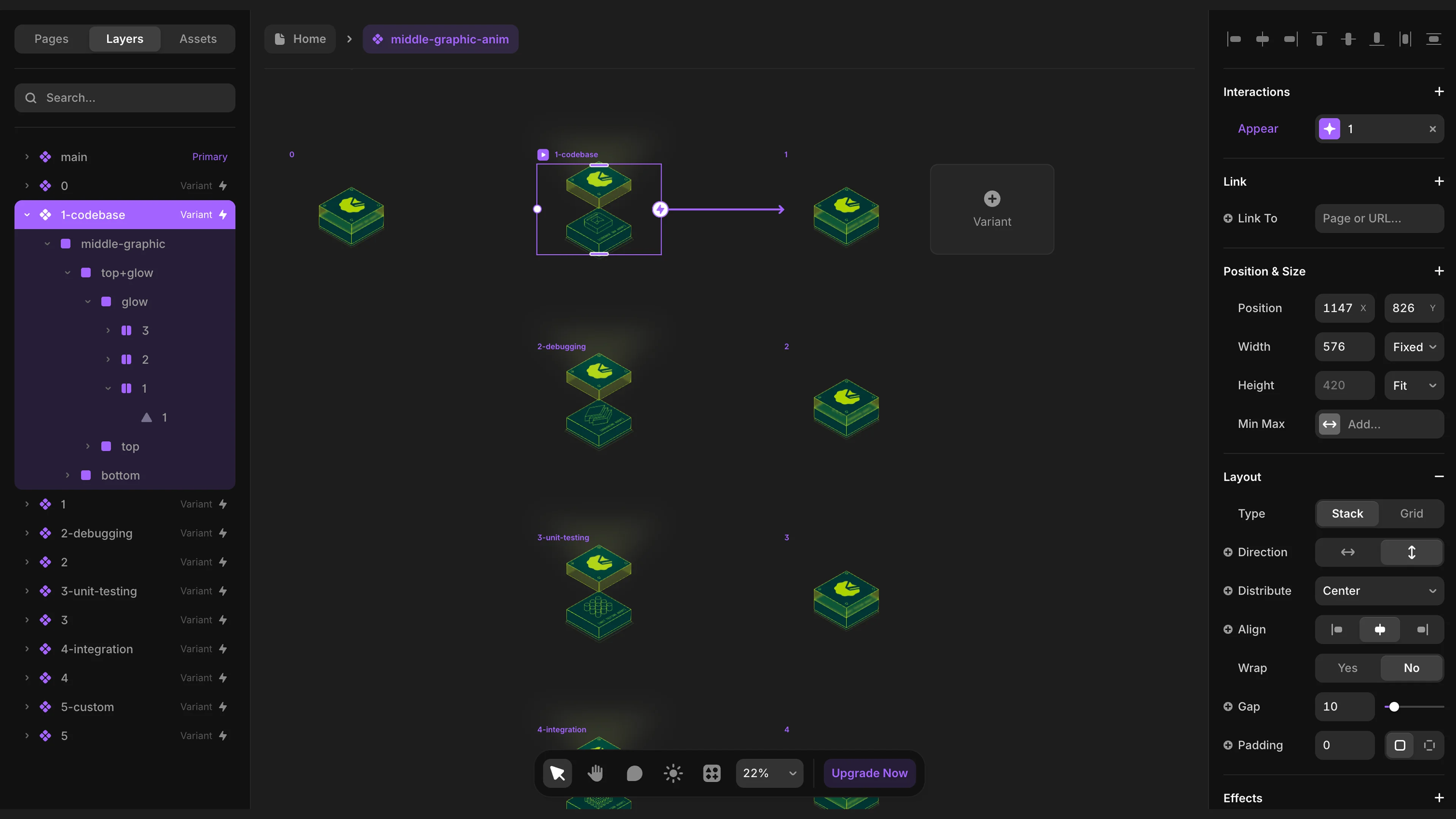
Framer Development
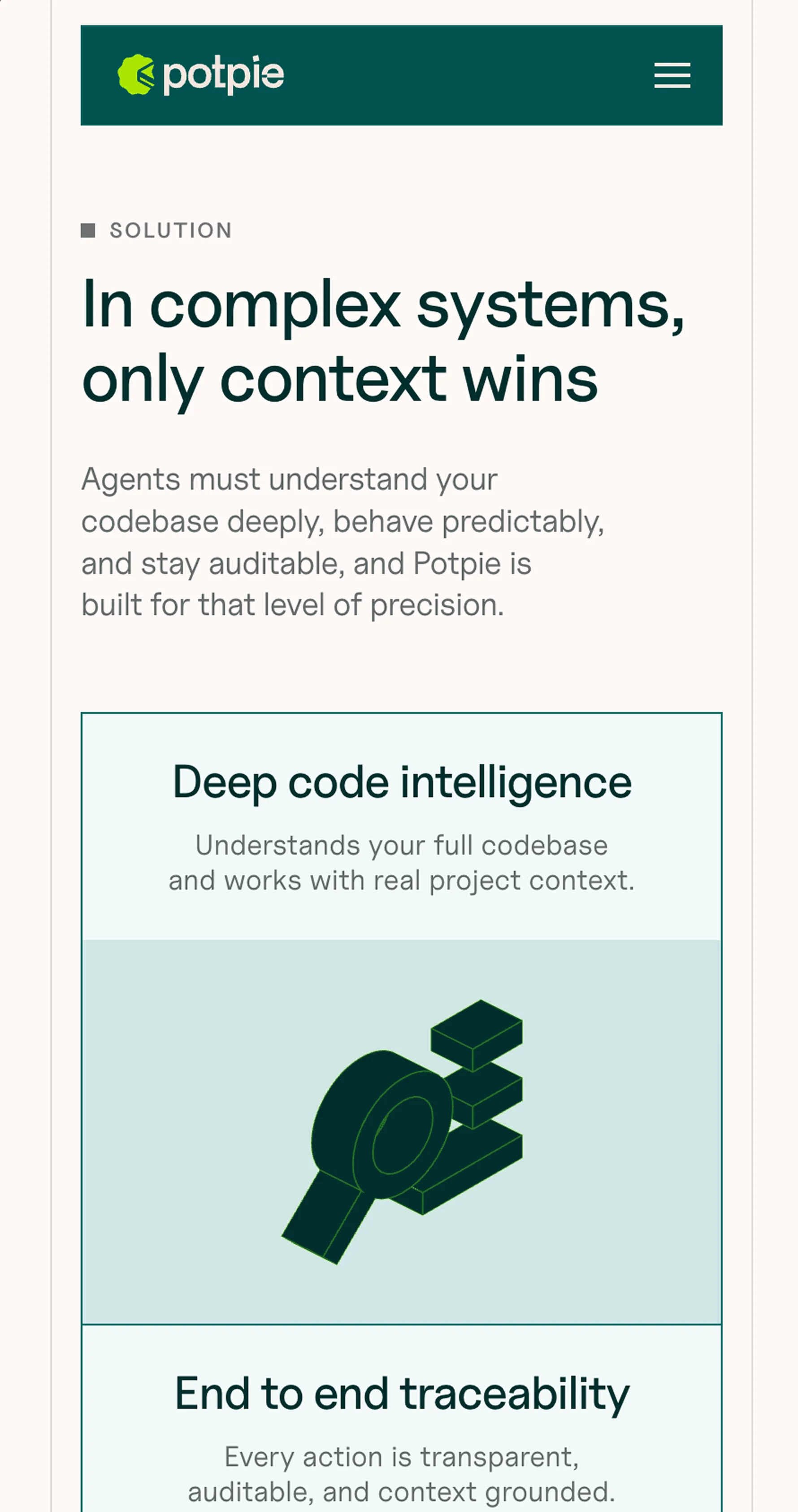
Everything built natively in Framer. No external libraries, no imported scripts. The hero animation runs entirely on Frames and vectors. Agent emblems, scramble text, packet animations, scroll interactions.
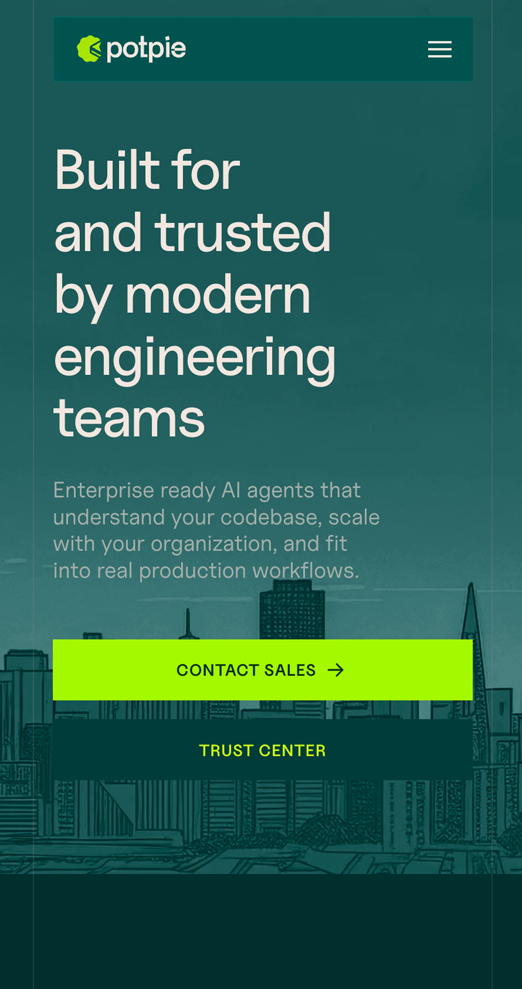
The enterprise page uses Framer's native forms. The blog runs on Framer CMS with auto-generated table of contents. We also built a UI kit of reusable sections so the client can create new pages without needing a developer.
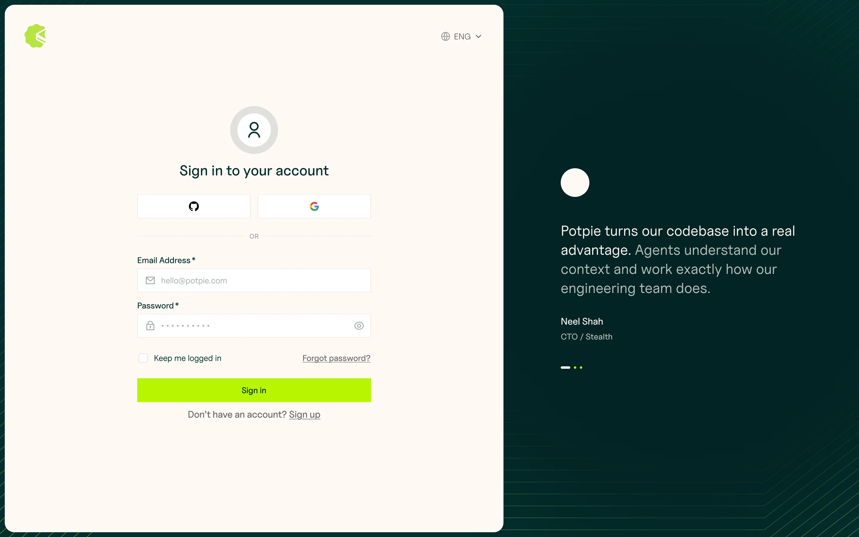
The Website
"Guys we showed the website to our team and everyone literally clapped. Wish I would have recorded that for you to see! But amazing work." The client presented the site to their engineering team before launch. This was the message we got right after.
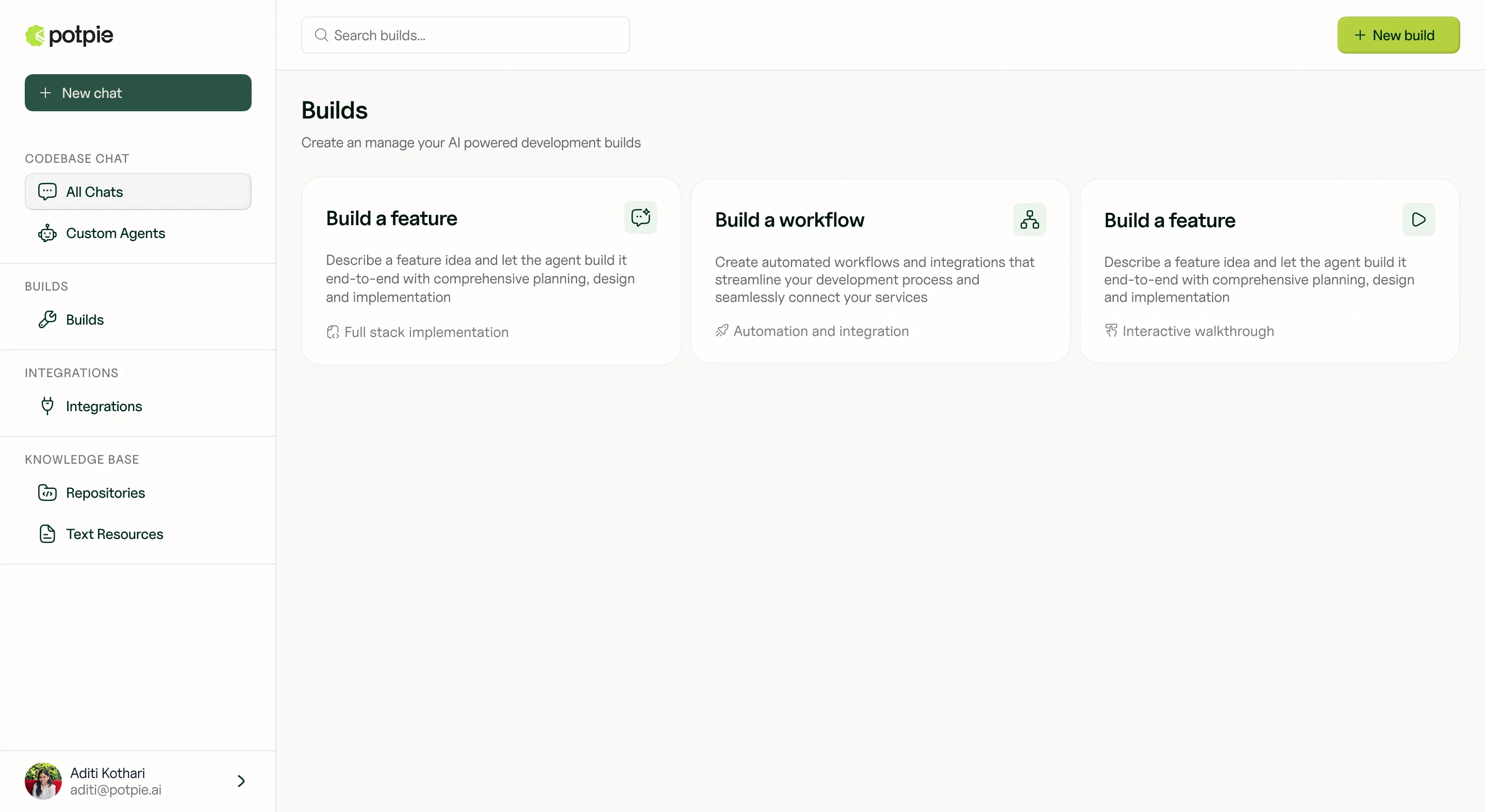
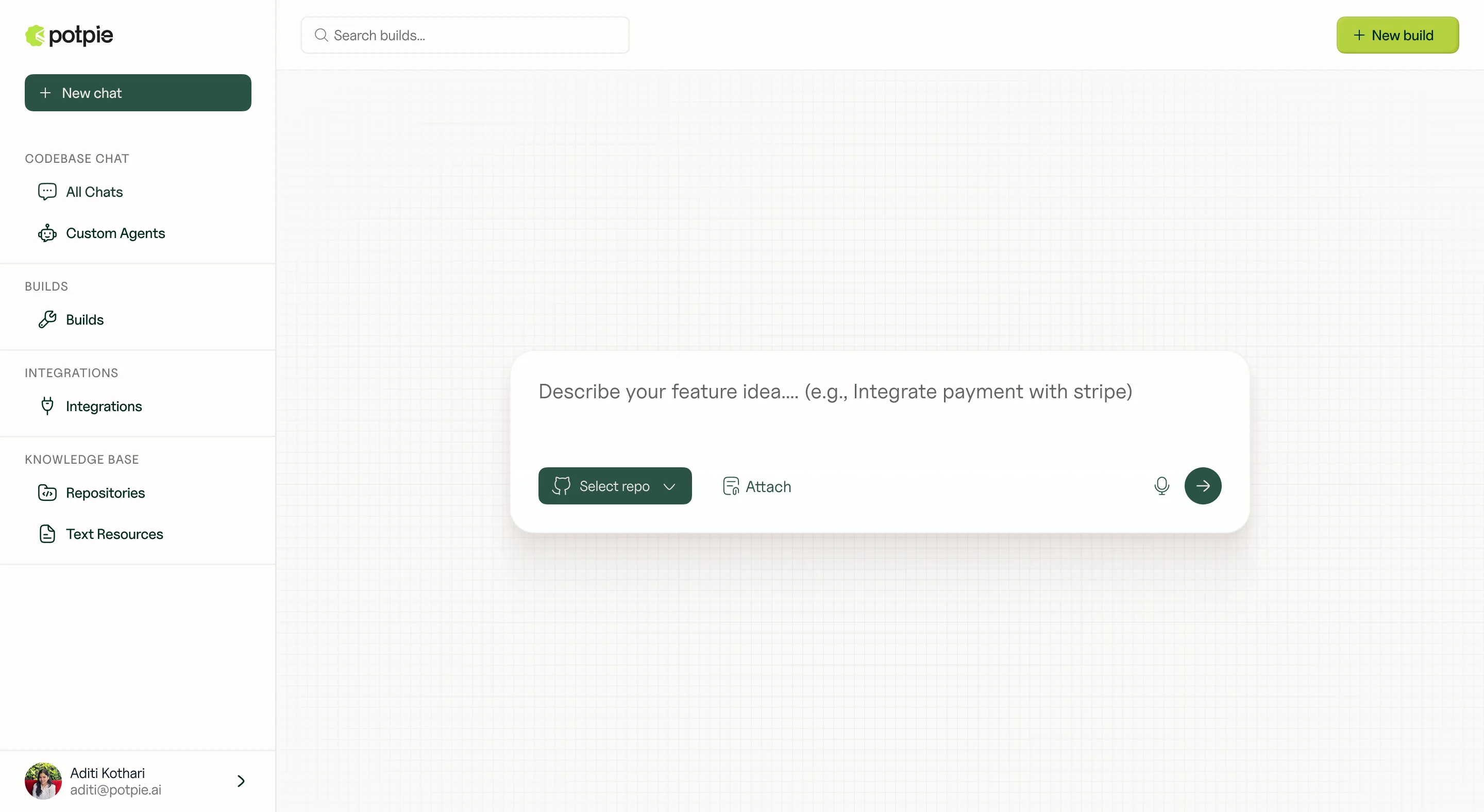
Product UI
We shipped these screens early through Figma so their engineering team could start building the product frontend while we were still working on the website. Sign-up flows, mobile variants, component patterns. Everything they needed to move without waiting on us.
Brand in Use
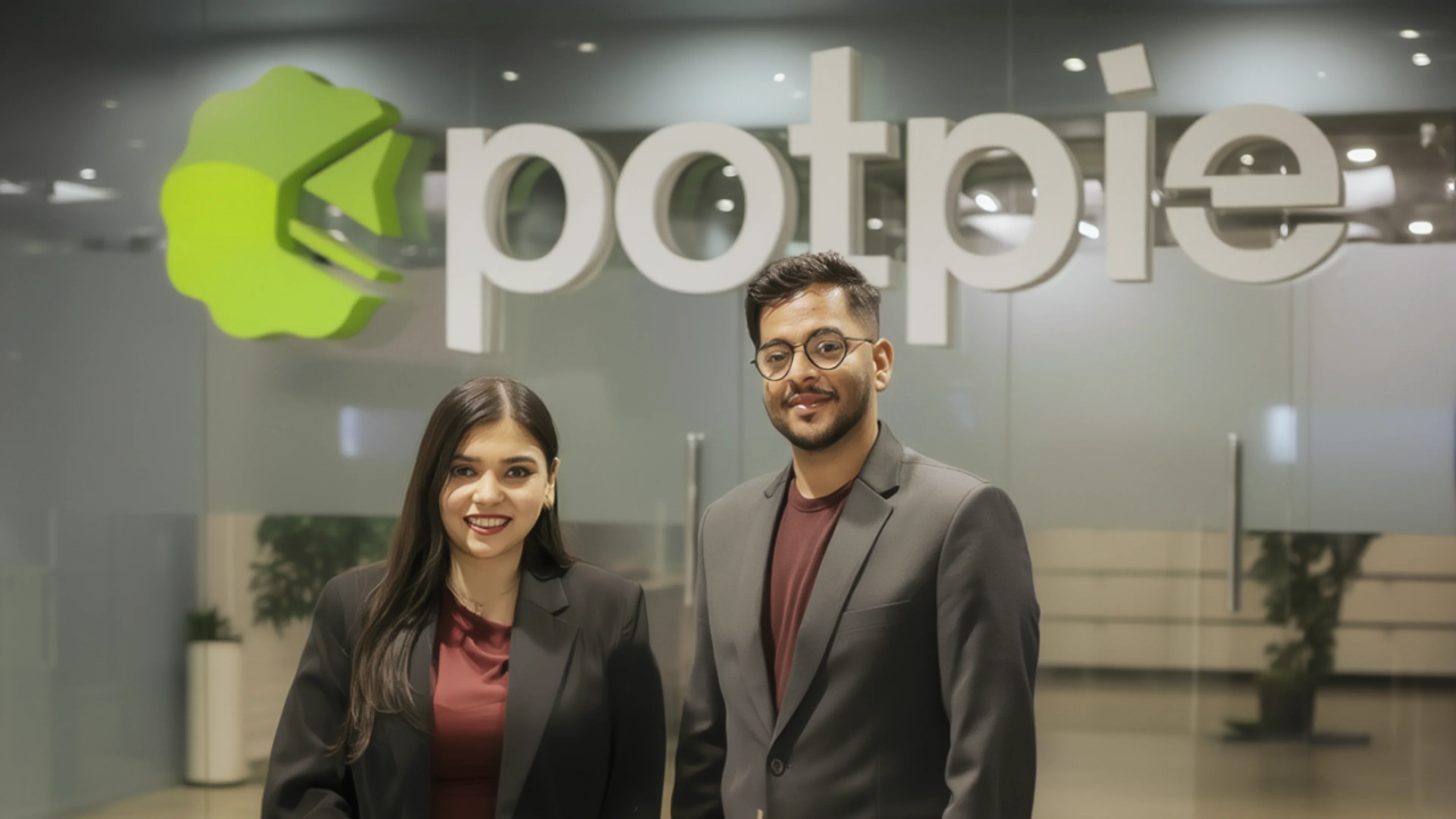
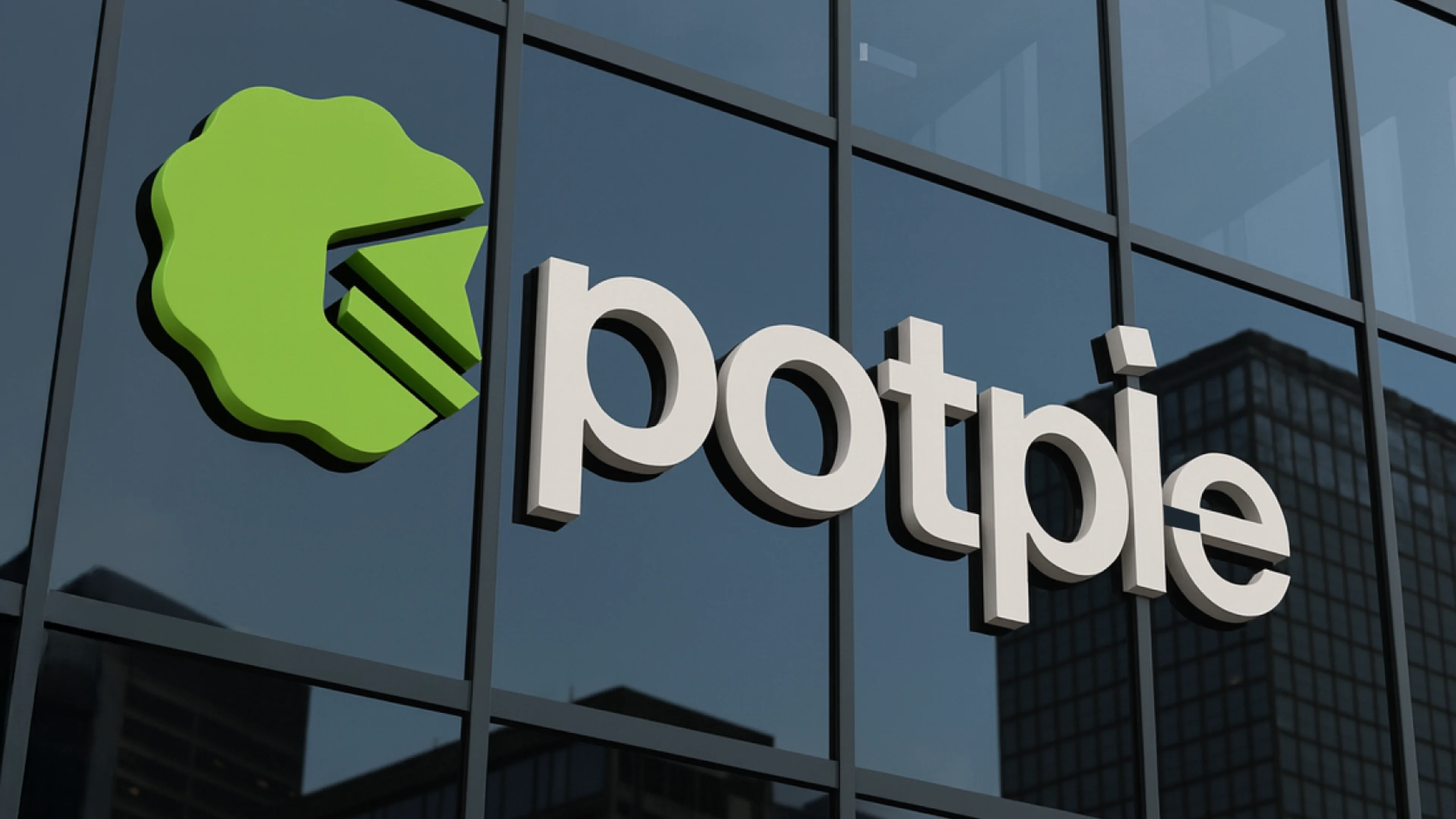
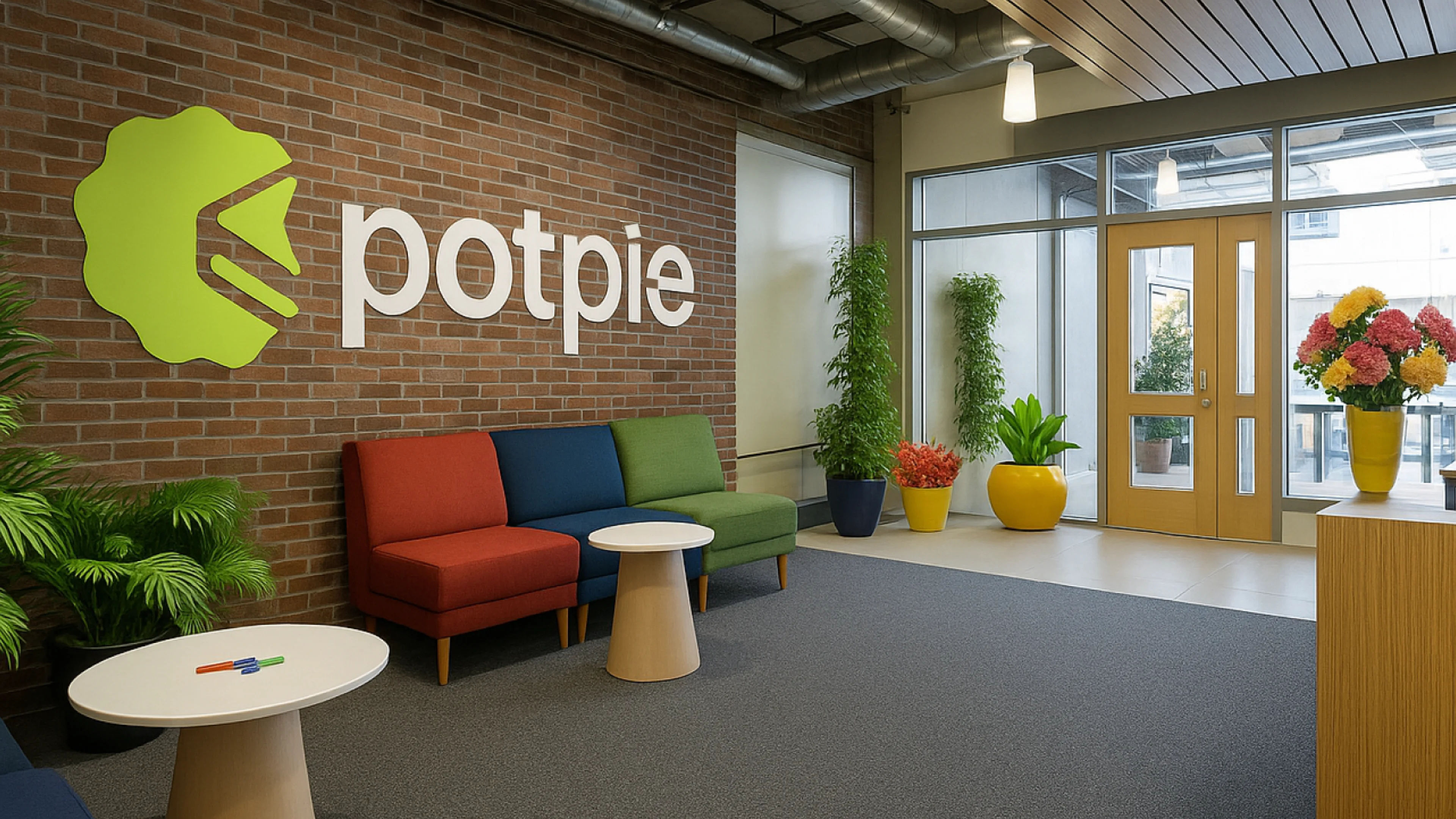
A brand that only lives on a website isn't a brand. We stretched it across physical and digital. Same system, same rules, every surface.
Launch
The site went live alongside Potpie's fundraise announcement and Forbes coverage. Brand, website and fundraise all launched together. Framer noticed the site and featured it. Forbes ran a piece on the fundraise.