CXVERSE
Nine products, one universe
The Challenge
Froogal spent eight years building the loyalty and engagement layer behind more than 100 consumer brands. It was becoming CXVERSE, with twelve products under one name, and the new site had to read as customer experience infrastructure rather than a loyalty tool.
The Solution
CXVERSE arrived with a logo. We designed the rest: one page skeleton that changes colour and emblem per product, a homepage that tells the customer journey as one story, a product switcher for moving between twelve products, and a direction for the dashboard.
Architecture
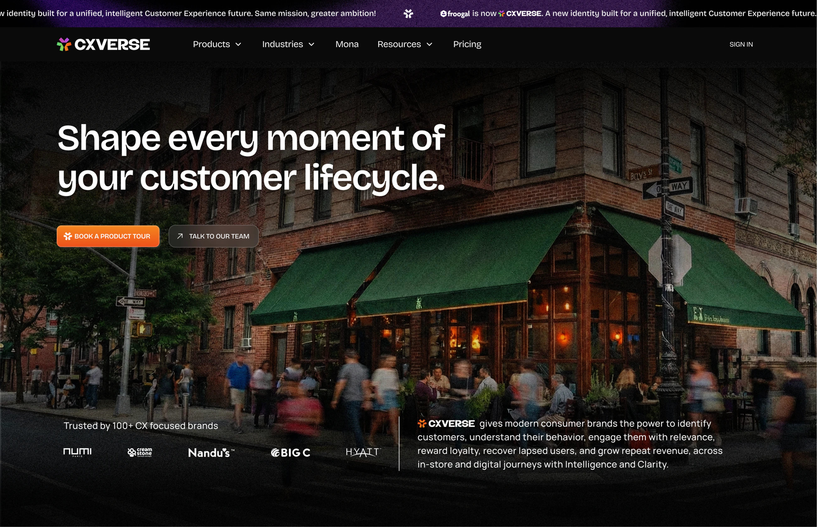
Mapped the product architecture on a whiteboard, wireframed the homepage and product pages, and explored hero directions on the colours CXVERSE already had.
Design + Build
Design was approved in the first week of January and the Webflow build started the next day. Staging was live within a month.
Product Pages + Launch
Templatised the product pages with a colour and an emblem each, reworked the industry pages, built the mobile breakpoints and shipped. CXVERSE launched in May 2026.
One name, twelve products
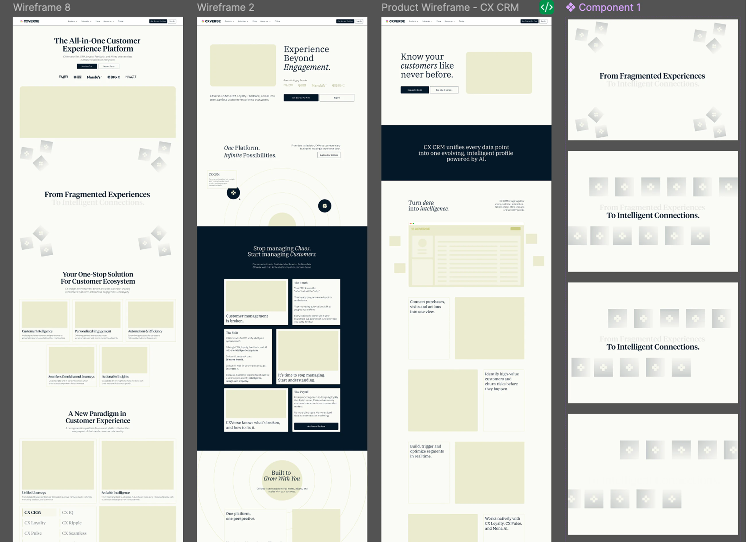
Froogal had grown into twelve products over eight years, each with its own name and its own logic. We started by mapping the whole thing on a whiteboard: every product, every industry, the resources and where they all sit, then wireframed the pages before any of it had a look.
From loyalty tool to infrastructure
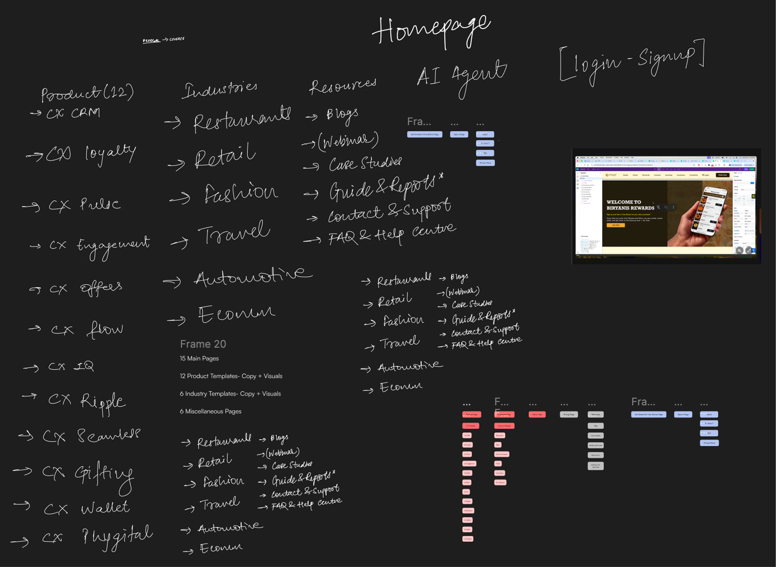
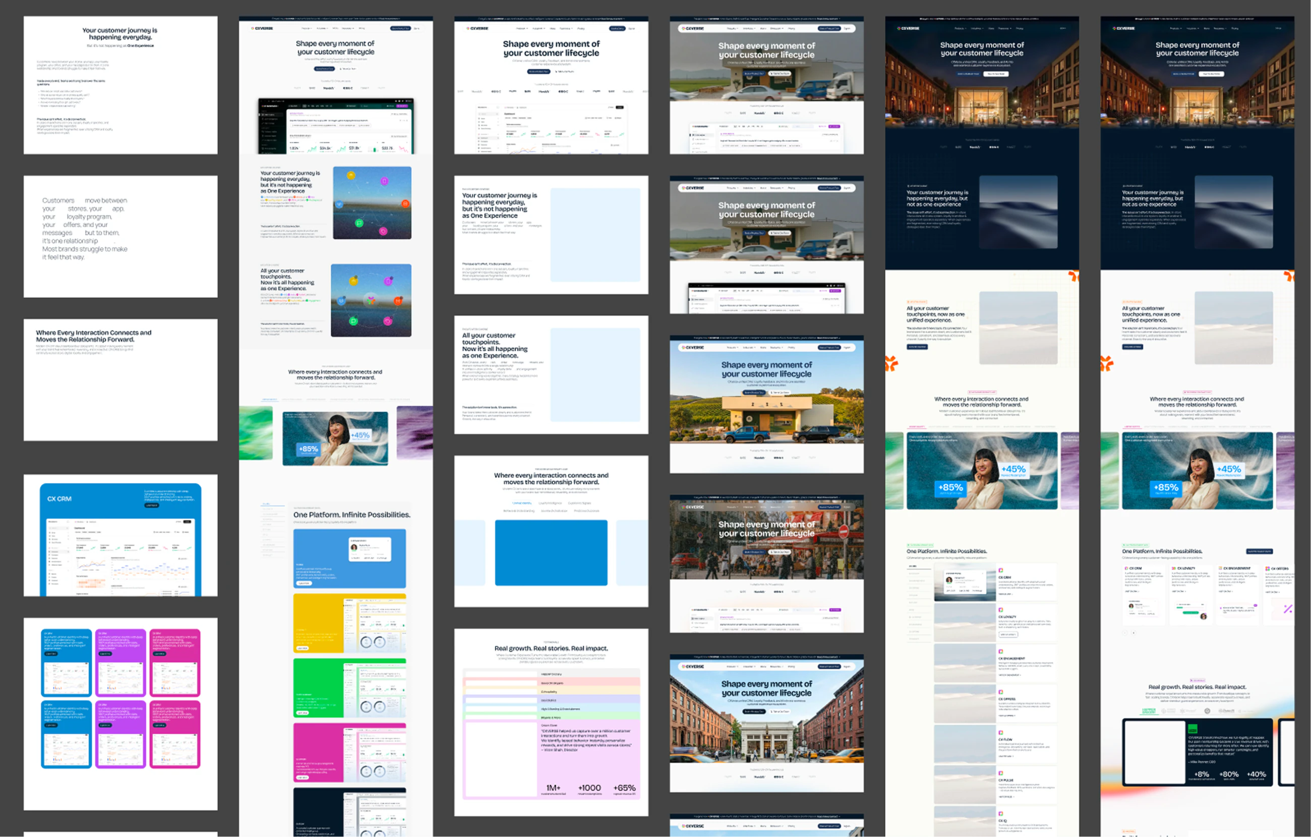
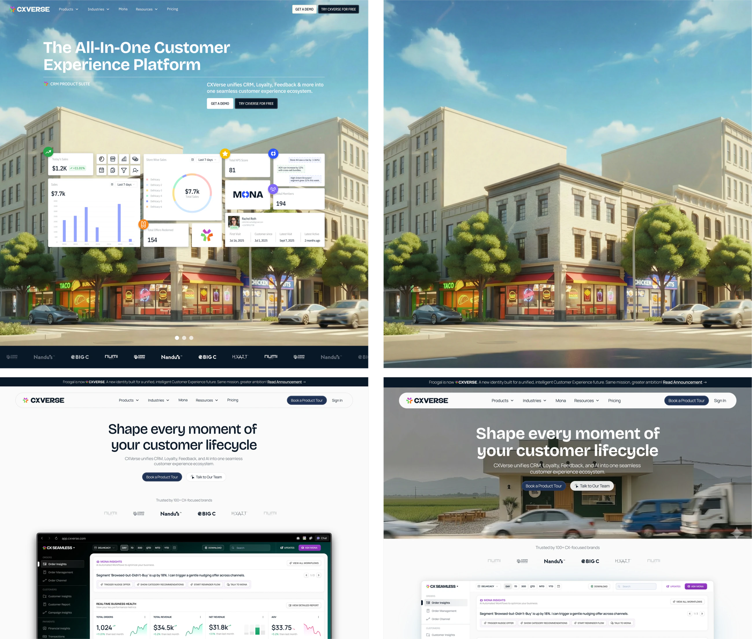
The hero had one job: move the company from a loyalty tool to customer experience infrastructure in a single screen. We explored several directions before settling on the street corner, where a customer's day actually happens.
The homepage
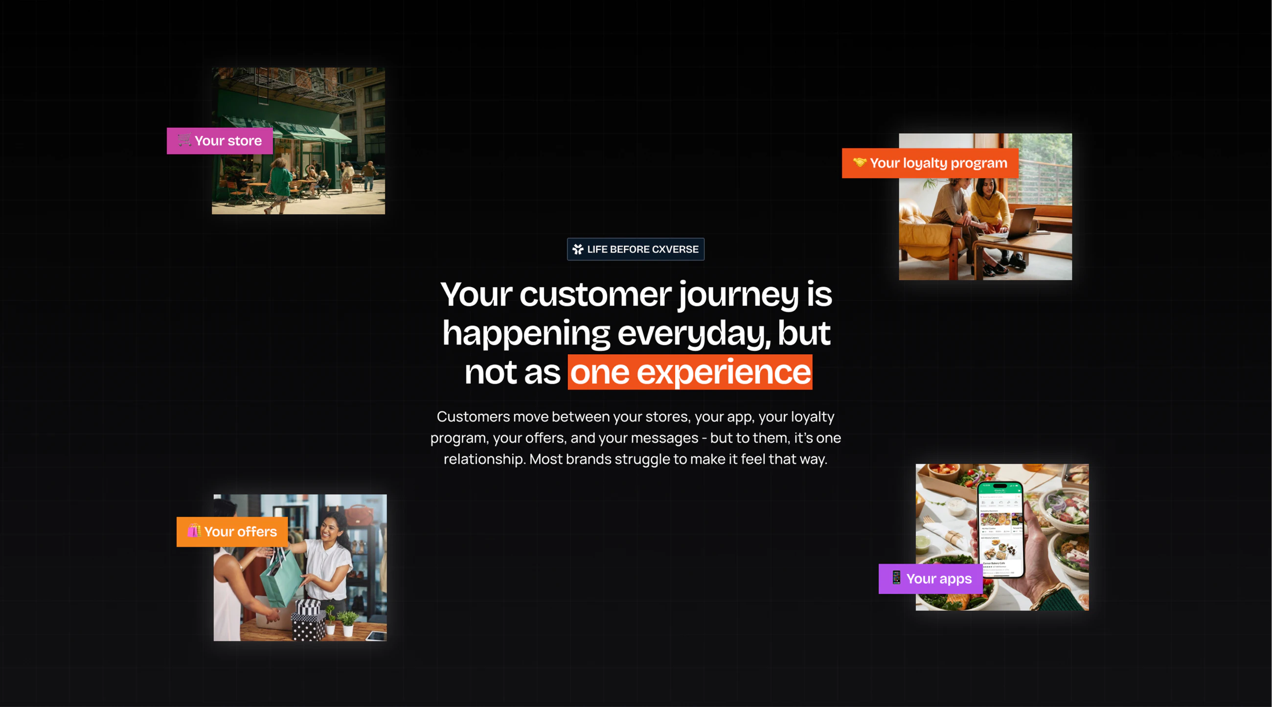
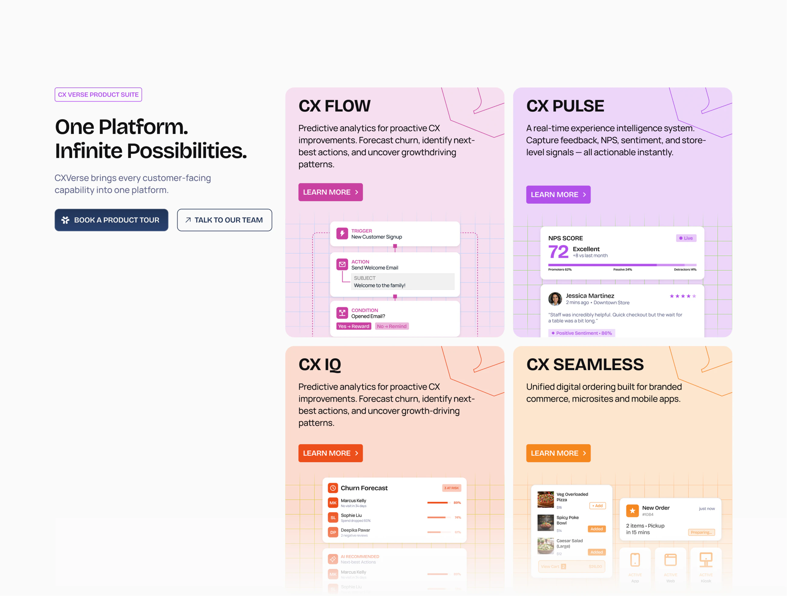
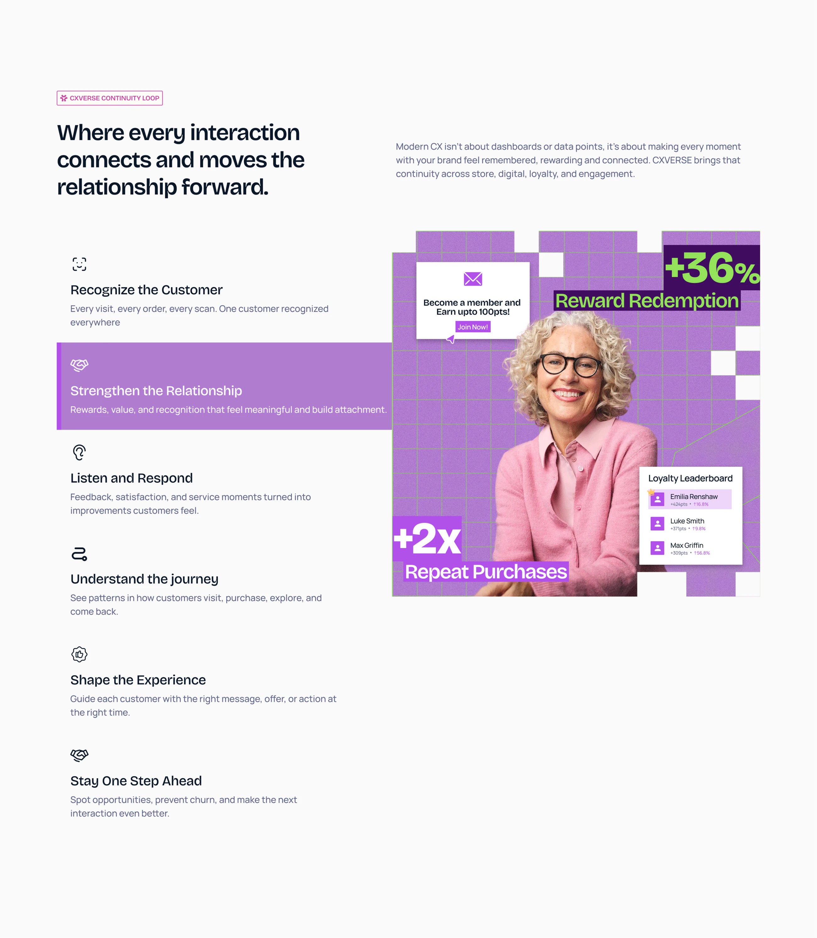
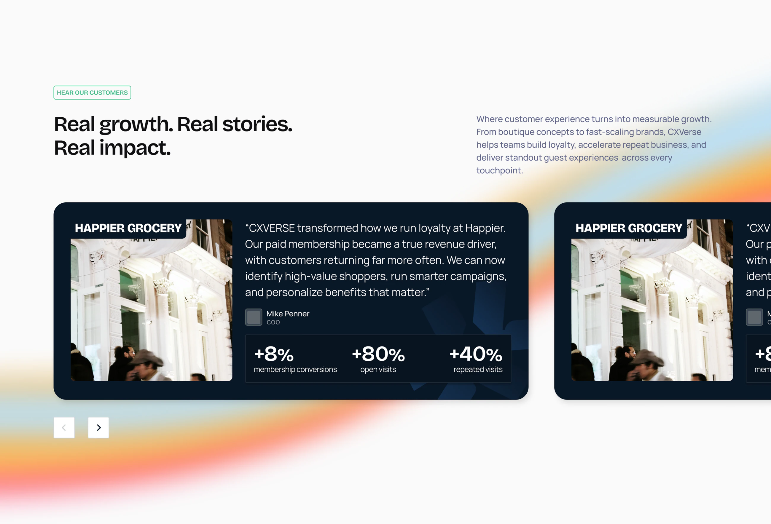
The page runs one story top to bottom. A customer's journey is already happening across the store, the app and the loyalty programme, just not as one thing. The product suite arrives in per-product colour, then the loop that connects them, then the proof.
Nine pages, one template
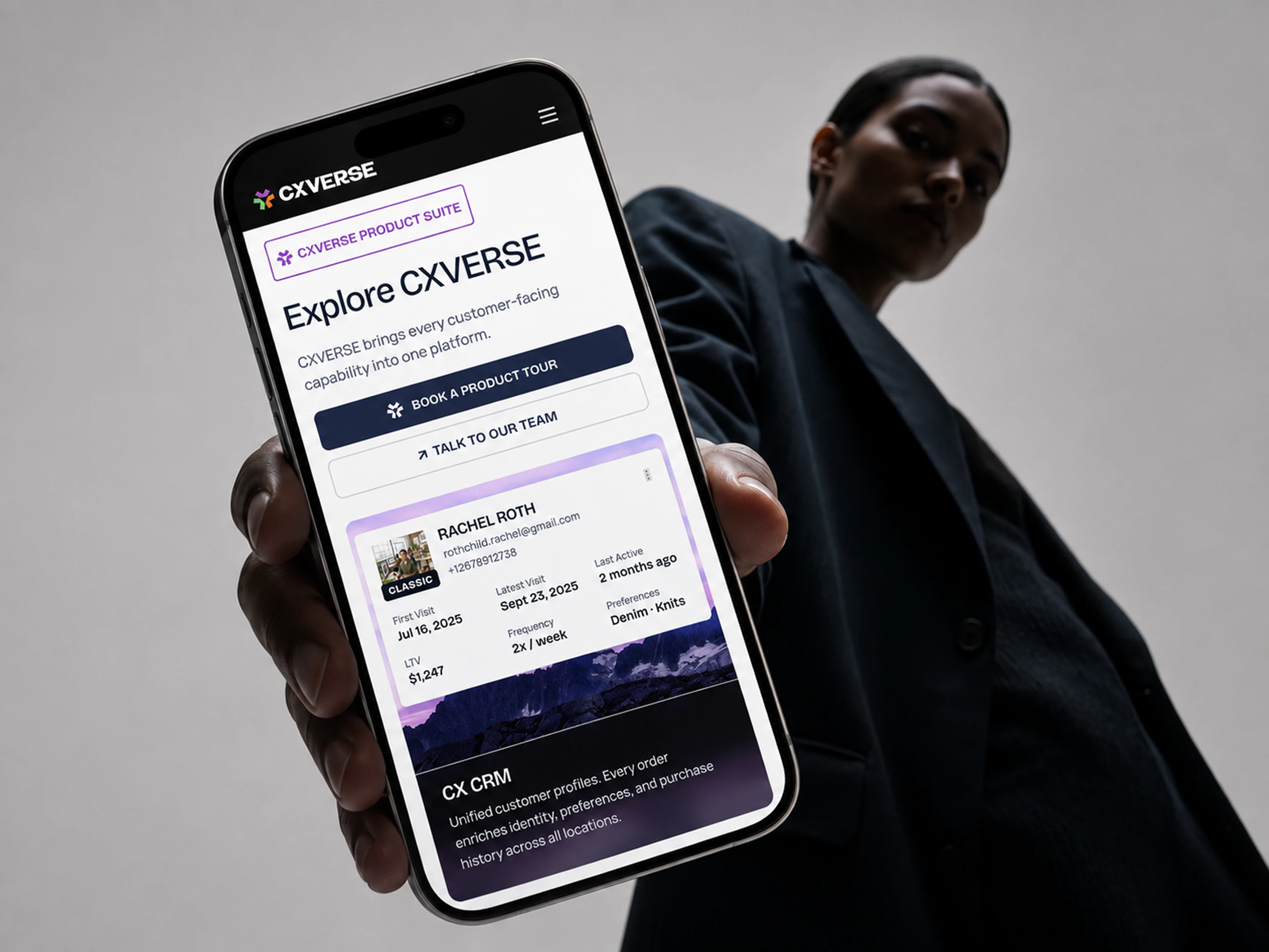
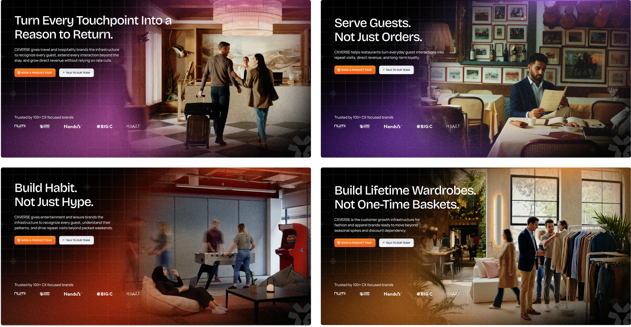
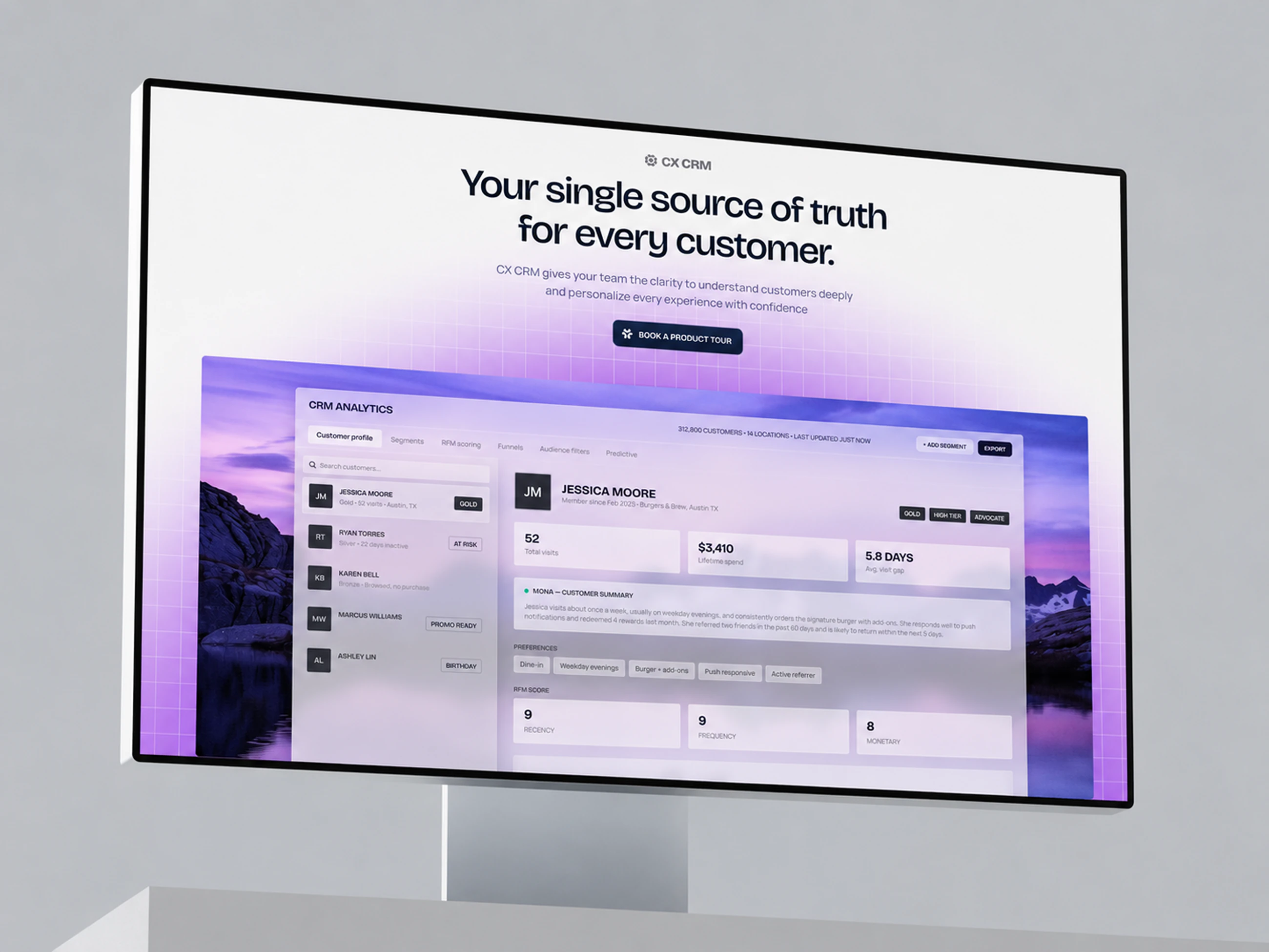
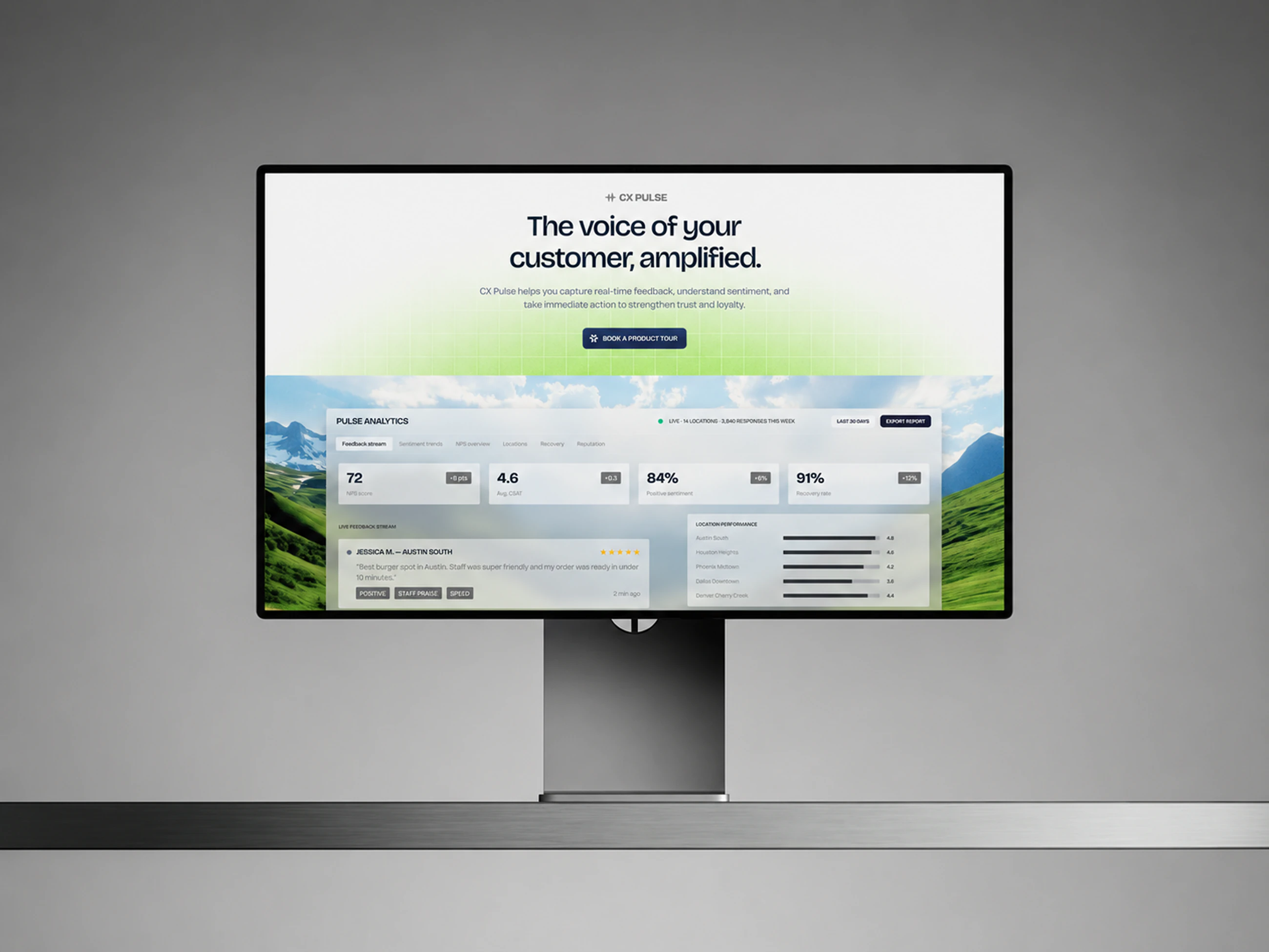
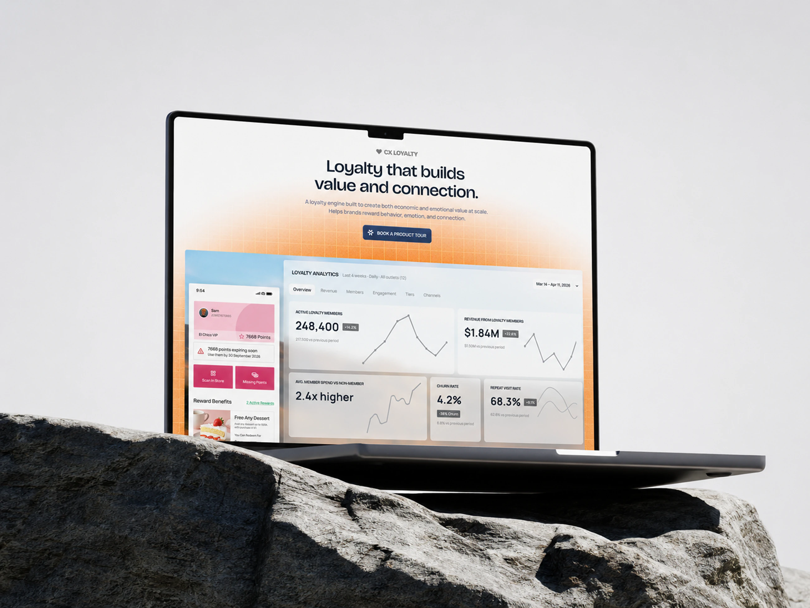
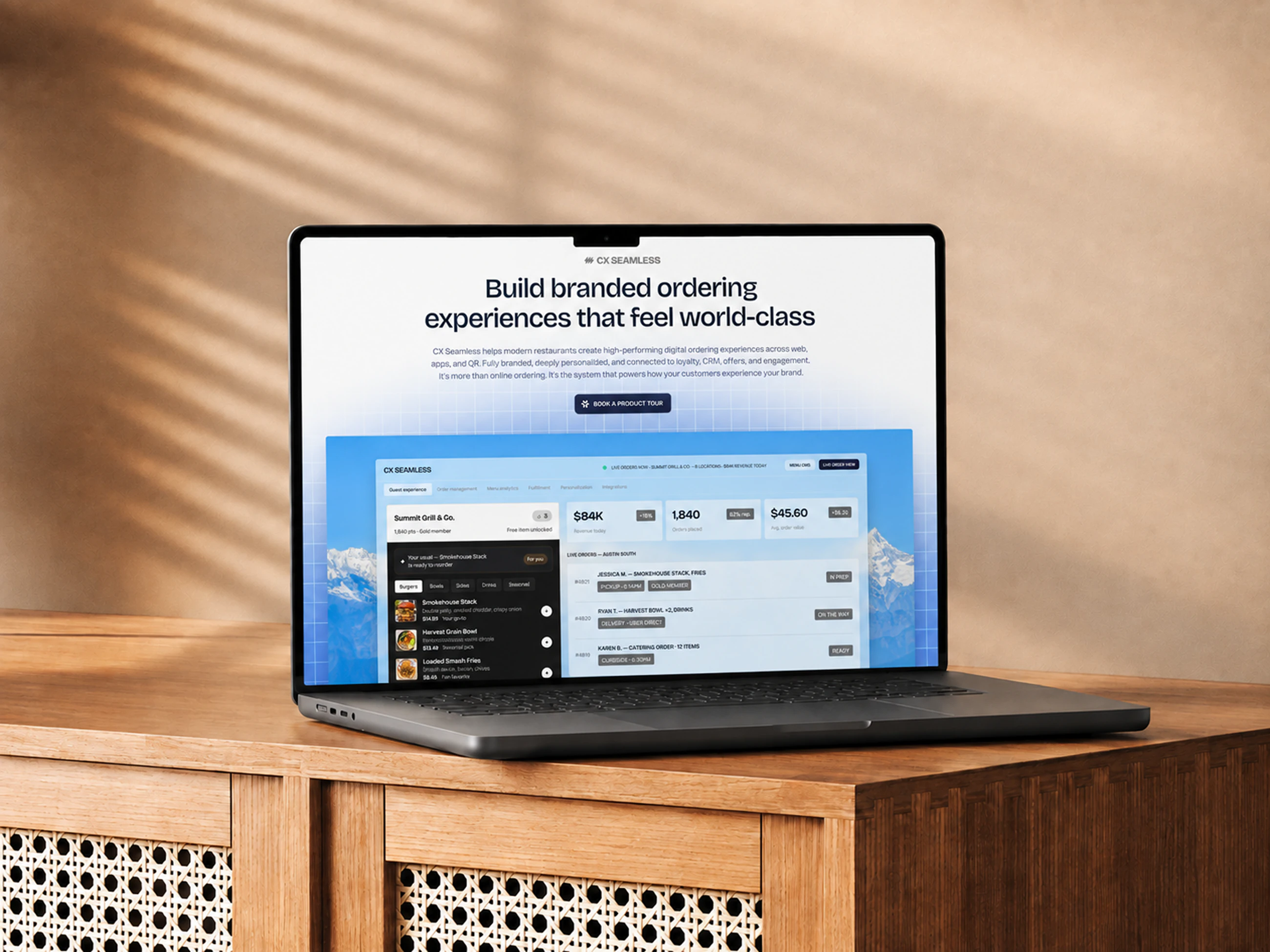
Every product page runs on the same skeleton and changes its colour and emblem. CX CRM is purple, CX Pulse green, CX Loyalty orange, CX Seamless blue, so a visitor moving between them knows where they are without being told.
The product switcher
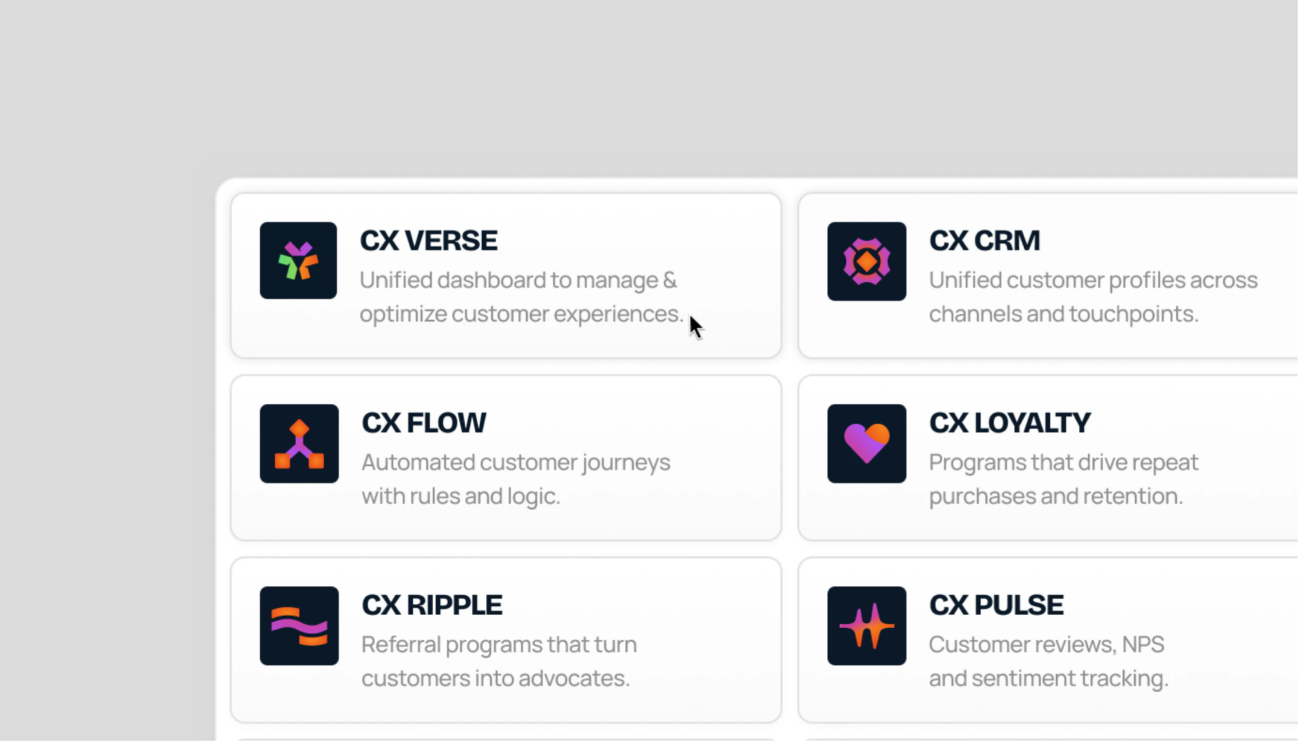
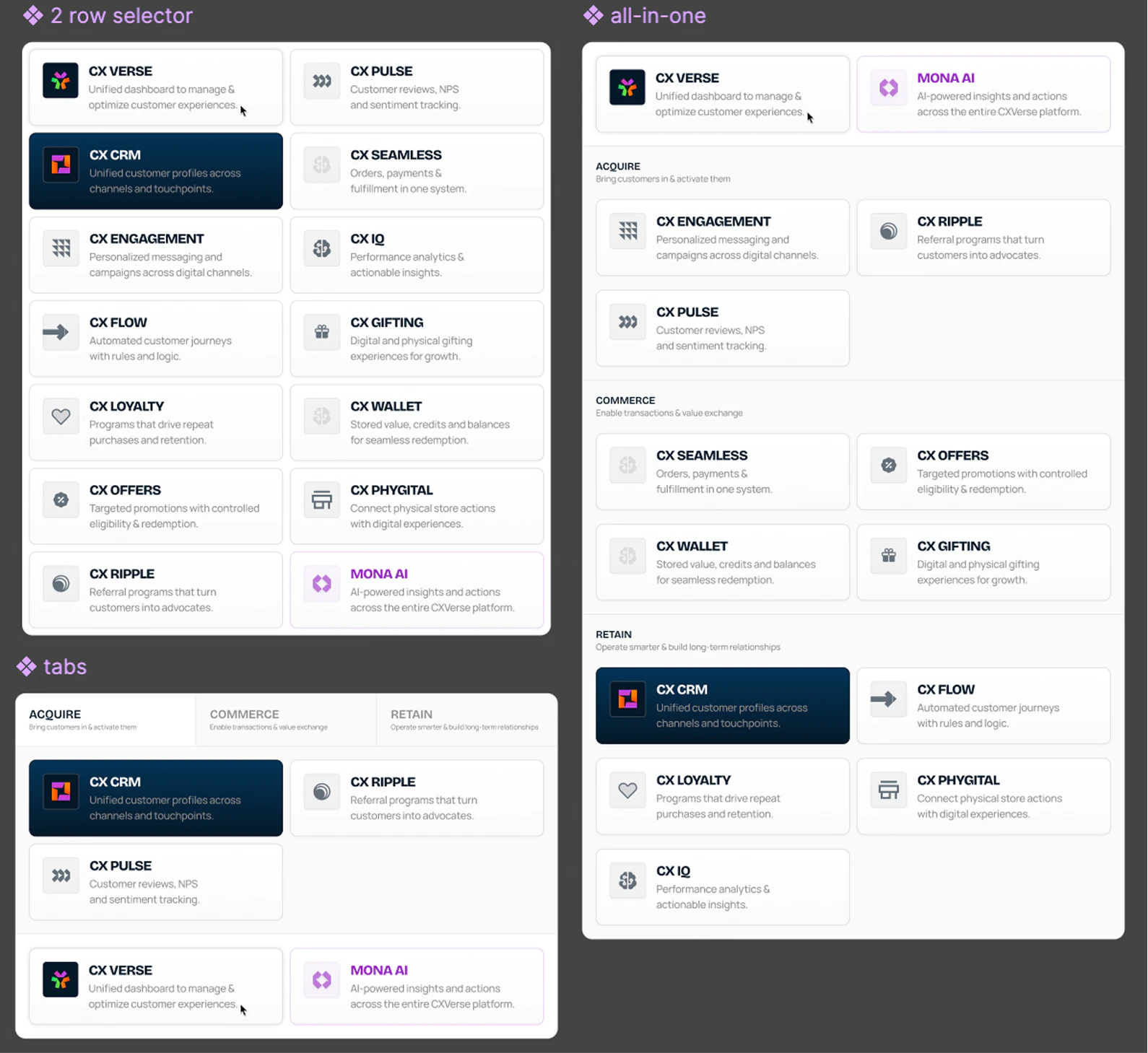
Twelve products need a way to move between them. We drew a family of emblems on shared geometry, then tested the switcher itself as a two row selector, as tabs and as one combined panel.
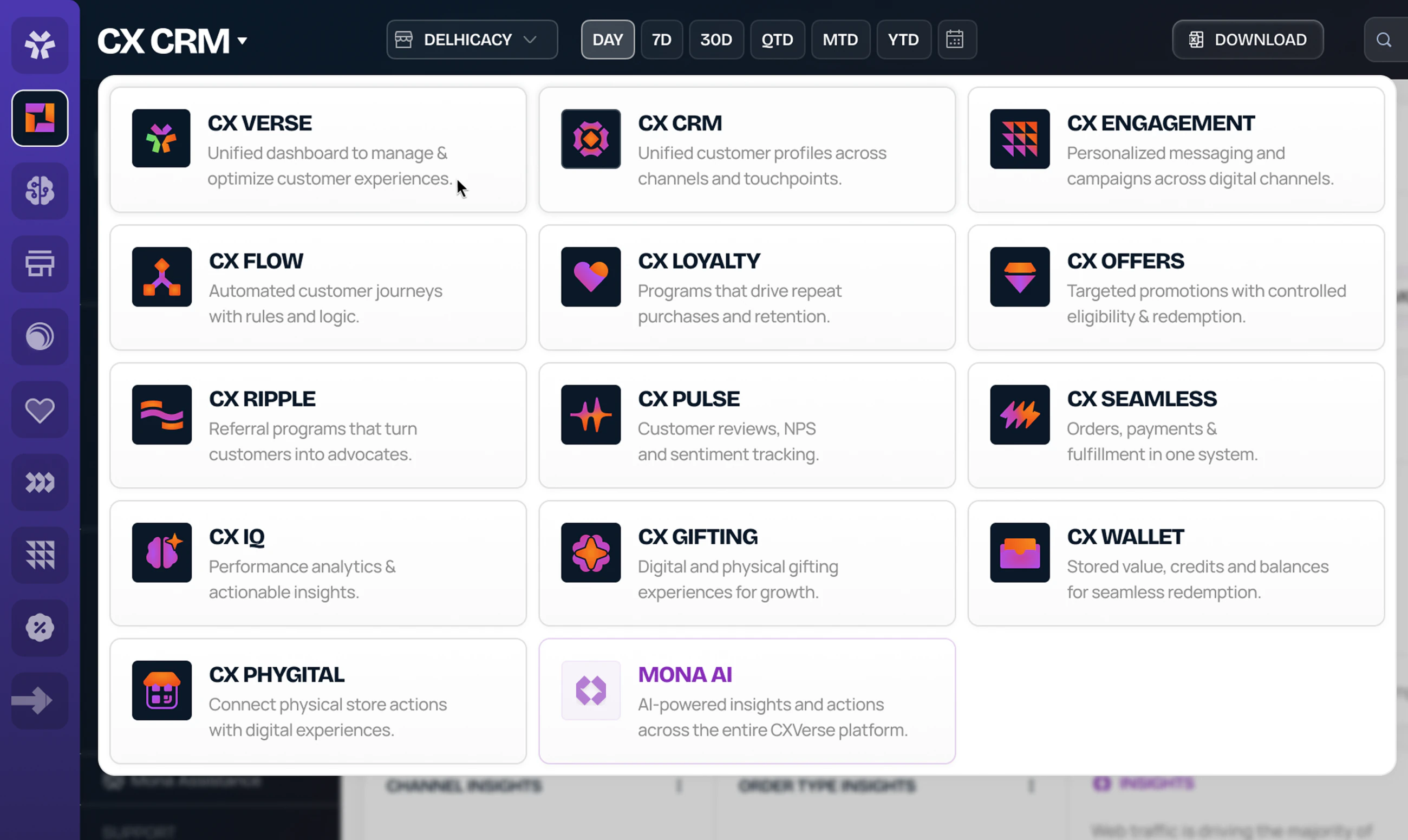
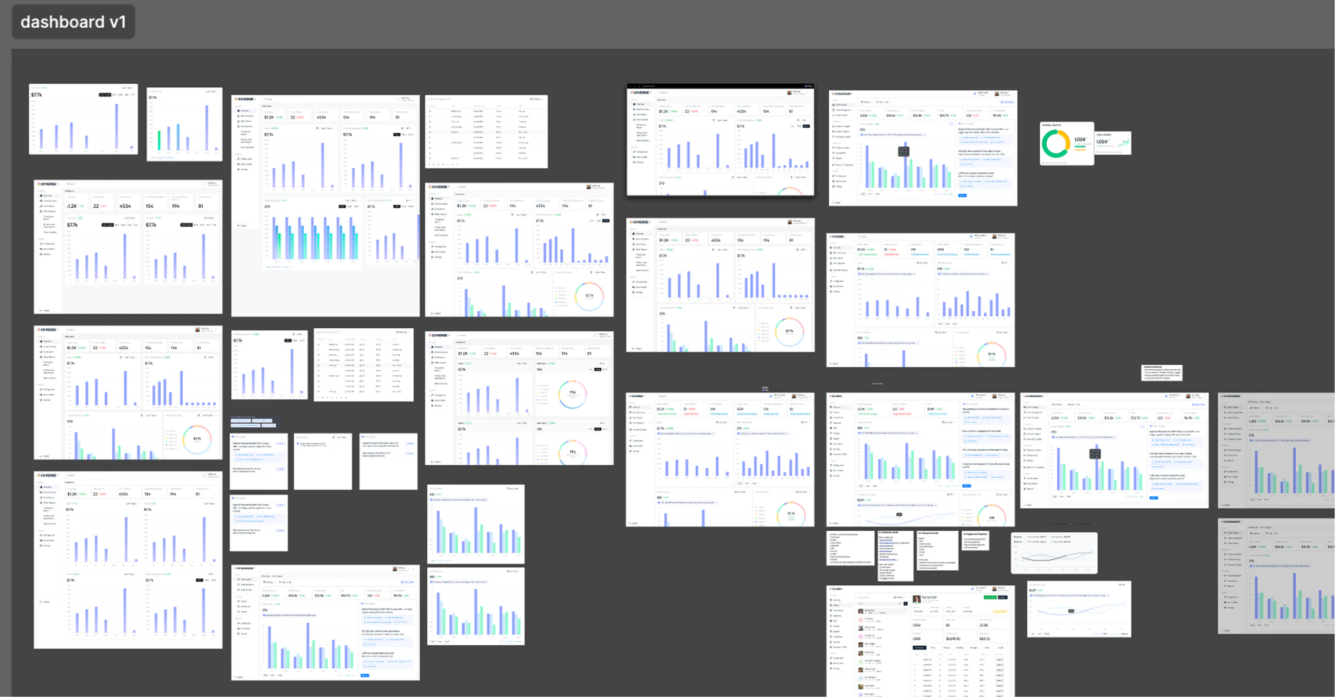
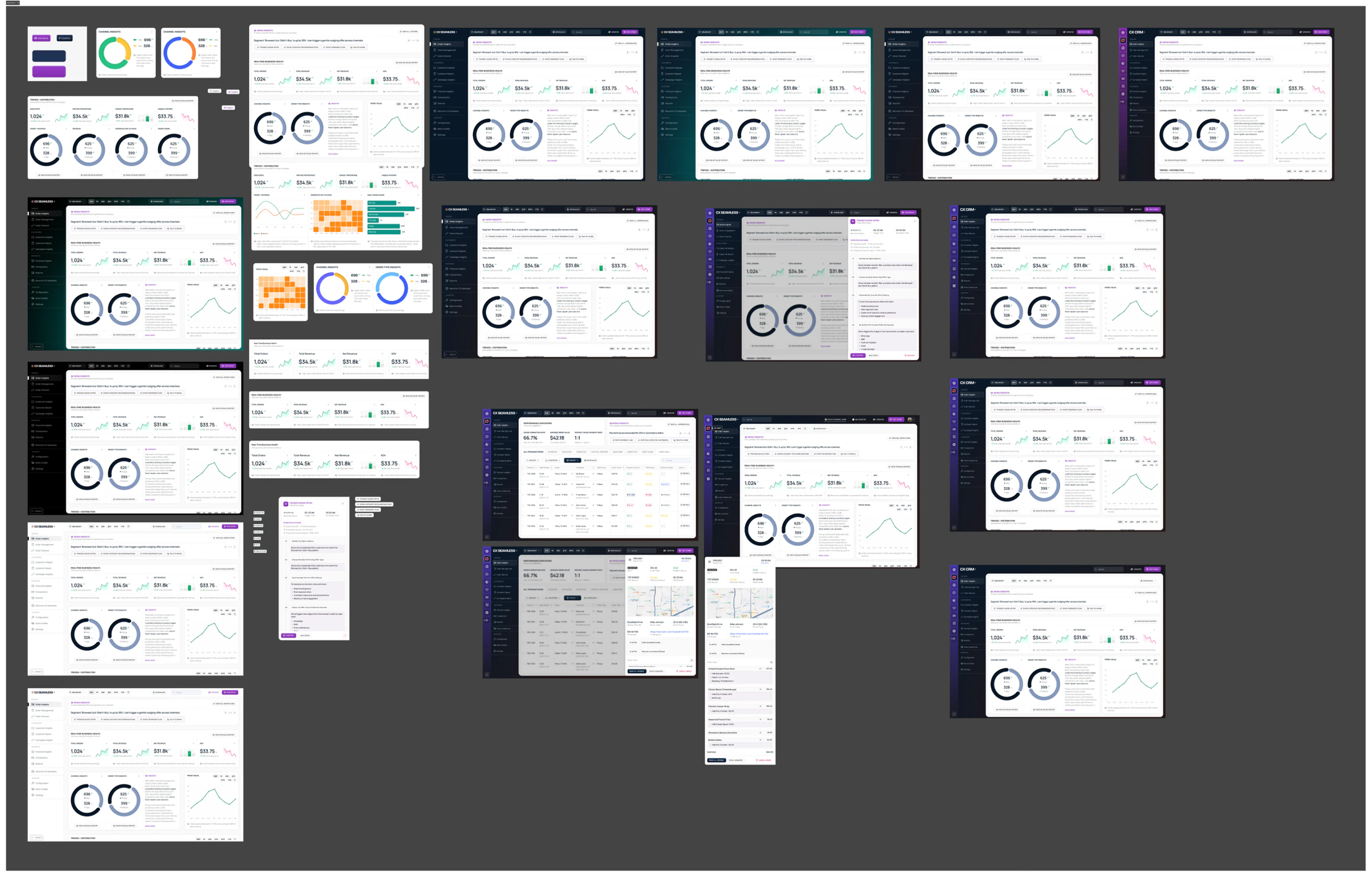
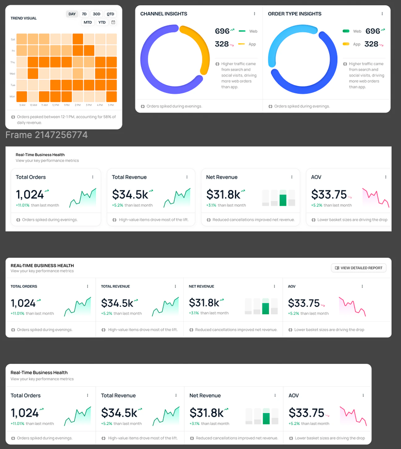
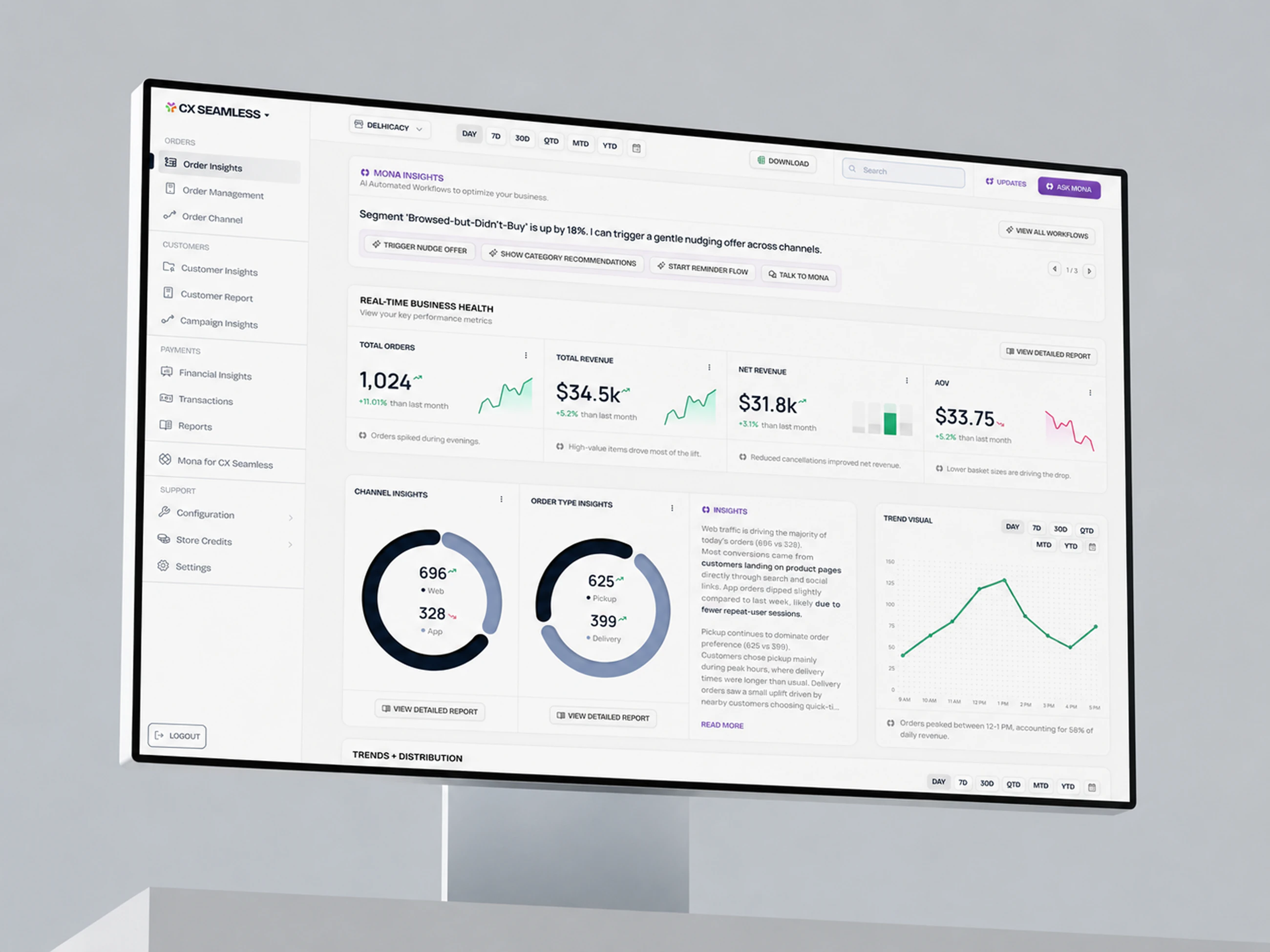
Dashboard direction
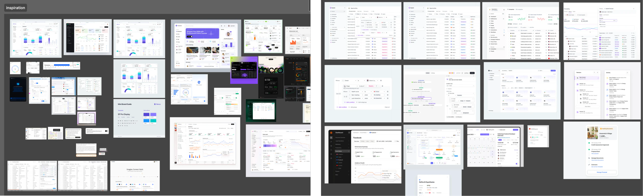
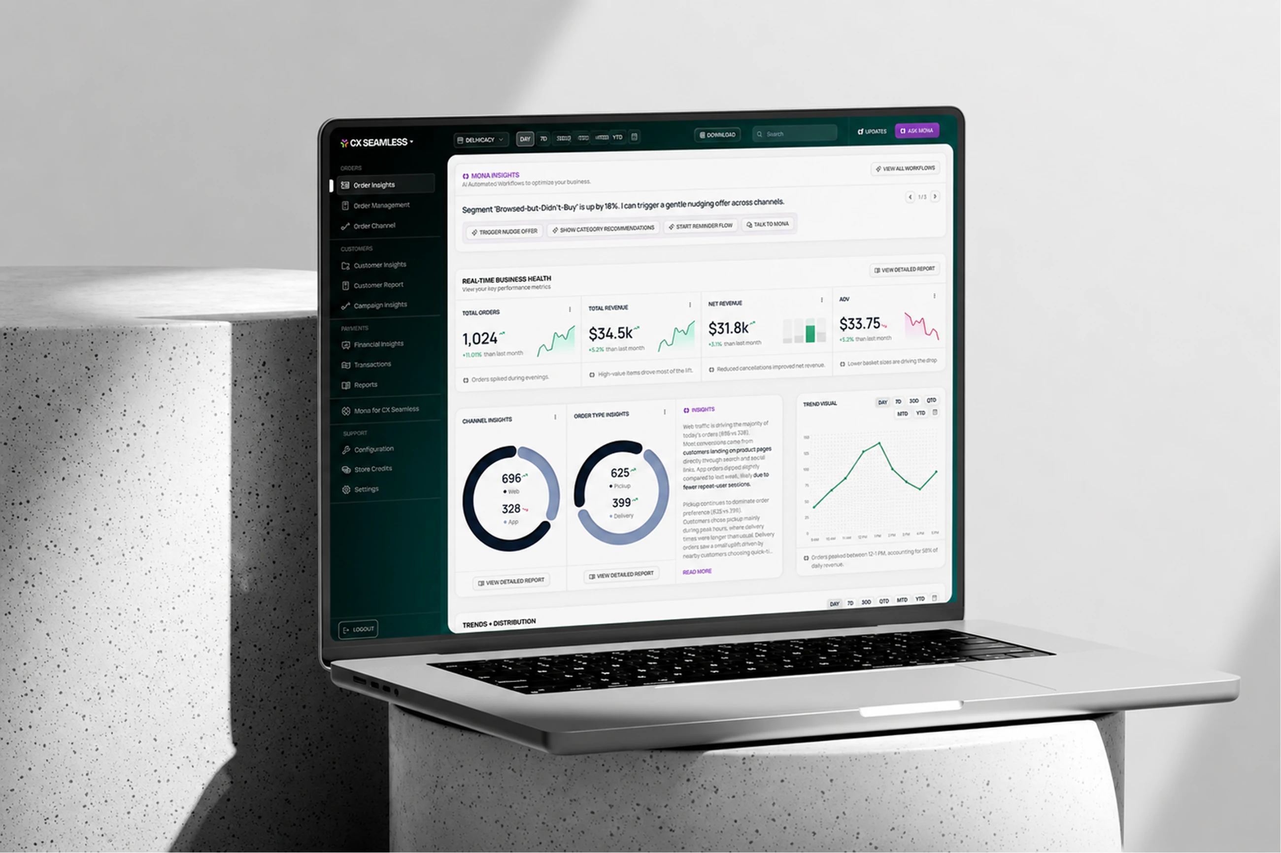
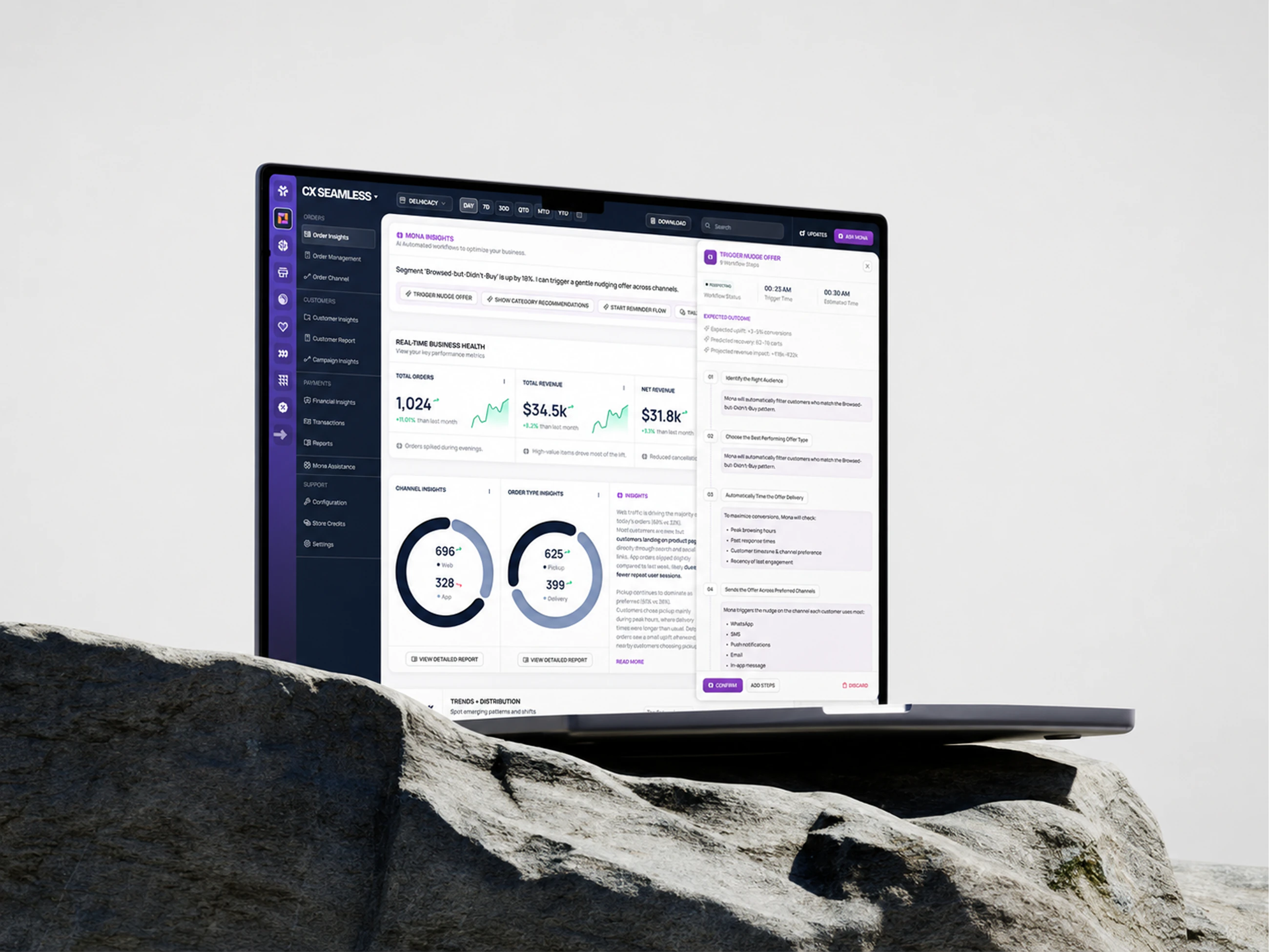
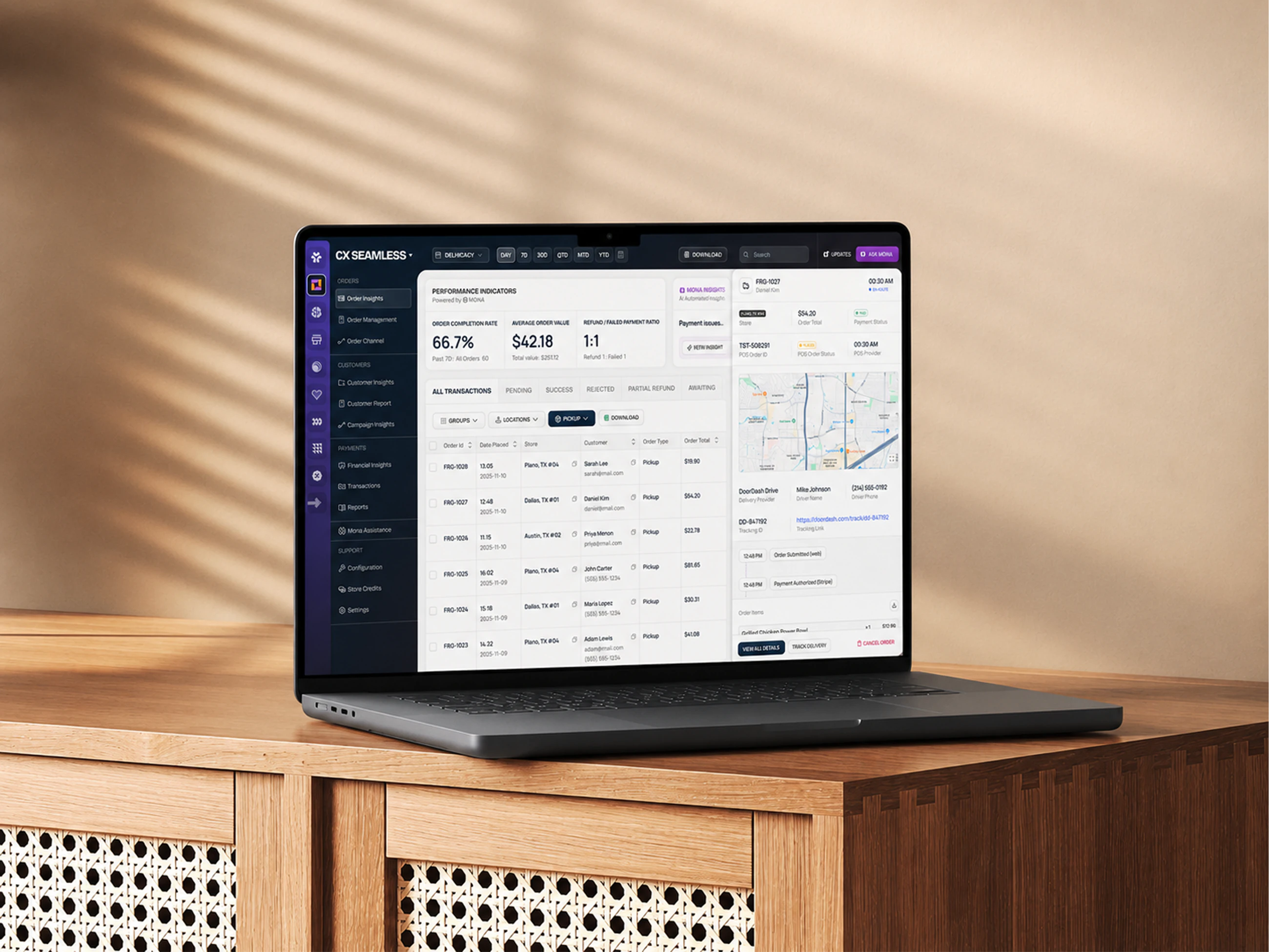
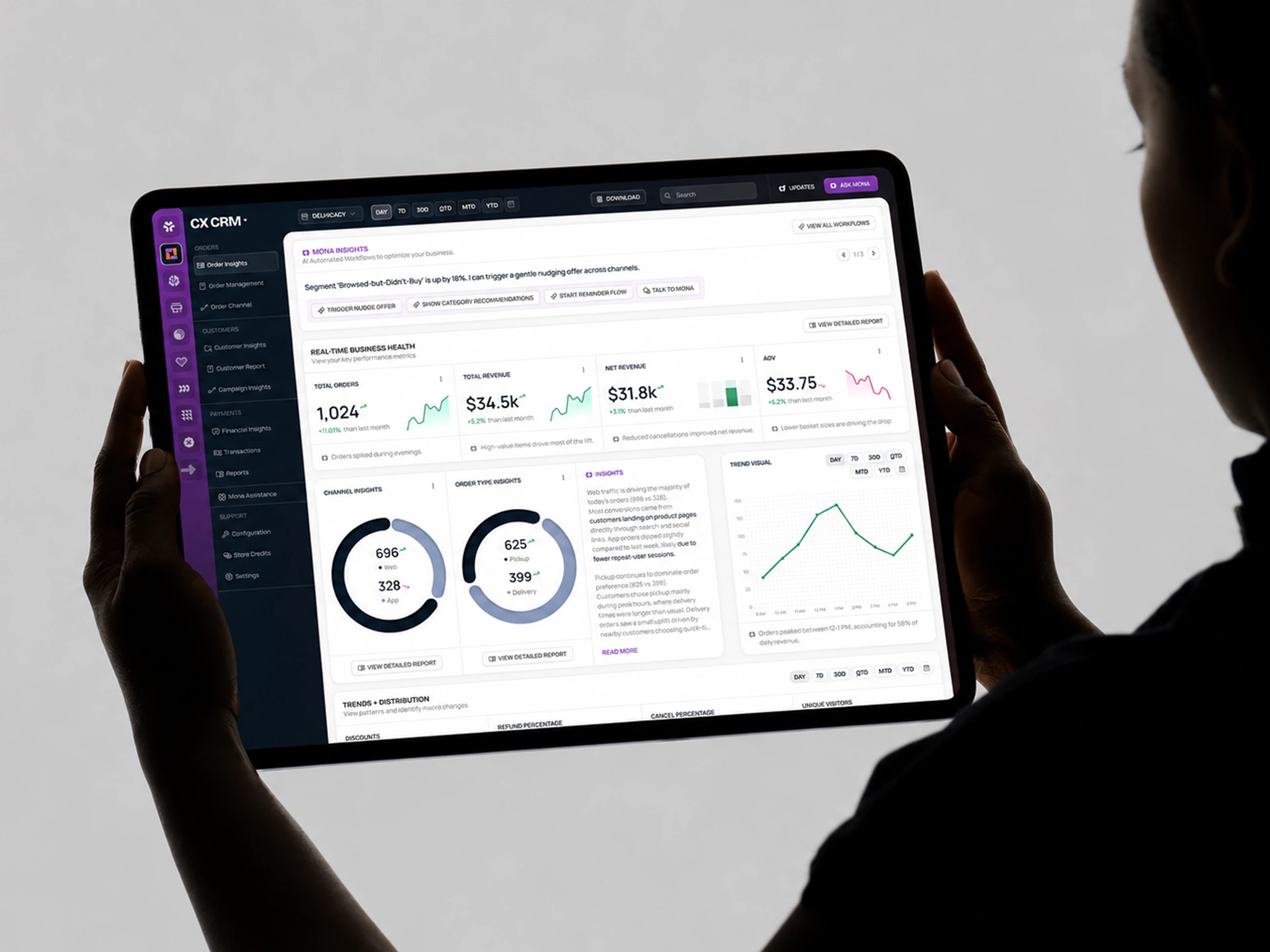
The brief was a brand skin on an off the shelf component library. We took it further and asked what the first screen is actually for, then designed the widgets that answer it: trends, channels and the numbers a shop floor manager checks first.
Mobile
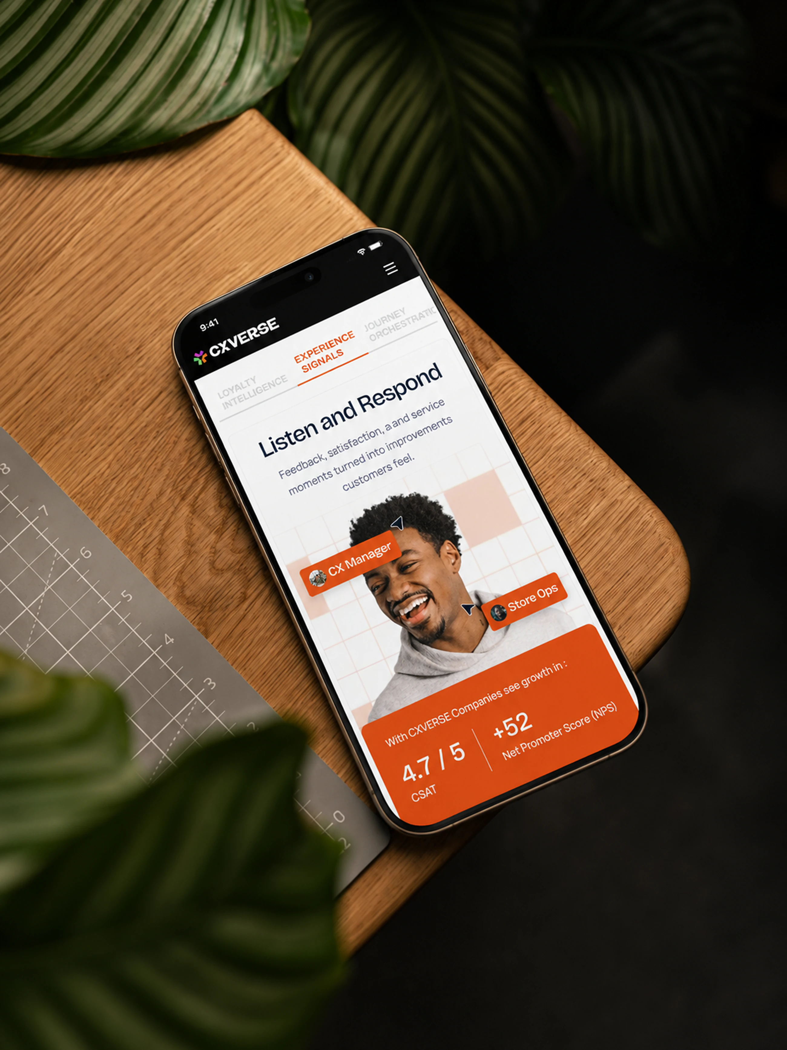
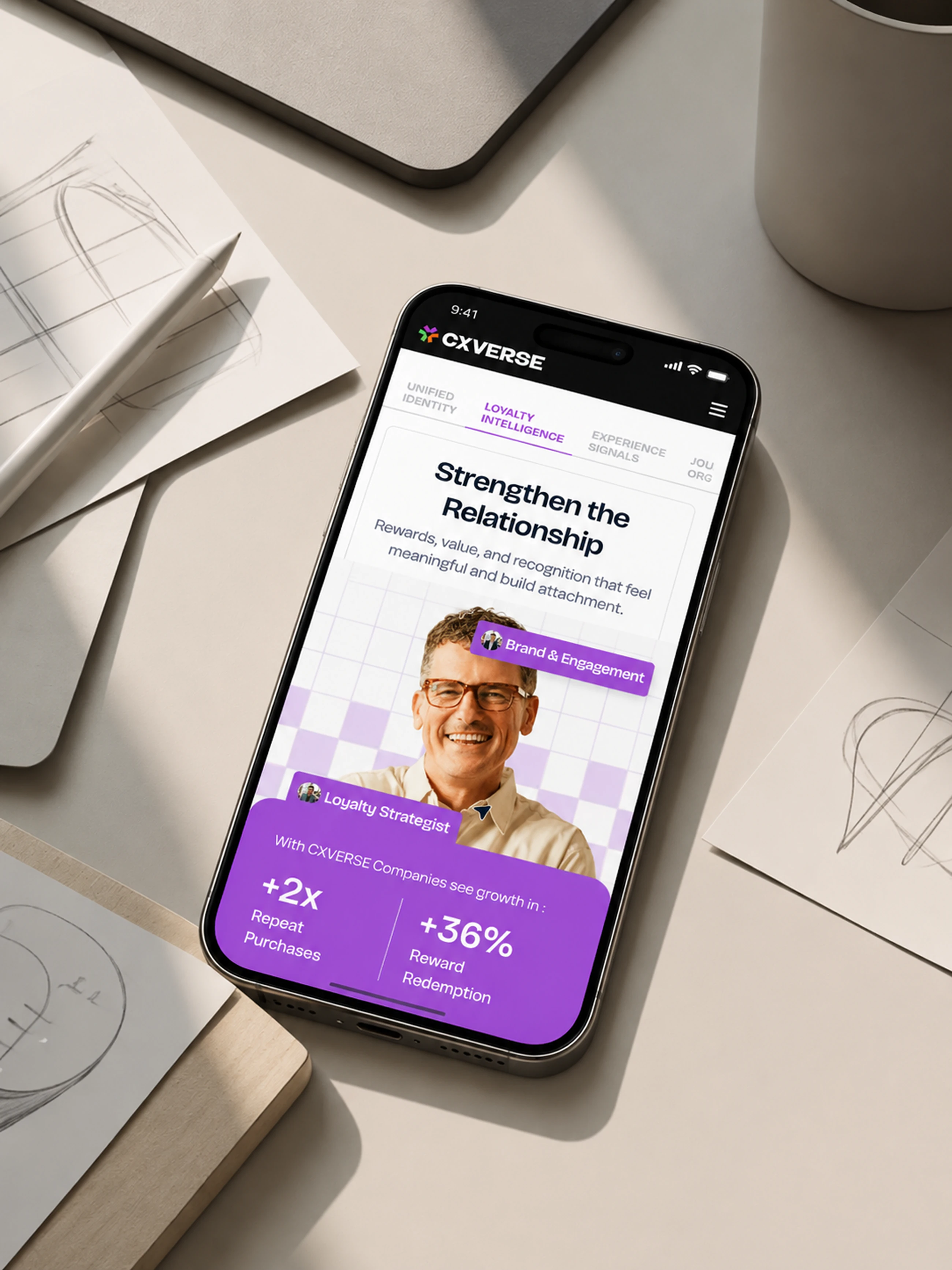
Most of these customers run the business from a phone, on a shop floor or behind a counter. Every section was rebuilt for that screen rather than squeezed into it.