Snowdrop
Patient access, powered by AI
The Challenge
Snowdrop runs the operations that get patients onto very high-cost medications, the oncology and rare disease drugs that come with assistance programmes attached. The site had to make three arguments at once: a better way to run those programmes, the economics of doing it at scale, and what it means for a patient waiting on a decision. The brand had just been rebuilt by another studio and arrived mid-project, logo included.
The Solution
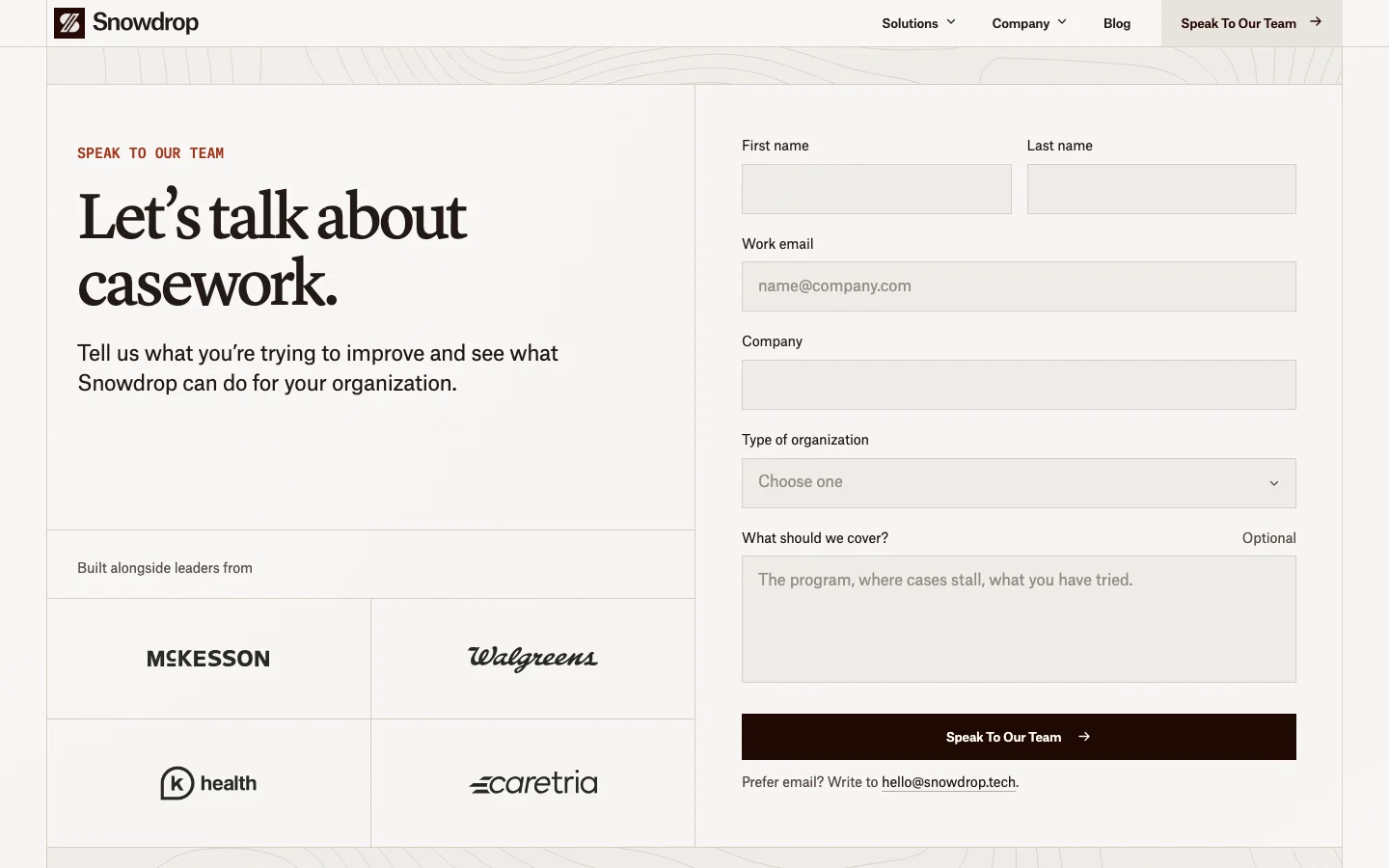
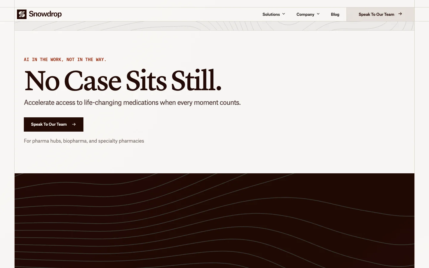
A small marketing site with most of the craft spent on the homepage. A warm near-white page, one dark visual held inside the grid that opens to full width as you scroll, and a topographic pattern drawn from the company's own biology references rather than the usual technology look. Then a contact page that emails leads straight to the team, an about page built around a single note, and a blog their team publishes themselves.
The Hero
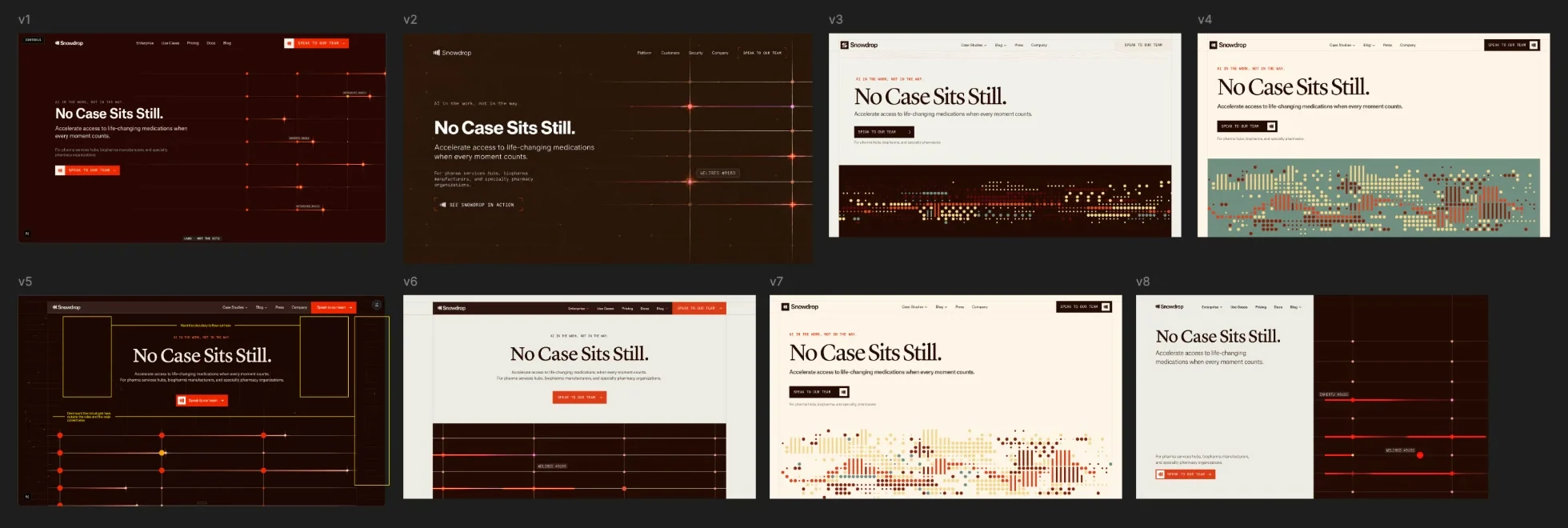
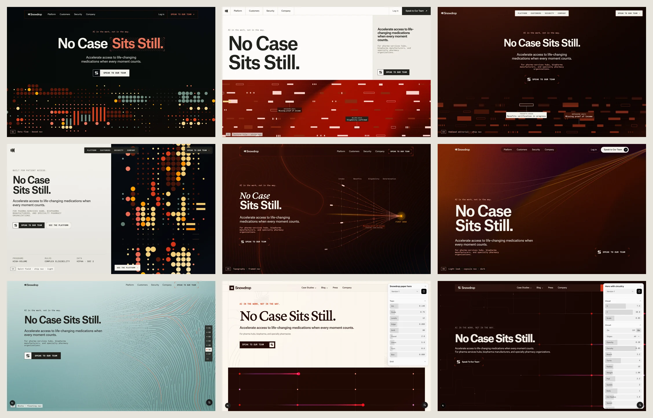
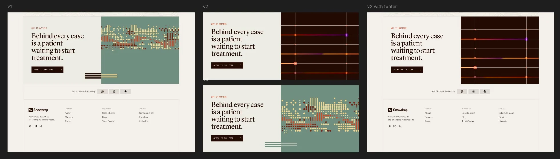
Two visual concepts went head to head: a dotted field and a throughline, one orange line moving forward across terrain. The throughline won. We shipped a control panel beside the live page so the client could set the visual themselves and send back the settings, and a toggle to compare the two directions.
Launch
Home and contact were finished, made responsive and moved into the client's own repository with search setup, structured data, canonical urls and a sitemap in place. Explorations stayed behind on an archive branch, so the production repository holds only what is live.
About + Blog
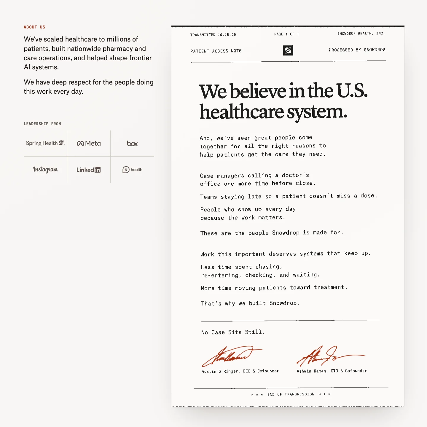
The about page became one note on a page styled like a fax, with the leadership logos and an invitation to join at the end. The blog followed, with a featured article, categories and search, and an editor where the team writes, previews and publishes through a pull request. The site went live in October.
The direction
Healthcare infrastructure without the stock photography. Snowdrop's identity already had a voice, so the work was translating its type, topographic pattern and colour into something that could carry a whole site.
From wireframe to homepage
The story was settled before the surface: what Snowdrop does, how a case moves, who it serves and why it matters. The wireframe and the finished page sit at the same scale, so the structure underneath stays visible.
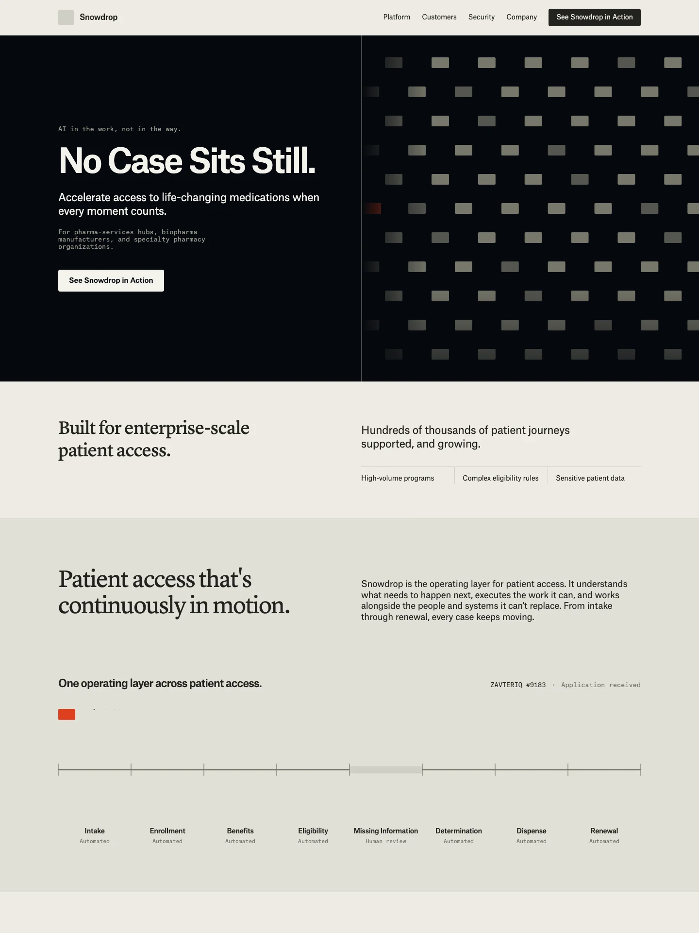
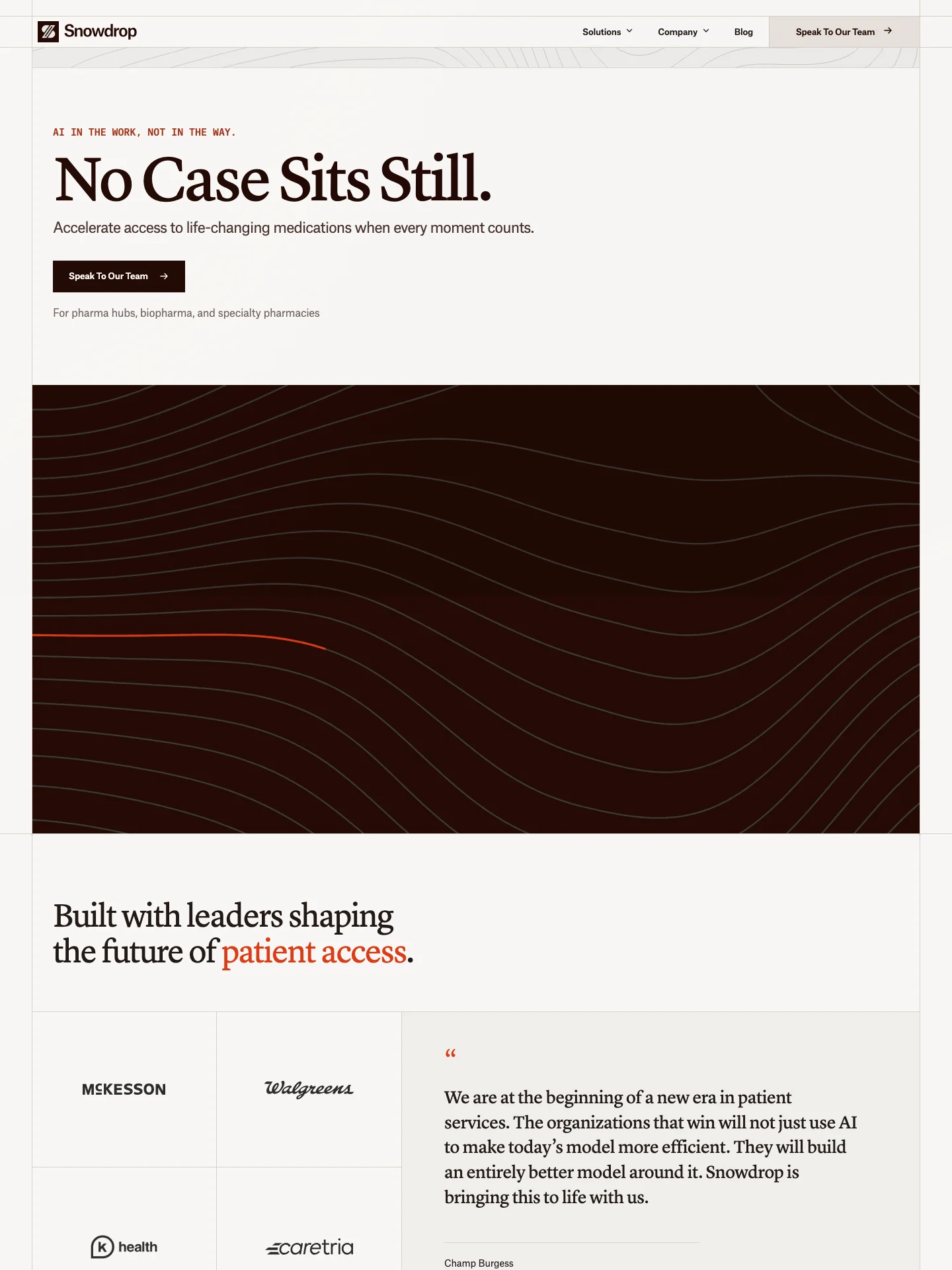
No case sits still
The product moves cases through checks, decisions and follow-ups across systems that do not talk to each other. We made that movement the centre of the homepage, so an operational product reads as a sequence rather than a feature list.
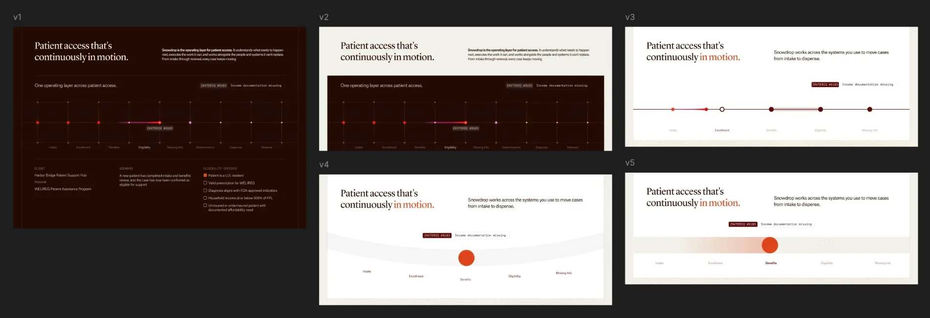
The homepage
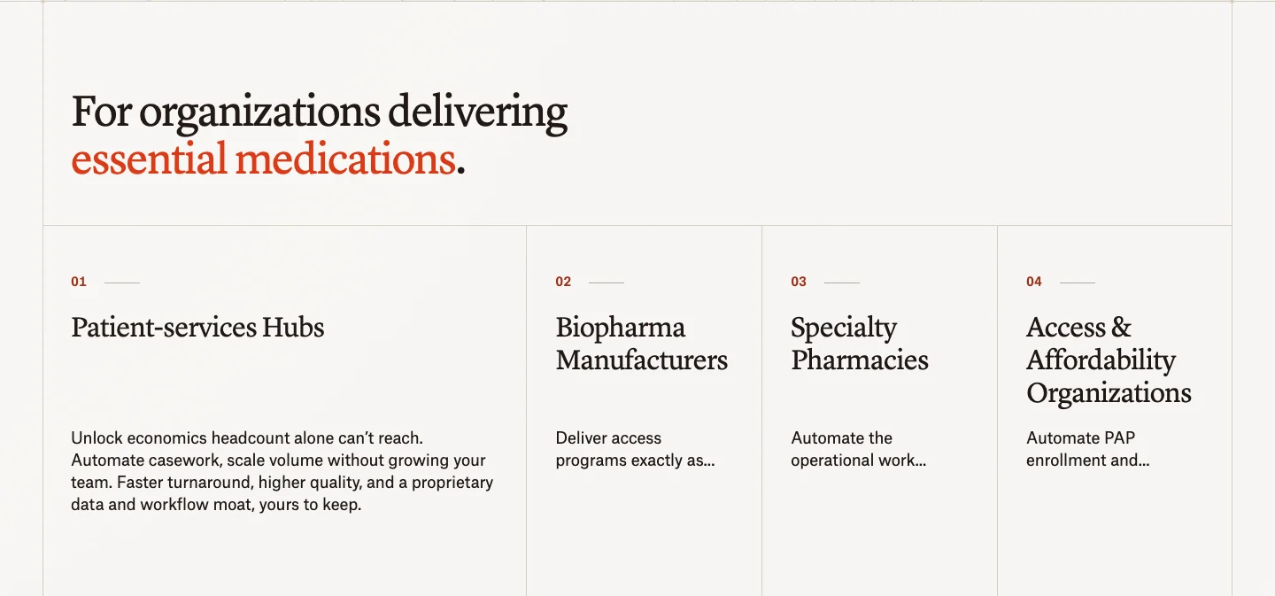
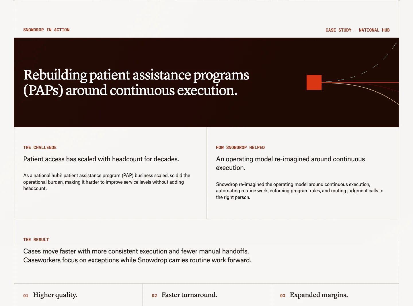
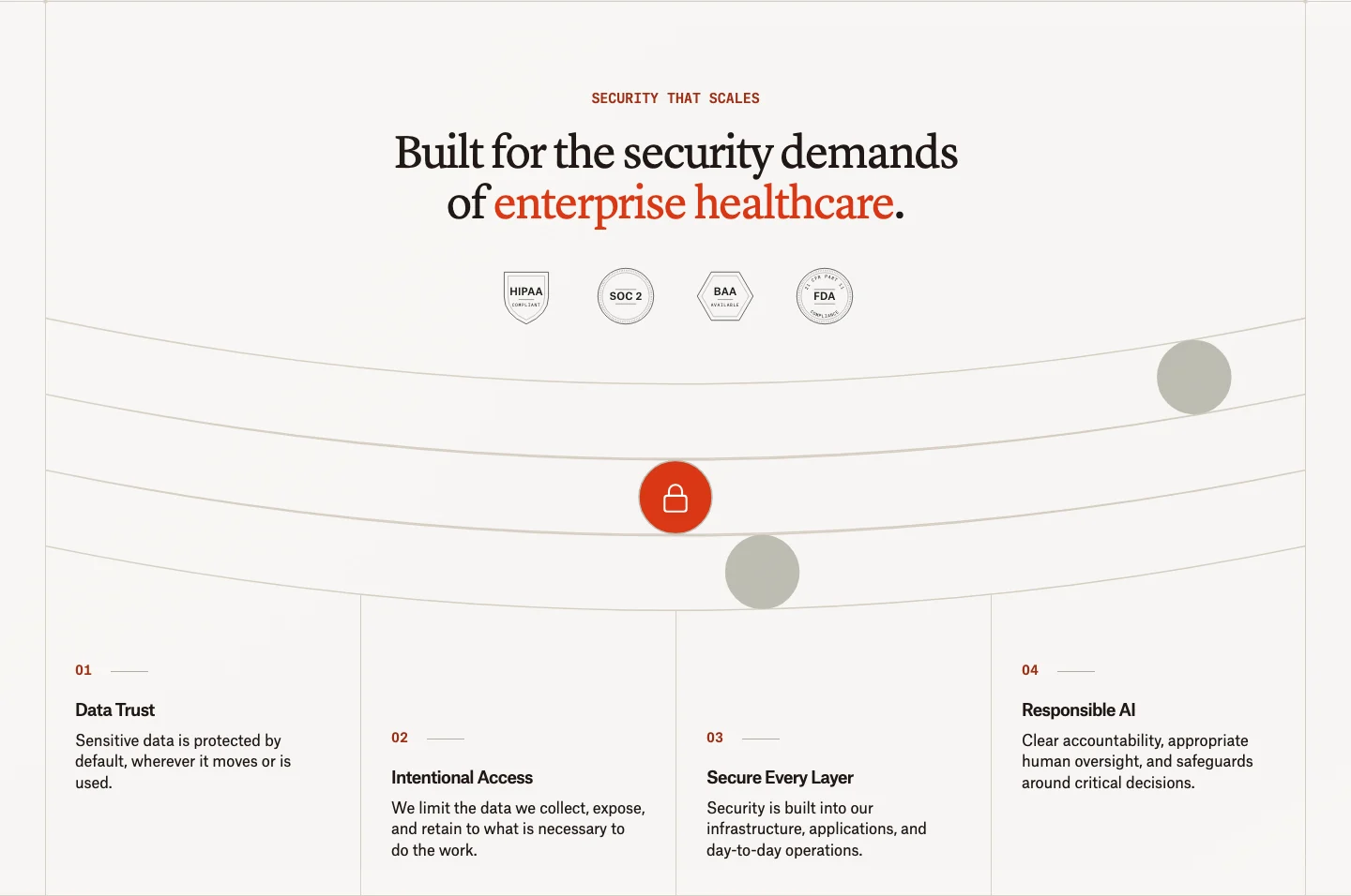
The page runs from the promise to the work itself, then to the organisations Snowdrop serves, the proof and the security questions a buyer in healthcare asks early.
A note from the founders
The about page takes the form of a transmitted patient access note. Document details frame a direct message from the founders, hand signed at the end.
Across the site
The same language carries into the supporting pages: layout, type and the topographic pattern holding together from the homepage through to contact.